Now that you have a structure for your presentation, it’s time to build your slide deck. Effective presentations have a story and a clear takeaway message from each slide. The audience will also process information faster through well-designed visuals. Once you’ve created your slides, be sure to evaluate their effectiveness and review your transitions.
1. Before you start
Identify your purpose (“Why”), your audience (“Who”), and your overall message (“What”) before you start creating slides.
1.1. Determine the message of each slide
Each slide should convey a single idea/statement. Breakdown your presentation sections (Motivation/Background, Results, Impact) into the individual points that you are trying to get across. By deciding what the purpose of each slide is, and using this to determine the content, you make it easy for the audience to follow your argument.
1.2. Include the message in your slide title
Each slide’s title should contain the main takeaway. This makes it clear to the audience (and the presenter) what the topic of discussion is. Although it may not always “feel right,” strong titles tend to be full sentences, since you need a full sentence to tell a message. This practice is particularly helpful when you have a mixed audience and want to help everyone follow along. It also facilitates communication if you’re presenting at an international conference where your audience may be more diverse.

1.3. Support the message with your content
After deciding on the message for each slide, think about what evidence is needed to support it. For a motivation slide, which figure encapsulate the problem? For a results slide, which data supports your finding? Check out the Motivation and Results slide examples below.
2. Creating your slides
2.1. Visuals > text
“A picture is worth a thousand words…”. Graphical content is the most efficient and memorable way to convey information to your audience, but you must be thoughtful in your visual design.

2.2. Simplify your figures
Remove elements that might distract from the key takeaway. You might have to replot the figure, or redraw it as a schematic. (More on Figure Design here.)
2.3. Control the information delivery
Don’t overload your audience with too much information, too quickly. Manage the delivery rate by making your content appear when you click through a slide (“Animations” in Microsoft PowerPoint). This way, you can control what your audience sees, at what time.
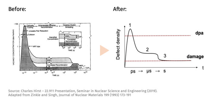
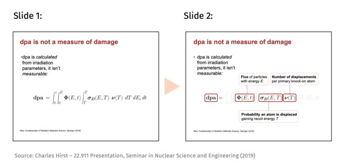
Also prime your audience to understand your data before you show it. In the example below, a schematic (Slide 1) is shown before the actual data (Slide 2) in order to highlight the key features.

Finally, you can help the audience follow along by repeating or revisiting content in different contexts or through new lenses. Include figures from the presentation on your outline slides to illustrate upcoming sections. Similarly, when reviewing your contributions, refer back to information shown in the Motivation section of your presentation.
3. Maximize effectiveness
Now that you have your slides, you can start optimizing their effectiveness.
3.1. Increase your signal-to-noise ratio
It is tempting to pack a slide with information, but all that “noise” can interfere with your key message—remember that your audience will try to read everything on a slide while you are speaking. Therefore, evaluate your content with respect to the message (title) of the slide; does it aid interpretation or hinder it? Highlight the important, remove the superfluous.
(The metaphor of “signal-to-noise ratio” comes from Jean-luc Doumont’s book Trees, Maps, and Theorems.)
3.2. Use annotations
Guide your audience to the key point of a figure or an equation with annotations. Highlight the trend or relationship shown, or use it to provide information necessary to understand the content. In this example, the terms are defined and the signal to noise ratio is increased by greying out the integrals in the dpa equation:
3.3. Check your formatting
Make sure the formatting is consistent throughout the presentation. Choose one text size for the headings, one for the content, and possibly one for the references.
Limit the number of different colors used. Start with a base color for regular content and another for highlights, and carefully decide whether to add more depending on the context. Colors can be used for coding and some have inherent meaning to them (e.g. red=hot, blue=cold) so use them accordingly.
3.4. Plan your transitions
As you finish the first draft of your presentation, find the logical connection between your slides to create a natural flow and keep your audience engaged. One option is to pose a question that results from Slide 1, and then answer it on Slide 2—obviously, do not do this for every slide! Ultimately, the messages from your slides should connect into one coherent story, which you can visualize using the “Slide Sorter” feature of Microsoft PowerPoint.
The final stage of slide creation overlaps with your preparation for oral delivery. As you go through what you’re going to say for each slide, you’ll find that some content is missing or unnecessarily redundant, or that transitions between slides could be smoother. Make sure to not skip this step!
4. Quick tips
Slide content
- If you haven’t yet, visit the Structuring a Slide Presentation article.
- Make sure each slide contains no more information than is required to support the message. This is also true if you are reusing materials from a different presentation.
- Avoid using jargon (specialized language used by content experts). If you have a mixed audience with different levels of expertise, you may use some jargon in your delivery if you also define it on the slide. Seek feedback to gauge the correct level of technical depth.
Visual appeal and effectiveness
- Don’t be afraid of white space, this provides contrast for important information to stand out.
- Make sure all text and figures are legible from the back of the room. A good way to check this is to print out the slides (6 per page) and see if they are easily read. If possible, visit the room where you’ll be giving your presentation, and go through your slides while standing in the back of the room.
Additional resources
- Carnegie Mellon University Global Communication Center has a neat handout with before-and-after slide designs and a 10-min video on Designing Effective Slide Presentations.
- Nancy Duarte, slide:ology: The Art and Science of Creating Great Presentations (the Comm Lab has a copy in 24-216) and other guides & tools available through her website.
- Jean-luc Doumont, Checklist for Slides
- Jean-luc Doumont, Creating Effective Slides: Design, Construction, and Use in Science (video of a 2013 talk he gave at Stanford)
5. Annotated examples
 |
 |
 |
 |
To get started or receive feedback on your draft, make an appointment with us. We’d love to help!