This CommKit was co-authored by CEE Communication Lab Fellows Sid Pai and Matti Gralka.
Criteria for Success
When designing a poster, remember to …
- Craft a title that explains your work and attracts your audience.
- Have a clear take-away message that stands out.
- Focus on communicating using your figures and use text sparingly
- Practice your 20-second pitch so you can engage the casual passerby.
Identify Your Poster’s Purpose
Your poster is a visual aid to help structure how you communicate your research to your colleagues. It should serve as a way to draw people to you at a poster session and help you explain your science to them. In order to design an effective poster, you should ask the following questions:
Why are you making this poster?
A clear purpose will help define the poster’s performance requirements, for instance, I am interested in getting critical feedback on my experimental hypothesis or I am interested in communicating the value of a new method I designed. In general, a poster should attract people who would read your future paper, get them up to speed on why you’re doing what you’re doing, and present them with the critical problems you want feedback on. A vague purpose like to tell people about what I’ve done doesn’t help you design your poster.
Often, you might decide to prioritize a few different goals, for instance, I want to communicate what I did on this project AND I want people to recognize my broader thought leadership in this space. It’s just important to be honest with yourself about what you are looking for out of your poster session so that you can appropriately design and execute on your poster. For example, if the goal of your poster is to get feedback on a specific methodology that is relevant to targeted experts in your sub-field, it might make sense to emphasize and elaborate on your methods section. Conversely, if you’re targeting a broad interdisciplinary audience, you might highlight the broader impacts of your results and how they might be generalized under different contexts.
When, where, and how will this poster be used?
Successful posters are designed for a targeted audience at a single event. Posters designed for multiple purposes, for example, first for use during a conference and then for use as a stand-alone manuscript-on-a-wall, tend to do poor jobs on all fronts. In most cases, you’ll be standing next to your poster, in which case you’ll be using it in the same way people use a pen and paper to explain their ideas and results. But if you’re not standing next to your poster, what should it accomplish? Someone might email you, they might be impressed and remember your name, and it might influence their research.
There are no hard-and-fast rules about what should or shouldn’t go on a poster.
After you have a specific audience and goal in mind, focus on removing elements of your posters that distract from that goal. To answer Should I put my detailed protocol on my poster?, ask yourself, Will that draw or deter my audience? Will it be useful to have on-hand during a conversation? Should I just have a copy of my protocol in my pocket instead? Do I want someone to be able to take a picture of it while I’m away from my poster?
Analyze Your Audience
People at poster sessions are often overwhelmed. There are so many posters, most posters are full of details, and most presenters love to talk details. A successful poster conveys all the necessary information clearly and quickly. It also helps get a conversation started whereas a weak poster is a technical memo broken up into boxes.
Compose a strong title
A strong title summarizes the main idea you want to get across. It should be general enough to cast a wide enough net across the attendees but specific enough so as to engage your target audience and describe your contribution.
To make a weak title strong, pick out the key nouns and verbs, make them as general as possible (appropriate to the audience of the conference you are attending), and link them together with as few words as possible. For example:
- The weak title Novel methods for accurately predicting the hygroscopicity of organic aerosol based on the morphology of particles leads to an improved model of fine particulate wet deposition over the south-east US
- has the key nouns organic aerosol, hygroscopicity, model and wet deposition
- and the key verbs predict, improve, and
- Linking the key nouns and verbs produces the strong title Accurately predicting particle hygroscopicity to improve wet deposition models of organic aerosol
Put your title in letters large enough to read from 15 feet away (at least 3/4″, but 1″ is better). Use a font size larger than 44 for your title and headings. Make the title as legible as possible: don’t use all caps, don’t use shadowing or embossing, but do use high contrast colors, for instance, black or dark blue text on a white background. Try not to use small fonts for your poster text. 28 point and larger fonts are usually easy for everyone to read. It’s usually best to avoid serif fonts like Times New Roman. Instead, use a sans serif font like Calibri or Arial.
Design your poster for easy navigation
After you’ve figured out how to show your main message, you’ll need to support it. What’s the motivation? What are the implications? What approach did you take? The rest of your poster’s space is for answering questions like these.
Aim to answer most of these questions with figures and very little text. To boost readability, chunk information into text boxes or bullet points (<15 words), which are easier to read than paragraphs.
Most posters arrange their material into boxes with a clear navigation system that goes from introduction to main result to implications. (Details that are essential to the message but don’t fit in the flow are relegated to the bottom or corners.) Exactly which boxes you include depends on your message.
Label your boxes with sentences or phrases that convey the message of the box. A title like “Arsenic contamination of groundwater is common in Southeast Asia” is far more informative than “Introduction” or even “Arsenic in Southeast Asia.” If you can’t formulate a strong message-title for a box, it might mean that the box isn’t saying anything important!
Stand out from the crowd
A poster session is a tough gig. If your poster is hard to understand, people will just move on. The best way to make your poster easy to understand is to make the main message stand out. Your main message should be the first thing someone sees and understands when they look at your poster.
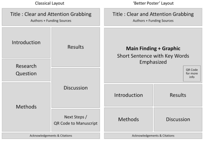
This is the basic reasoning behind the “Better Poster” design mentioned below that leverages a big, beautiful figure right in the middle of the poster with a strong takeaway message. Whether it shows your protocol, technology, or most important result, a good picture is worth much more than a 36″ x 36″ page full of text. A cohesive design guides your audience’s eyes to the takeaway message, which then invites them to have a deeper or longer look at your other sections.
That said, there isn’t only one way to design a poster. Get creative! Aim for a mixture of figures and text—how much of each depends on your sub-field, your research, and the conference itself—and think about the times you will be unable to stand next to your poster to explain everything. These factors will influence how much text you will need on your poster to provide context.
As alluded to above, there are two fundamental layouts that are thought to work well: the classical layout, and the “Better Poster”. You can follow these templates or adjust your layout to somewhere in between. You can also download various styles of poster templates in Illustrator and PowerPoint (hat tip: Biological Engineering Comm Lab!).
Get Feedback
Talk to peers and mentors—senior grad students, post-docs, and faculty—to better understand the general expectations in your field. Ask if they’ve submitted posters to the conference you’re attending and try to discern if there are any common elements across their posters. This will give you a sense of any field or conference-specific preferences you should incorporate into your poster. You should also reach out to your lab members or make an appointment with a CEE Comm Lab Fellow to get detailed feedback on your poster drafts.
Practice your Pitch
The most common question at a poster session is some variation on the question, So, what’s all this about? To hold your audience’s attention, the next 20 seconds are critical. A strong summary of your main message can spark a conversation while a fumbling deluge of details can sink one. A strong pitch has five parts:
- Something that every single person in the room cares about
- Why we need to know/do more about that thing
- What you did in this project
- What your results mean
- How your results contribute to the thing everyone cares about
Here’s a pitch that can be comfortably delivered in 20 seconds:
- Bacteria helped clean up the Deepwater Horizon spill much faster than expected.
- Only a handful of oil-degrading species have been isolated in the lab.
- In this project, we aim to identify oil-degrading species and oil-degrading pathways with culture-independent techniques.
- These results could provide a baseline measurement of biodegradation in natural environments…
- …improving the way we respond to oil spills.
Attribution: Parts of this CommKit are adapted from the MIT BE CommKit and have been modified with permission.
Resources and Annotated Examples
CEE research poster
This example by a CEE PhD candidate presents an engaging visual story with a central image that captures attention. 766 KB
CEE research poster
This example by a CEE MEng student features helpful annotations for each visual. 5 MB