Structure Diagram
Criteria for Success
- The presentation starts with the larger motivation for the work shown.
- The research shown in the slideshow concretely connects to the larger motivation.
- Experiments and their results are connected to the the larger motivation.
- Each slide tells a message.
- Each slide gives no more information than is required to support the message.
- The title text stands on its own, and most other text supports the visuals.
- The audience will take away the messages that achieve the presenter’s goals.
Identify Your Purpose
Know your own goals as a presenter, and structure your presentation based on your goals. This will make it easier for your audience to follow your logic and identify the most important points when providing feedback. Keep in mind that often our own goals and that of the audience may be different. Sometimes it is hard to overcome our own needs or desires, but putting the needs of the audience first typically results in a more memorable and successful presentation.
For example, if your goal is to get feedback from your colleagues on an experimental strategy, focus more on the experimental methods. Compare the advantages and disadvantages to alternatives. Explain why you think your proposed experimental design will give more useful results than other experimental designs would.
By contrast, if your goal is to communicate a new scientific result, then you should focus on the results and broader implications rather than your methodology. Avoid talking about specific methods (e.g., say “I measured key material properties” rather than “I found the thermal decomposition temperature and profile”). Say how your findings impact the broader motivation.
In less formal settings, like a lab meeting, you can explicitly tell your audience what you’re looking for (e.g., “I’d appreciate critique of my experimental methods”).
Analyze Your Audience
Different audiences pay attention to different things. Engineers are interested in innovations, scientists are interested in broader scientific questions, venture capitalists want to hear about both scientific novelty and marketability, and clinicians want to hear about how it will help patients. Your presentation should speak to and excite your audience.
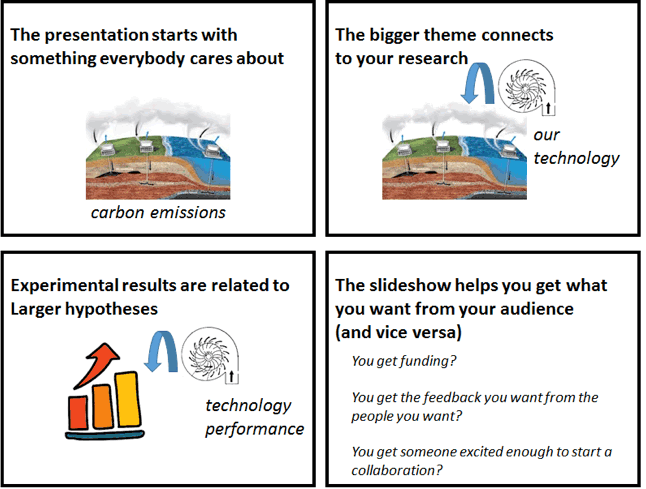
That being said, you probably know the subject material in your talk better than anyone, so what feels to you like a natural starting point for your presentation could easily feel baffling to others. Your presentation should start with something that everybody cares about and move step by step toward what you actually did and why. This may seem like a waste. However, if you spend too much time on background material, you only waste a few minutes. If you spend too little time on background, your audience might not understand your work and the entire talk will be a waste.
Another way to help your audience understand you is to avoid jargon, keeping in mind that the same words or images can be “useful detail” to one audience but “jargon” to another.
Skills
Plan the presentation
A common pitfall in creating a presentation is to start with the slides first, and then rearrange and restructure as you think about how they would be delivered. Sometimes these slides are even just made by copy/pasting from a paper or directly from data analysis. But a presentation is a unique form of communication where you are lucky enough to know and see the audience, and have both a visual and audible “voice.” Presentations are also constrained by the fact that the sequence and rhythm of delivery are fixed upfront – you listen to the speaker during a presentation, whereas you can read a journal article in whatever order you desire. With this in mind, proper care should be paid to structuring the presentation upfront.
When you’ve identified your purpose and audience, you can then design the content. Be sure to maximize content which supports your purpose and appeals to the audience, and minimize unnecessary details. Think about your constraints such as room size, time of day, and length of presentation, and about backup plans for technical emergencies. Oftentimes it is helpful to draw out a sketched “storyboard” of the slide deck ahead of time, and then build your slides to match this.
Because the audience cannot see the structure, it is often a good idea to provide a roadmap of the presentation to them directly early on in the presentation, and consider reminding them of where they are on this roadmap at points throughout the presentation. Keep the roadmap concrete, but at a high level. As a rule of thumb there should be 2-5 points and no sub-points in the roadmap. A parallel structure of the roadmap is often shown at the end of the presentation to drive home the message to the audience again.
Connect your work back to broader motivations and hypotheses
At the beginning of your talk, develop the broad context for your work and then lay out the motivating questions you aim to answer. The audience should be able to see how the answers to those questions will impact the broader context.
When showing data, be clear about what that data has to say about those motivating questions. What do different experimental outcomes mean for those larger questions?
Transitions between parts of the talk should also reference the larger motivating questions. A weak transition like “After running this gel, I decided to also sequence the DNA” doesn’t help orient the audience. A stronger version might be, “Running this gel showed us that we had an abundant PCR product, but it wasn’t clear if this band was from the gene we set out to study. We then sequenced the DNA to check if we had amplified the right gene.” A slower, more deliberate transition will give your audience time to process what they just saw and figure out how to connect that information with the rest of your talk.
“Introduce” your data
Make sure your audience will be able to understand your data before you show it. They should know what the axes will be, what each point in the plot represents, and what pattern or signal they’re looking for. If you’re showing a common type of plot to an audience that’s familiar with that kind of plot (e.g., a FACS plot for immunologists or a gene circuit diagram for synthetic biologists), there’s no need to worry. But if you show the data before the audience knows how to read it, then they’ll stop listening to you and instead scrutinize the figure, hoping that a knitted brow will help them understand.
If you are worried your audience won’t understand your data, one approach to try is to show cartoons of what the resulting data would look like if your hypothesis is true and what the data will look like if the hypothesis is false. Show the real data afterward.
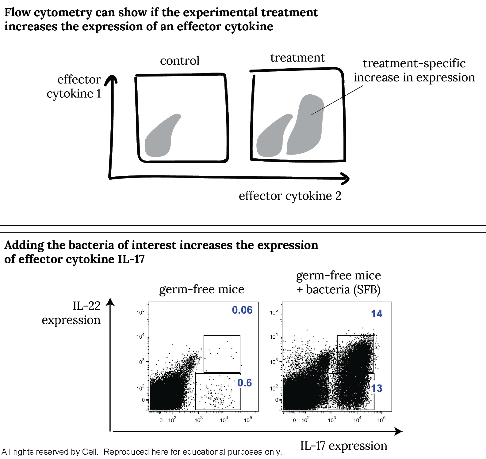
Try visually explaining unfamiliar data. For an audience unfamiliar with reading FACS plots, an imaginary immunologist first shows a slide explaining how the biological signal would appear in a FACS plot (top) before showing the slide with the actual data (below). [Adapted from Ivanov et al., Cell (2009) doi:10.1016/j.cell.2009.09.033]
Each slide should convey a single point
Keep your message streamlined. Make a single point per slide. This gives you control over the pace and logic of the talk and keeps everyone in the audience on the same page.
The slide’s title should be the slide’s main takeaway. In other words, the audience should be able to follow your story just by reading the slide titles. Even if you completely forget what a slide is about, you can just read the title to convey most of what you had to for that slide.
| Context in presentation | Weak title | Strong title | Why? |
| Background slide | “Antibiotics for Gram-negative pathogens” | “The antibiotic development pipeline is not limited by target discovery” | It highlights the most relevant point that motivates your work. |
| Data slide | “RT-qPCR” | “RNAi knocked down the target gene 100-fold” | It states the finding rather than the method. |
| Conclusions slide | “Conclusions” | Whatever the main conclusion was | You said “In conclusion” with your words, tone, and body language. There’s no need to repeat it. |
Strong titles tell a message. Strong titles tend to be full sentences, since you need a full sentence to tell a message. Weak titles tend to be nouns like “Background” or “RT-qPCR of the cell line”.
Here’s one way to figure out what your slide’s title should be: have a friend look at it and say, “I don’t understand what the point of this slide is.” If you find yourself saying, “Well, the thing I’m trying to convey with this slide is X”, then X should be the slide’s title.
If a slide makes multiple points, try one of the following:
- Remove points that don’t come up later in the talk.
- Make multiple slides, each with their own message, title, and content.
- Make parts of the slide appear and disappear to display different pieces of content that together support the title’s message.
Emphasize visuals over text
When you put up a new slide, most people in the audience will stop listening to you and start reading the words on the slide. Most people simply won’t hear what you’re saying. The more words on the slide, the less control you have over what your audience pays attention to. If you’re reading lots of words off the slide, you’ve lost the audience’s attention.
In the best case, a slide has only one complete sentence on it: the title. It’s okay to use terse statements to support and highlight secondary conclusions that aren’t already conveyed by the title. If you have a large block of text on your slide, try one of the following:
- Replace the text with a picture
- Break up the slide’s content into multiple slides that each make one point
- Take the text off the slide and put it into your presenter notes
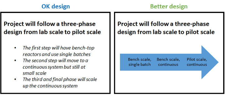
Replace blocks of text with easy-to-read pictures. The original slide (left) makes a main point in the title and supports it with specific information. The specific information contains long sentences. The improved slide (right) conveys the same information but with a picture to support minimal words. Descriptive phrases such as “final phase” can be left out and instead implied with the image.
Make each figure as simple as possible while still conveying its message
The purpose of a figure is to convey a message using visual evidence as support. Your audience usually gives you the benefit of the doubt and assumes that whatever you show in the figure is important for them to understand. If you show detailed data, your audience will get distracted by these details and miss the forest for the trees.
A figure that’s effective in a presentation is usually not the one that came straight out of Matlab or the one that you made for a paper. Unlike when you’re reading an academic paper or scrutinizing your own data, your audience doesn’t have a long time to pore over the figure. To make the figure more effective, ask yourself what minimum number of things need to be shown for the figure to make its point. Remove details that don’t help prove the point. Simplify data labels, and add emphasis using colors, arrows, or labels.

Simplify labels and add emphasis. The figure in the publication (left) is very detailed: it shows the values for statistical significance, effect size, and method of computing effect size. An adaptation of that figure for a slideshow (right) leaves off many of the specifics while still communicating the major points: E. coli genes go up and genes from other species mostly go down. The original figures caption mentions that this is “bacterial gene expression”; the slideshow figure conveys this by putting the word “genes” right in the labels. [Adapted from Charbonneau et al., Cell (2016) doi:10.1016/j.cell.2016.01.024]

Simplify data. Academic referees, your labmates, and your PI probably want to see the raw data (left) so they can interpret it for themselves. In a presentation, you might want to simplify the data (right) to emphasize the results of the experiments (which knockouts cause which phenotypes) rather than the exact form of the data (the bands on the gel). [Adapted from Choe et al., Nature (2016) doi:10.1038/nature16973]
Avoid jargon, both textual and visual
One way to help your audience understand you is to avoid jargon. Discuss the concepts in terms that anyone in the audience could understand. Names of specific genes or assays might be widely familiar, but they can distract from the main point. For example, if you say “GFP,” it’s not clear if (a) any old gene expression reporter would have worked and you just happened to use GFP or if (b) there is some scientific or engineering reason that makes it important that you chose GFP.
Usually “jargon” refers to certain kinds of words, but a picture can be worth a thousand words of jargon. If you show your audience some kind of detail – for example, the exact design of the gene circuit you are using in your experiment– then they will think that they need to understand that detail. Try to separate the things you needed to understand in order to make the experiment work from the things your audience needs to understand in order to follow your conclusions.
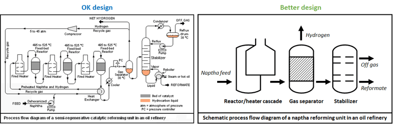
Avoid visual jargon. (left) A process flow diagram you might see in an average chemical engineering talk. The unit operations are all present in detail, including stream information and operating parameters such as temperature. The message will easily get lost.
(right) A simplified diagram that tells the important message: a naptha reforming process contains three major types of unit operations and outputs three flow streams.
Design tips for constructing the slides
Because a good slideshow is in equal parts about the visuals and the audio, a clean set of slides will minimize noise and highlight the important elements of both your slides and speech. The purposes of the following graphic design tips are to…
a) reduce visual noise
b) guide the viewer’s eyes to important information or to follow a flow
c) demonstrate hierarchical importance of slide elements
d) imply mood, emotion, or, most importantly professionalism!
Design tips: visuals
- Spread out elements on a slide to use space effectively, but do not be afraid of keeping white (negative) space! This provides clarity for important information to stand out.
- Coordinate all sizes and positions for structure and harmony. Be self-consistent within a slide and across the whole presentation. Pay particular attention to things like line widths on graphs, types of bullets or numbering used, line or label coloring, etc.
- Use in-software alignment and centering features to your advantage! Powerpoint’s “align-middle, left, right, and center” tool is a huge timesaver.
- Use color to your advantage to highlight important items on the slide, but use it sparingly so that it does not become a distraction. A good recommendation is to stick to black/grey and only one other color. If you must add levels of importance or understanding, try working within shades of a single color.
Design tips: text
- Optimize line breaks by hand rather than letting your slideshow program do it automatically. Make sure each line ends with distinct thoughts grouped together where there would be a natural pause in the speech.
- Don’t be redundant with bullets. If text or images are already separated by spacing or size, there is no need for a bullet to do the same thing.
- When things are grouped as a list, make sure they belong together and have a distinct theme which unites them.
- Use one typeface, and a minimal set of sizes (not more than 3). Make sure each size of font corresponds to the same level of hierarchical importance throughout the presentation.
- Make sure all text and figures are legible from the back of the room. A good way to check this is to print out the slides in small scale (6 per page) and see if they are easily read.
- Consider footers and slide numbering. Make sure they are necessary and add to the logistics of the presentation. Avoid unnecessary logos on every slide. It is sufficient for the MIT logo to appear only once in your presentation.
For guidelines on preparing for the oral presentation, see Slideshow: Presentation Skills.
Resources and Annotated Examples
Annotated Slideshow Example 1
This Third Year Talk received excellent department feedback in the form of questions during the talk as well as peer evaluations collected afterwards. 908 KB
Annotated Slideshow Example 2
This Third Year Talk received excellent department feedback in the form of questions during the talk as well as peer evaluations collected afterwards. 5 MB