Criteria for Success
A strong portfolio…
- Shows your most relevant work.
- Includes projects (often 3-4 main ones) that cover your diverse technical skills.
- Tells a story of you as a capable and experienced candidate for the application.
- Can be quickly parsed. Uses visuals as the primary communication tool, lays content out cleanly, logically and consistently, and has one project per page.
- Includes your name and contact info.
For each project, a strong portfolio…
- Describes the objective of the research/design project, e.g., your high-level design requirements.
- Provides visuals (photographs, renderings, drawings, graphs, …) that illustrate and support your technical work.
- Explains your specific technical contribution to the project.
- Provides just enough technical detail to orient the reader to the project.
- Describes the results of the design, and evaluates how well it met the initial objective.
Most importantly, document your work while you’re doing the project! You can easily build a portfolio later, but it’s difficult to gather photos of your sophomore class projects during your senior year.
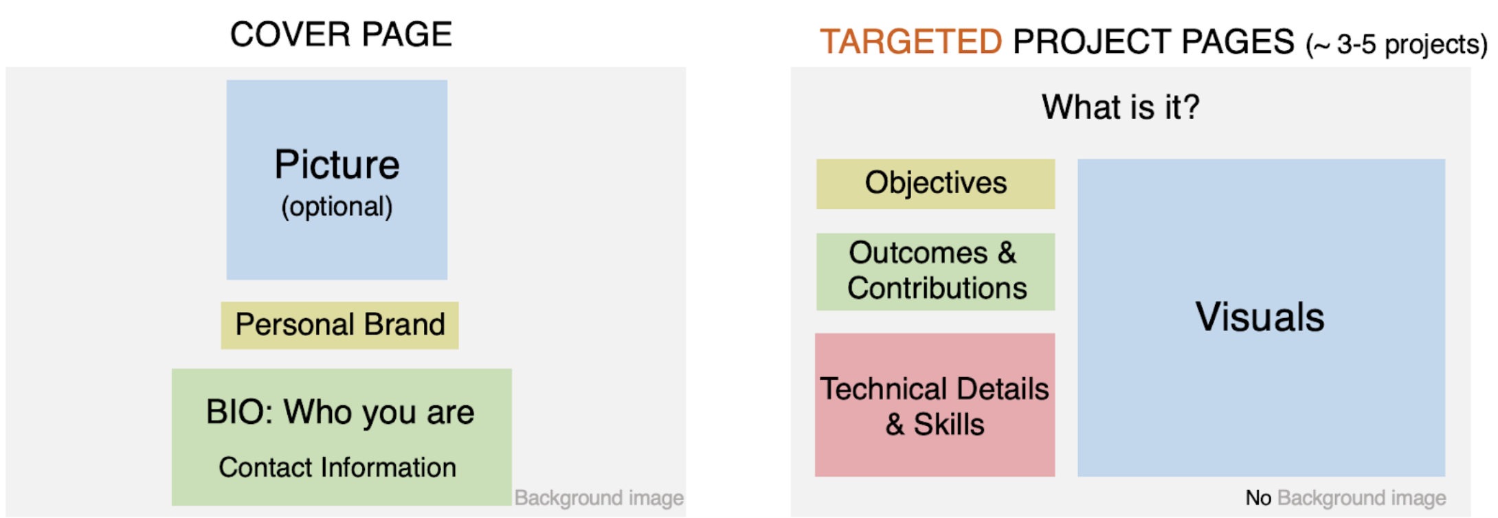
Structure Diagram
A portfolio is a visual tool that conveys technical competency. The exact layout will change depending on the platform you use, but all portfolios will have a cover page and targeted project pages. Expect that each page will be skimmed by reviewers for no more than 30 seconds to a minute (read on for how to make this time count).
“Should my portfolio be a PDF or a website?” It depends!
Benefits of PDFs:
- You can create a PDF with PowerPoint (or Keynote, Adobe Illustrator), so you don’t necessarily need to learn a new platform
- You can rearrange or include/exclude pages to give a tailored portfolio to each recipient
- You can bring a hard copy to an interview or career fair
Benefits of a website:
- You can include videos or GIFs to show dynamic projects
- Templates make it easy to have a clean, graphically appealing layout
- You can update your content even after you’ve sent your portfolio to the recipient
- A link to a portfolio can be included in a CV/resume even if a portfolio is not specifically requested as a part of an application package
“Which website platform should I use?” Again, it depends!
There are lots of options: Squarespace, Wix, Adobe Portfolio, Google Sites, Google Slides, and more. Some are paid while others are free but come with ads. Think about what your audience might expect regarding ads and where you are in your career. Also consider the longevity of your portfolio. It takes a lot of time investment to create a portfolio, and you might not want to have to migrate platforms later down the line.
In standard mechanical engineering positions, no one will expect you to build your own website from scratch. If you have that skill and want to highlight it, go for it! If not, use a platform and focus your effort on your content.
Purpose
Your portfolio complements a text resume with visual information that clarifies technical details of design projects and engages the reader in your work. As a whole, the portfolio should present a narrative of you as a capable, experienced candidate for the position you’re applying for. In an interview, you won’t have time to go over everything, so pick your 3 or 4 most relevant experiences that support the narrative you want to present.
TIP: Keep a master portfolio with all of your current and past projects. For each recipient, select specific projects to tailor a smaller portfolio.
Analyze your audience
Each time you share a portfolio, you should think about who will be reading it and what they want in an applicant. If mechanical engineers will be evaluating your application, then technical design details will be well-received and understood. But if you’re applying to be the sole mechanical engineer within a startup, your portfolio might need to be revised to provide more background, and just enough technical detail to demonstrate you know what you’re doing.
Keep in mind that many companies recruit students from the same department year after year. If you want your portfolio to stand out, do not put forward the class project that most people in your department did too (e.g. the recruiters have already seen hundreds of yo-yo designs made by MIT MechE students).
Similarly, consider the role you’re applying for. Which of your skills are most valuable? For each context, match a relevant project from your experience to the needs of the employer. Choose projects that highlight your most pertinent skills and accomplishments and ensure that you emphasize the aspects of the project that are best aligned with the position.
If you are using a web portfolio with many projects, it should be easily sorted by skill or topic so that different audiences can filter for what is most relevant to them. This could include a table of content, search bar, or pages grouped by key word.
Take a look at the example below for how this might play out in practice.
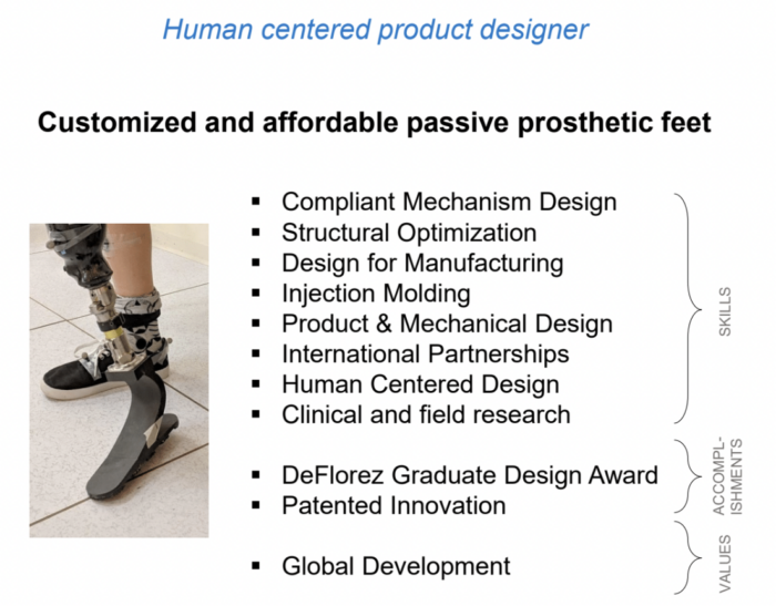
This student completed a research project entitled “Customized and affordable passive prosthetic feet” and wants to apply to two positions: one as a human centered product designer and one as a structural design engineer. First, they listed all the skills, accomplishments, and values associated with the project.
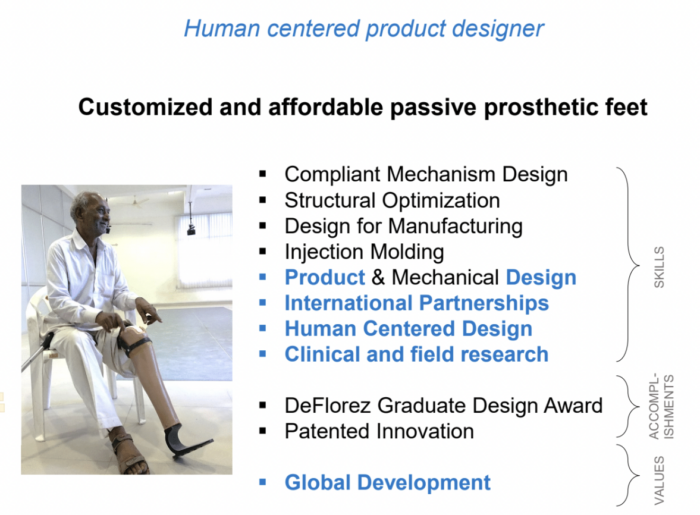
Next, they highlighted the skills specific to the human-centered role and chose an image that was most appropriate for that context.
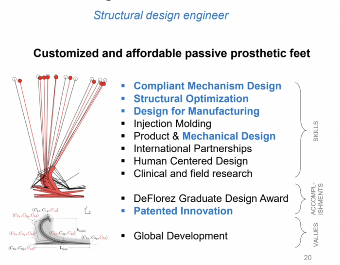
Alternatively, they showcased the skills specific to the structural design engineer role and used an image that demonstrated competencies in that context. This approach allowed the student to organize their specific skills and accomplishments that were pertinent to the role they sought. This approach can help guide the conversation with prospective employers towards your most relevant experiences.
Skills
Once you have identified your audience and qualifications, the next step is to create visually appealing project pages that tell a story.
Frame your story
Your portfolio should contain one project per page. Each page should follow an “inverted pyramid” structure that conveys the following items:
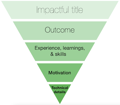
Impactful title
Grasp the reader’s attention and convey meaning to a broad audience.
| Instead of… | Try… |
| 4.450 – Computational Design | Generating CAD through sketches |
Outcome
Articulate what you are showing on the page and highlight what the reader should know. What is it? How did it perform? What is the impact? What is your contribution?
| Instead of… | Try… |
| Over the course of the semester, my 2.009 team and I stepped through the design process to identify, evaluate, and then solve a problem we observed in the real world environment. We considered varied problem spaces and developed product ideas from vastly different contexts. Eventually, we identified the lack of independence for lead climbers and created Areta, an auto-belay for lead rock climbing. | Areta is the first auto-belay for lead rock climbing. It increases climbers’ independence and safety. As part of a team, I designed a fail-safe speed-triggered fall detection mechanisms that automatically detects a fall and engages a magnetic damper to safely lower the climber to the ground. |
If you realized afterwards that your project didn’t work as intended, reflect on what went wrong and what you learned for the next design iteration.
TIP: If you won an award for your work or it resulted in a patent issued, consider showing a photo of the award/patent to catch the reader’s eye, instead of just mentioning it in text.
Experience, Learning & Skills
Think about your personal outcomes. What did you gain from this project? How did it make you a better engineer or researcher? For group projects, describe your role within the team (e.g., “I was responsible for…”). Use strong action verbs that describe what you did.
- Strong Verbs: designed, machined, analyzed, compiled, organized
- Weak Verbs: used, did, studied, helped
TIP: List the skills applied as bullet points so it’s faster to parse.
Motivation
What was the project objective? Why does it matter? Who does it help? In addition to motivating the project, this can be a good time to include constraints such as team size, budget, and timeline.
Technical Details
Include these details for the most curious readers but assume not everyone will take the time to review them.
E.g. Design/Modelling process, specific brands/suppliers worked with.
Creating strong visuals
Depending on the project, use 2-6 visuals to demonstrate the most important parts of the project. Select visuals that support what you want your reader to understand about your technical abilities and design process. For instance, if your system met stringent requirements to support your objective, a plot of performance metrics can emphasize a successful design.
Don’t choose redundant visuals. Make sure that the visuals illustrate different aspects of the project and of your contributions.
To help orient the reader to how your work fits into a larger system, use a mix of system-level and subsystem-specific visuals (schematics, pictures, renderings, drawings). As a rule of thumb, motivate your contributions to a subsystem by first showing the whole system.
Best practices for presenting your visuals
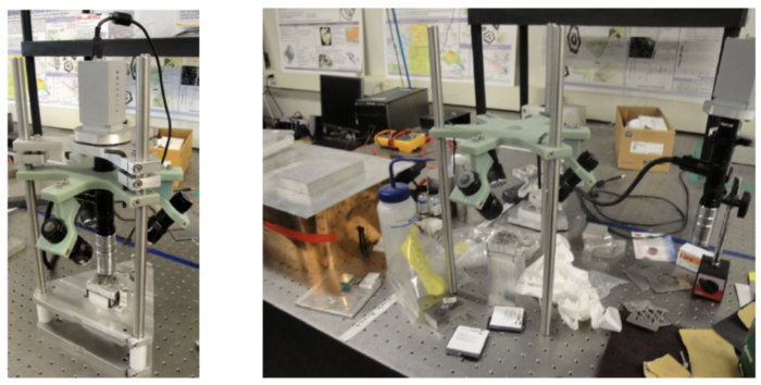
- Photographs should be high-quality and staged. Make sure they are well-lit, sharp, free of clutter to direct attention to what you want to show. You can see in the following example how the left visual is stronger than the right one.
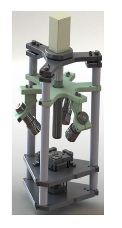
- Decide if you want to show a CAD model (below), a photograph (above), or something else. CAD models demonstrate your CAD abilities while photographs show you have built something physical. What skills do you want to highlight?
- If you want to focus attention on a particular subsystem, consider inserting a close-up of that subsystem into a block diagram or schematic of the larger system (example below).
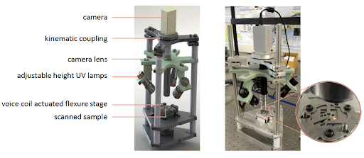
- Much of your text should be integrated with the visuals. Include annotations to draw attention to specific features or concepts that relate to your technical contributions. For instance, if you worked on a specific subsystem, highlight its place within the larger system. If your work involved precision design or high loads, illustrate the critical forces that are relevant.
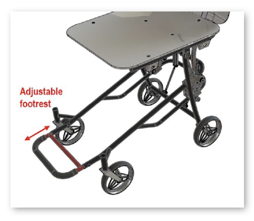
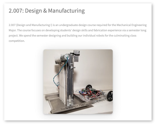
- Keep visuals large enough to grab attention! They are the main focus of your portfolio, so they should take up about 70% of the space (example below).
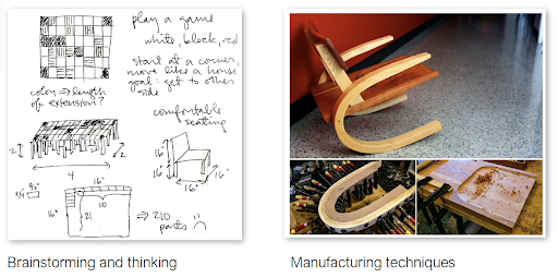
- Use visuals to show process. You should include more than just the “hero” shot of your finished project. Show how you got there (examples below).
Example Portfolios from Alumni:
| https://www.alyssali.me/ | Structure shows the full design process of how each project unfolded- nice demonstration of process over product |
| https://www.harithmorgan.com/portfolio/ | Good use of animation and videos for storytelling |
| http://sahils.scripts.mit.edu/ | Strong visuals for each project- hovering over each photo shows the project title and key skills |
| https://www.donlonisland.com/ | Skills based organization of projects so relevance to employers is immediately clear |
| https://rimadas.myportfolio.com/ | Many visuals and organized according to type of project for easy navigation |
| https://www.hilaryannajohnson.com/ | Leadership section showcases skillset beyond work-related projects |
| https://www.gdvdz.com/ | Highlights teaching experience in addition to project experience- relevant to jobs |
