What is #betterposter?
Introduced in 2019 by a psychology graduate student1, #betterposter is a framework for improving scientific poster design and presentation. The goal is to eliminate large blocks of text—which too often plague academic posters—to improve audience understanding and to make posters more efficient to create and view. To accomplish this, #betterposter templates are dramatically stripped back, emphasizing a clear, direct title and reducing the amount of other information to the bare minimum. MIT Communication Labs (and folks on X/Twitter) acknowledge some advantages of this format and also identify several key limitations. In this blog post, we outline some of these pros and cons and synthesize them into alternative, “#evenbetterposter” templates.
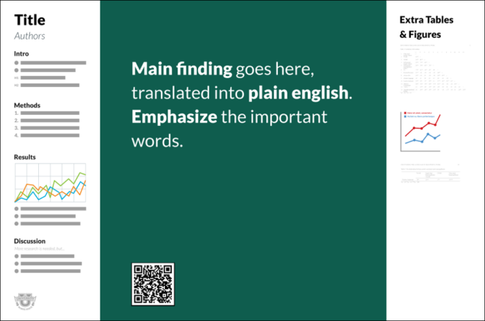
The original 2019 #betterposter template.
The Pros
- It is easy to find and understand the main message. Because the title occupies the majority of the space and uses plain language, the central idea is impossible to miss, even at a glance.
- It massively reduces clutter. The template eliminates one of the main pitfalls of posters, namely paragraphs of text and (in its best form) squished, confusing, or overwhelming figures.
- It works to account for ways the audience might engage with the poster. MIT Communication Labs emphasize the importance of analyzing your audience and purpose at the start of any communication task. The #betterposter framework draws on user experience (UX) principles that consider the audience’s internal state, desired forms of interaction, and basic human psychology to inform the template design.
- A QR code that links to a paper/preprint is a convenient, simple addition. Making your paper easily accessible to interested audience members can further disseminate your work and provide details outside the scope of a poster session.
The Cons
- Many people have a strongly negative initial reaction to this format. While it is important not to blindly accept conventions, straying too far from the audience’s expectations can elicit confusion, dislike, or even distrust—all antithetical to effective communication.
- It does not leave enough room to justify claims. With over half of the poster real estate devoted to the title (and excessive whitespace around it), data and other key information are relegated to small side bars. This is especially problematic for results that are less easily condensed, such as microscopy images. As scientists, we rely on evidence to draw conclusions, yet the #betterposter format deprioritizes this essential information and allows little room for nuance. Some critics even suggest that this template feels more like an advertisement than a rigorously justified claim, which may undermine the credibility of the presenter and introduce unproductive skepticism.
- Like any poster template, it can be used ineffectively. Not everyone prefers the aesthetics of the design, and the framework adapts better to certain content than to others. Too easily, presenters can shrink and squish data to fit in the small sidebars, decreasing their readability. While modified examples and templates do exist, the core tenets of the #betterposter format are not well-suited to all contexts or styles.
Towards an “#evenbetterposter”
The #betterposter framework emphasizes efficient knowledge transfer and considers many aspects of audience engagement, yet it misses key audience perceptions and expectations. Considering the benefits and drawbacks of this template, we can extract several principles of poster design for scientific contexts. These suggestions may help improve your posters without requiring you to fully adopt the #betterposter format.
- Spend time crafting your narrative and considering your audience. What is the main idea you want your audience to take away? How can you convey this to audience members with different levels of engagement (e.g., just walking by, looking and listening for 30 seconds, inspecting and discussing for several minutes, reading while you are not there)? The #betterposter framework does an excellent job of calling attention to these questions, even if its solution is not perfect. It may be helpful to consider several levels of detail, from very broad claim (title) to justification (section headers and figures) to details (annotations, text, and verbal descriptions). Only include data that is most important to support your claims, and reduce extraneous information where possible.
- Make your title large and legible. Write your main claim in your title as a complete sentence, and style it (using location, color, font, etc.) such that it is easy to read and understand from afar. Avoid excessive jargon. While #betterposter likely takes this too far, the spirit of its title design is in the right place.
- Use ample whitespace and organize your layout so information is accessible without feeling cluttered. The #betterposter framework emphasizes designing for efficient audience understanding by reducing cognitive load (from excessive or confusingly presented information) and by making key points eye-catching and clear. These strategies map well onto the concept of maximizing signal-to-noise ratio that the MIT Communication Lab and others2 espouse. And do eliminate blocks of text—#betterposter advocates and critics alike agree on this point.
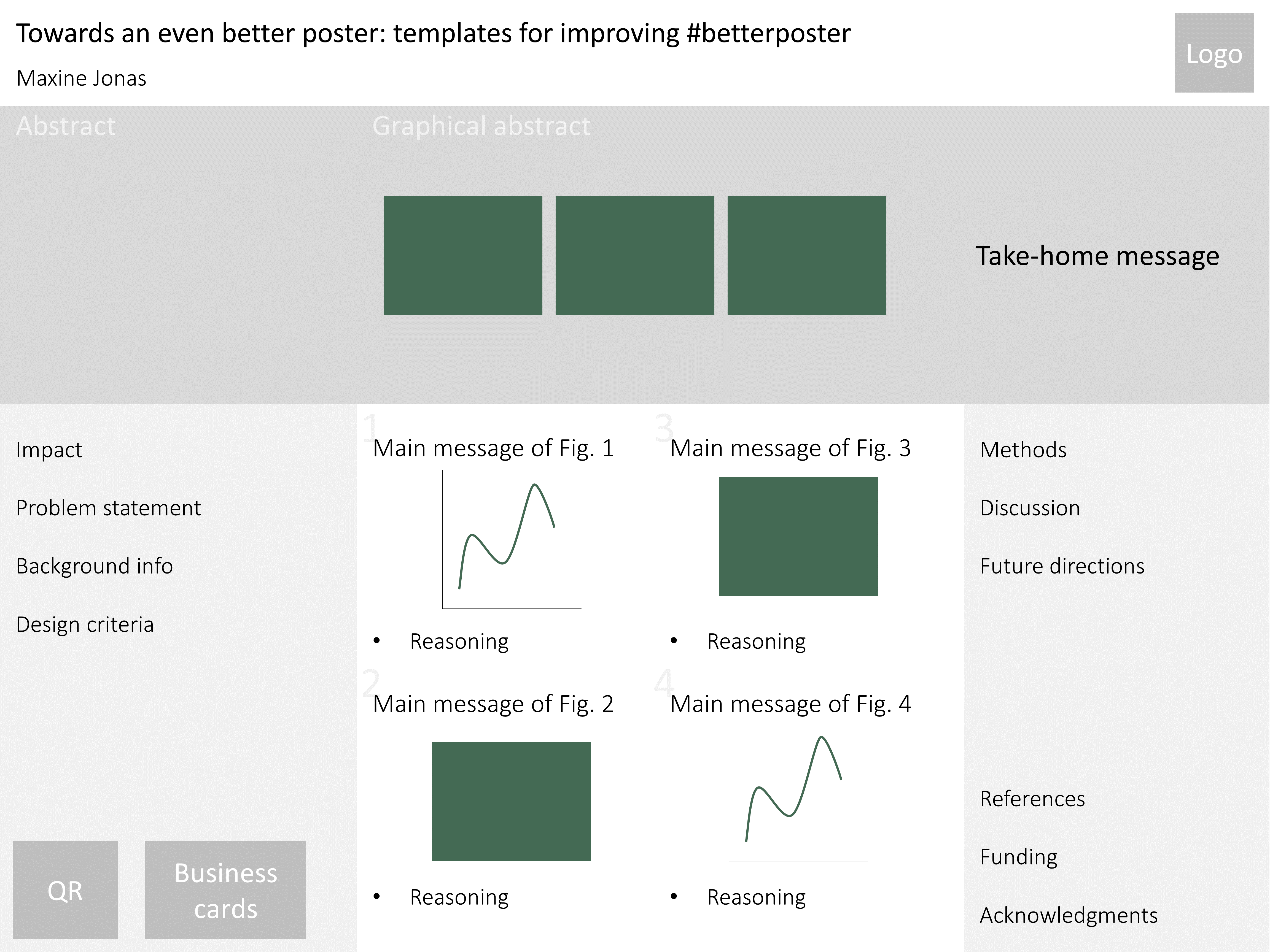
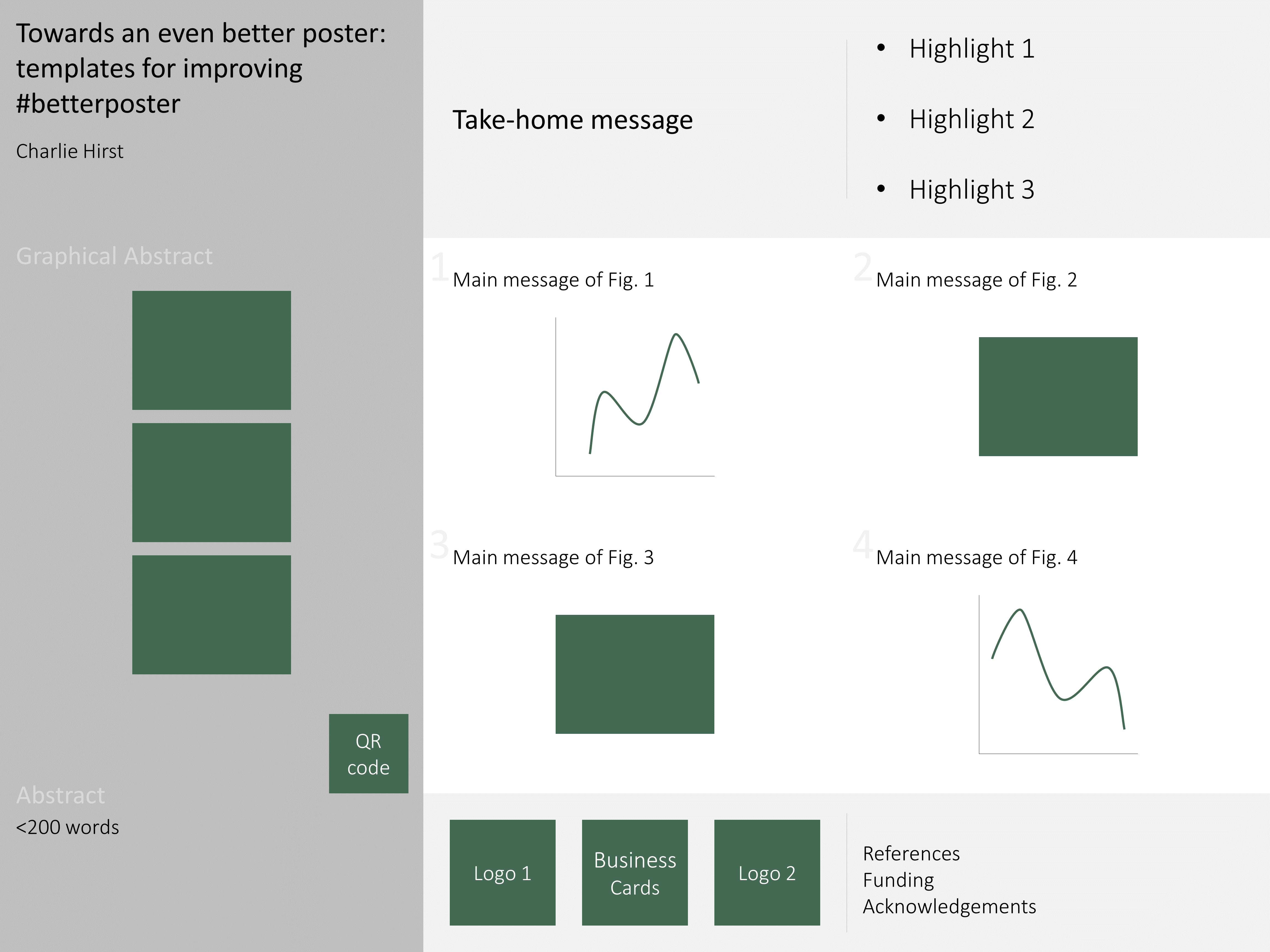
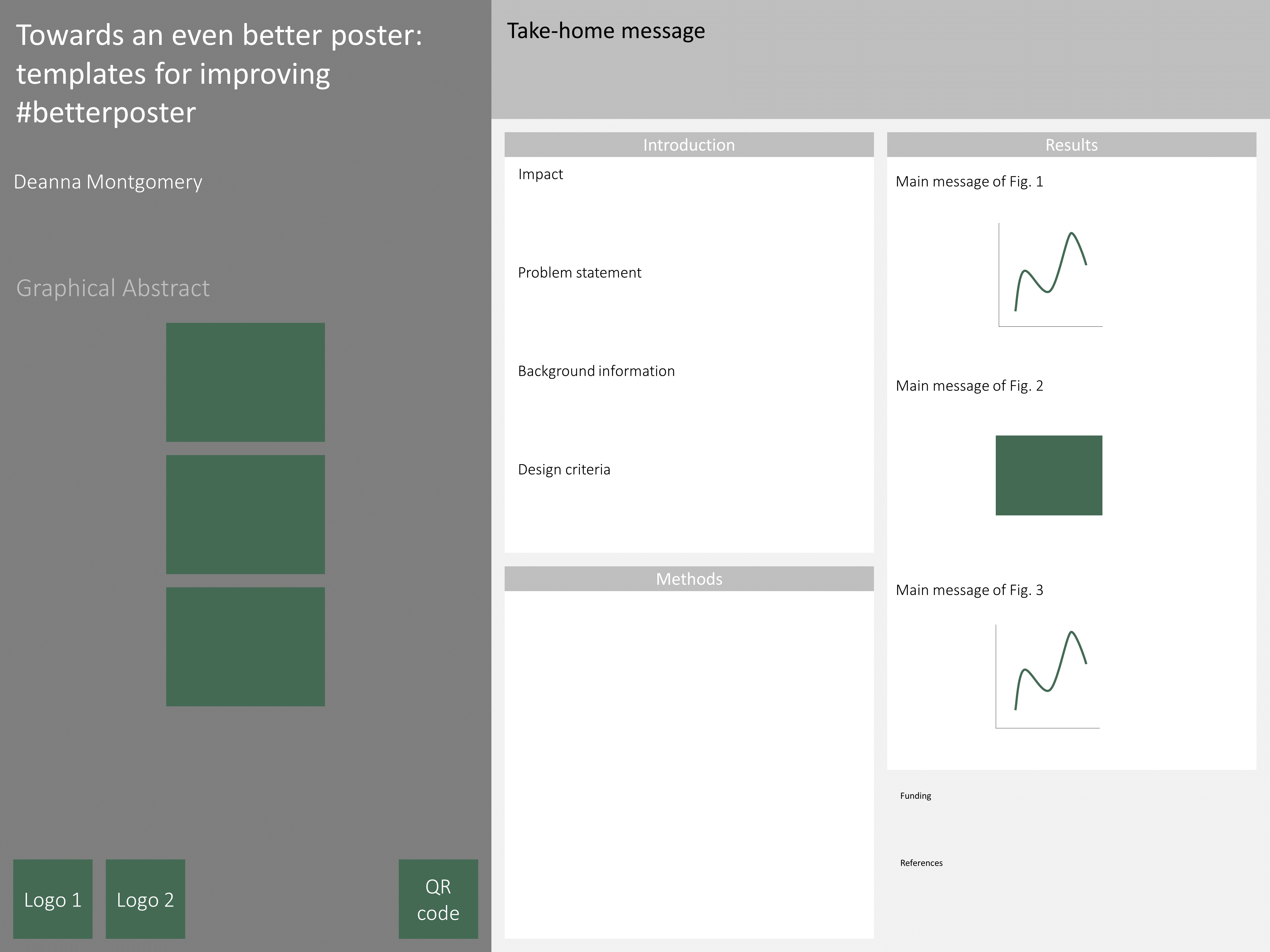
- Avoid blindly following templates. Although the #betterposter creator laments uncritical use of (often ineffective) templates, #betterposter presenters can also fall into this trap—leading to a confusing (and largely empty!) poster. Instead, make the effort to adapt your poster design to your particular audience, goals, context, and content. It can be helpful to create multiple (rough) drafts in various orientations and layouts to settle on one that most effectively communicates your point. With that disclaimer, check out some of the poster templates below that were inspired by thoughtful critique of the #betterposter format from MIT Communication Lab Fellows and Staff.
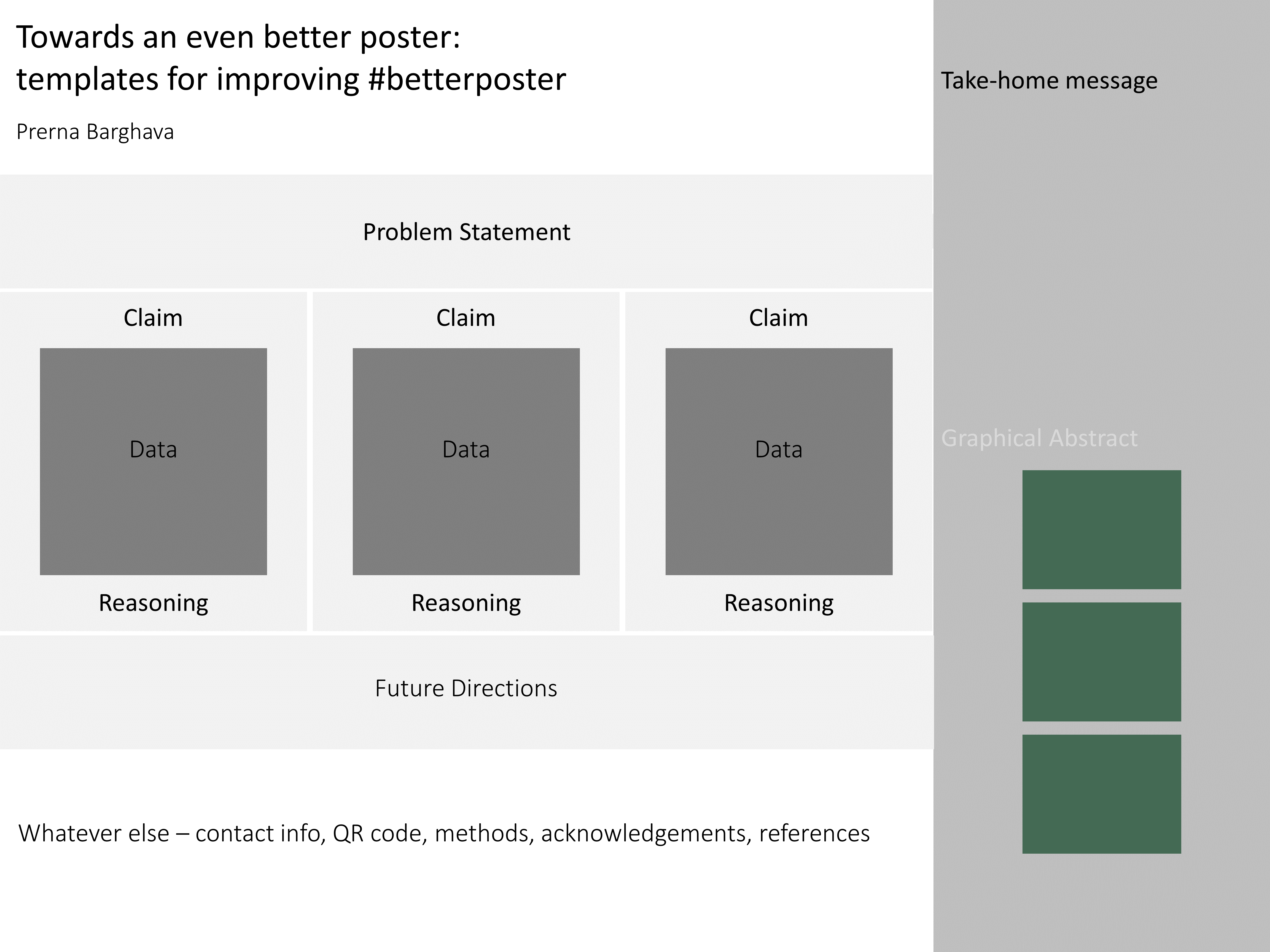
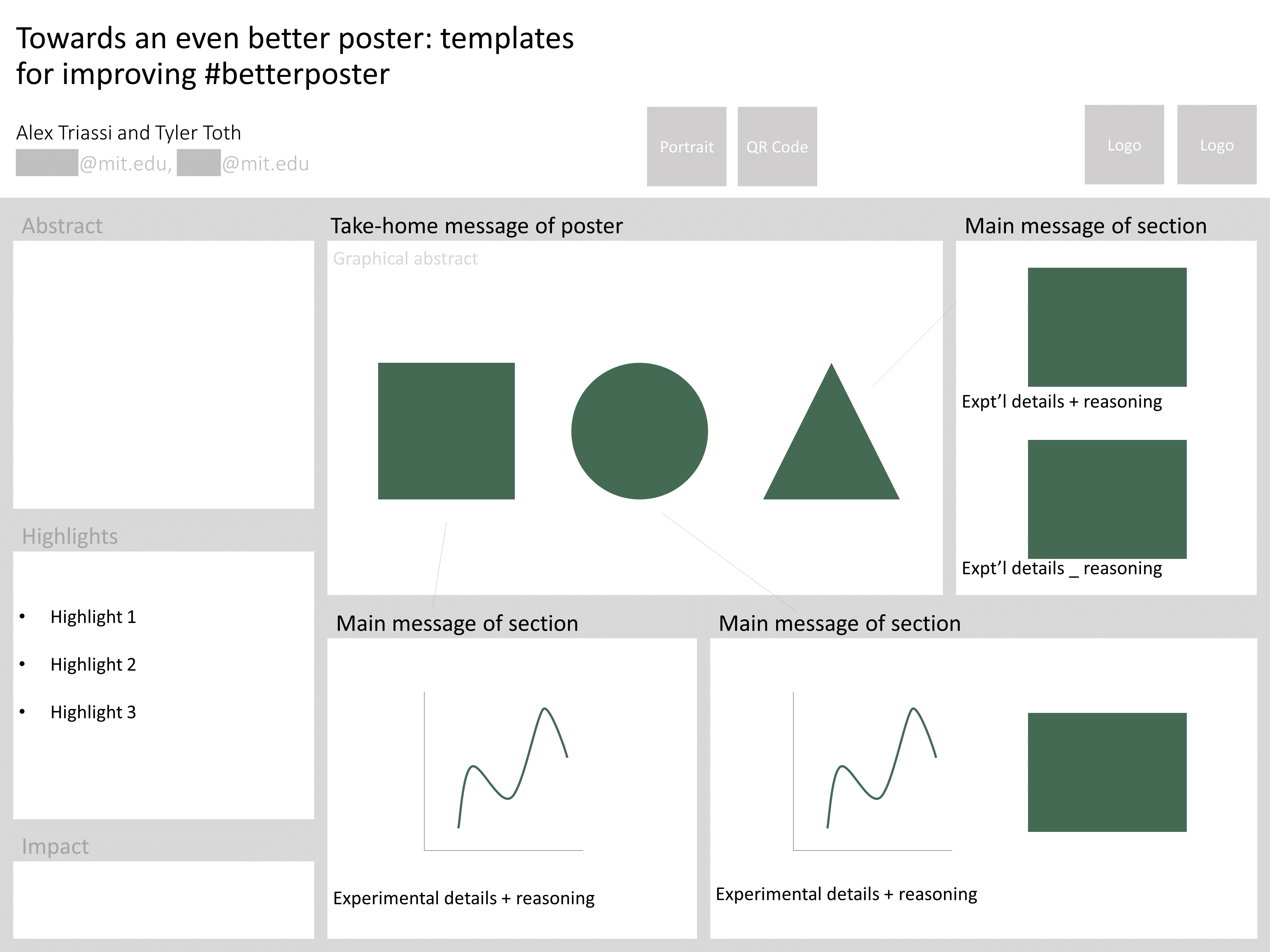
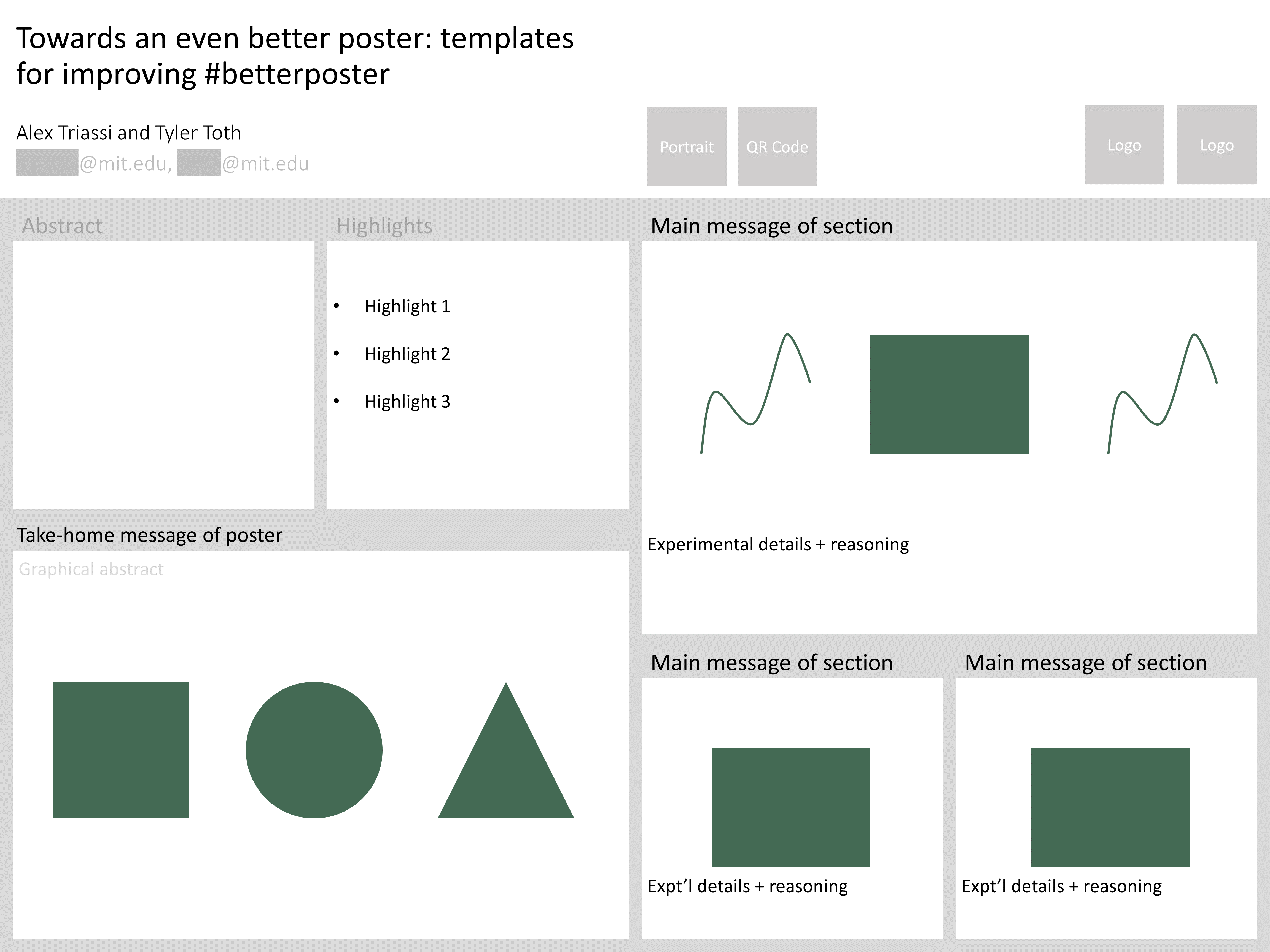
#evenbetterposter: template and example sketches
Explore and adapt our Powerpoint and Illustrator #evenbetterposter templates, included as part of our Poster Resources Github.
The following example sketches illustrate just a few of the many ways in which you can implement an #evenbetterposter design:
 |
 |
 |
 |
 |
 |
References
1 Videos explaining the design and rationale of #betterposter from its creator: Generation 1, Generation 2
2 Concept of signal-to-noise ratio in communication from Jean-Luc Doumont, author of Trees, Maps, and Theorems.
Blog post by Kasey Love, sketches/templates developed in collaboration with Maxine Jonas, Charlie Hirst, Deanna Montgomery, Prerna Bhargava, Alex Triassi, and Tyler Toth
Post published on 2023/9/27