Developed in collaboration with Dr. Dan Pomeroy, manager of MIT’s International Policy Lab.
Criteria for success
- The presentation starts with the main policy implication of your work or recommendation.
- Do not spend time on your methods; policy makers are not peer reviewers and trust your work.
- Unnecessary scientific detail and jargon is kept to a minimum.
- Each slide has a title that stands on it own and tells a single message.
- Figures have the minimum amount of information to make your point and nothing more.
Purpose
Generally, when an academic is presenting to a policy audience, they are either providing information, typically in response to a request, or making policy recommendations. In the case of the former, it is important to directly answer the questions and not just provide generally relevant information. For the latter, the more specific you can be, the better.
Policy makers often do not have time to devise solutions based on problems presented to them, but can instead evaluate, modify, and hopefully adopt the suggestions of experts. Therefore, if you can lay out a blueprint for what they will do from the time they leave the room through the implementation of your recommendation, you will significantly increase the likelihood that your recommendation is considered. Policy makers appreciate proposals for action that are clear and articulate and show that they have been thought through before presentation.
Finally, you might also provide recommendations by laying out a variety of policy options and identifying the pros and cons of each.
Structure Diagram
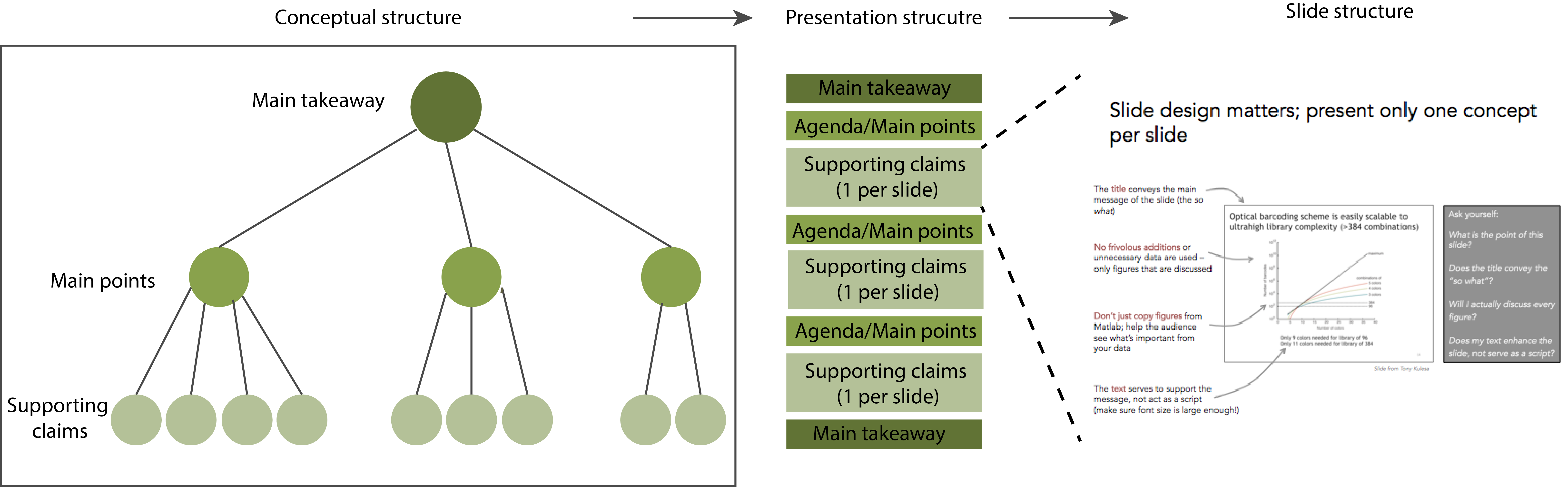
Structure Diagram
As scientists and engineers, we often present work as a story, where we present a problem and then innovative methods developed to address the problem. However, if policy makers do not grasp the relevance of the talk within the first few minutes, their minds may wander to other business or personal issues. You must quickly present the conclusions of your work, along with desired actions, and state how this relates to the problems on their desk.
Only after presenting the take-away message should you begin to present supporting arguments and data. Try to organize all the details of your presentation into 1-3 arguments and group these ideas together to support the take-away message. Each slide should be structured to convey a single message or sub-point (see below).
After major sections, come back to your Agenda slide, highlighting the section to be covered next. If your arguments are presented in a logical order, this will help your audience follow your presentation.
The final slide (or second-to-last slide if the final slide is “Next Steps”) should reiterate the take-away message and look a lot like the first slide.
Analyze your audience
Whether presenting to Congressional staff or Executive branch officials, keep in mind there are likely few, if any, scientists in your audience. Your audience will not have depth in your scientific area of expertise, but they are smart and can learn quickly. Furthermore, policy makers are constantly evaluating new information and requests as they arrive through the day. You may be presenting to an audience that is busy or distracted and you must communicate as effectively as possible in the limited time available.
When possible, learn the background on specific members of the audience. Before any presentation to policy makers, make sure to know what issues they are currently discussing and debating. Try to learn specifics such as their voting record, committee assignments, or past statements on the topic. If possible, learn as much as you can about their agenda, why this topic or presentation is important to them, and whether you expect any pre-conceived biases or opinions.
Skills
Each slide should convey a single point
The purpose of each slide is to convey a message using visual evidence as support. Ask yourself what minimum set of things needs to be shown for the slide to make its point and only include elements that you actually plan to talk about.
To help get your main points across, use strong titles with complete sentences that explicitly state the slide’s main takeaway. Weak titles tend to be nouns like “Background” or “Incidence of cancer.” A strong title might say “Lung cancer incidence is increasing 5% per year.” Ideally, someone should be able to flip through the presentation and understand the argument by just reading slide titles.
If a slide makes multiple points, try one of the following:
- Remove points that don’t come up later in the talk
- Make multiple slides, each with their own message, title, and content
- Make parts of the slide appear and disappear to display different pieces of content that together support the title’s message
Make each slide as simple as possible while still conveying its message
Treat the message you want to communicate as your “signal”. Your goal is to transmit this signal as clearly as possible to your audience. For each message, spend time thinking about the best way to transmit the signal to your audience. For example, text and visual media can deliver identical messages, but with different clarity.
- Tables list information with little context or interpretation. They are best for highlighting individual values or drawing attention to a precise value.
- Figures illustrate conclusions with evidence and are open to interpretation. Figures are better suited for viewing the overall shape of the data.
- Text and speech tell precise statements.
Anything that interferes with communication of your message is “noise”.
Noise from evidence
Don’t drown your audience in data: include only the minimum data necessary to make your point. Including evidence that doesn’t directly support your message distracts from evidence that does. For example, if only three data points matter in a complicated line plot, perhaps you could highlight those three numbers by displaying them in a table instead.
Noise from presentation
The way you present your chosen evidence can also draw attention away from your message. The example below gives a few common techniques for how a slide can be improved to remove noise.
- The title of the slide is changed from a description of the data to a message about the data.
- Legends are moved directly next to the data they describe, so the reader doesn’t have to look back and forth and match colors.
- Color scheme is simplified and changed to draw attention the the relevant portion of data.
- Unnecessary 3D graphics are removed.

Source: Trees, Maps, and Theorems, by Jean-Luc Doumont, page 99
Many other types of noise exist. For example, unnecessary gridlines, axis labels, and color can clutter a figure. Ask yourself what you want your audience to take away from the figure and how you can make it easier for them to locate and focus on the relevant information. The format and style of your presentation should never distract from the content.
(The metaphor of “signal-to-noise ratio” comes from Jean-luc Doumont’s book Trees, Maps, and Theorems.)
Choose figure designs that best communicate your message
Just as words may be better or worse at communicating an idea, different figure designs may be better or worse at communicating your message. In designing a successful figure, consider which media, figure types, and plot types (see below for examples of each) best highlight your message. For complex messages, multiple panels can break down a message into clear statements. Multi-panel figures will likely employ a combination of media and plot types. Use the complementary strengths of each element to communicate your message.
Plot types emphasize different types of data.
What are you trying to show with your data: a correlation, a distribution, an event in time?
| If you’re trying to show… | …try this presentation |
| Overall distribution of data | If possible, show the entire data set |
| Large data set | Histograms, box plots: summarize features of the distribution |
| Events in time
Evolution of a variable |
Line plot |
| Correlations | Scatter plot |
Use simple, consistent formatting
- Use a consistent font and font size: e.g., 24 for slide titles, 16 for text in slide, and 10 for axis labels.
- Make sure all graphics are sized such that all text is readable.
- Simplify data labels by removing generic gridlines and other visual clutter.
- Instead add emphasis to key points only using colors, arrows, or labels.
- All axes on graphs should be labeled and titled and units should be indicated in parentheses, e.g., “Revenues ($M)”. Only use 3-5 tick marks with labels on each axis. These labels should be only numbers, since you have already included units in the axis label.
- Leave white space on your slide. A dense slide is hard to read. A spacious slide will have less information, but your reader will understand more of it.
Additional resources
- CommKit article on general slideshow design
- CommKit article on figure design
- CommKit articles on public speaking
Resources and Annotated Examples
Annotated Example 1
Policy presentation by two MIT Nuclear Science and Engineering professors 4 MB