Table of contents (TOC) or abstract figures are becoming increasingly popular additions to academic journals. Some journals have required them for some time, such as publications by the American Chemical Society. Whether you are new to TOC figures or not, here are some tips for generating TOC graphics to entice and inform!
What is a TOC figure?
TOC figures are small graphics that appear alongside journal article abstracts. Usually, it can be a structure, scheme, drawing, photograph or some combination. During a recent literature review, scrolling through hundreds of review articles on a new topic, I was pleased to see this alternative visual abstract. A great TOC figure could tell me if a paper was relevant with a quick glimpse. Stare at a picture, or read another paragraph? For me, the choice was clear! Unfortunately, not all TOC figures I saw were equally clear…
Show and tell
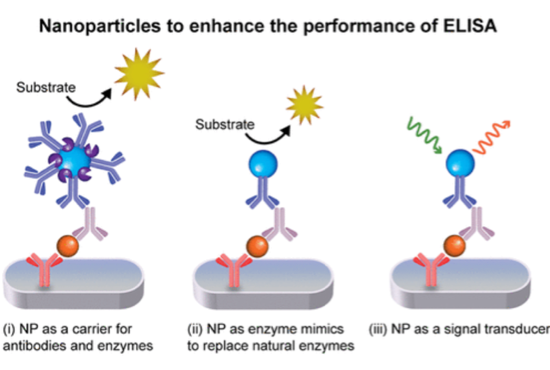
There are general guidelines that apply to all TOC figures. Here’s a graphic[1] published in ACS Appl. Nano Material:

The graphic shows clearly the focus of the paper. It’s brief, easy to read and the little pops of color make it visually appealing. Labels are used sparingly, which keeps the figure simple. Nice.
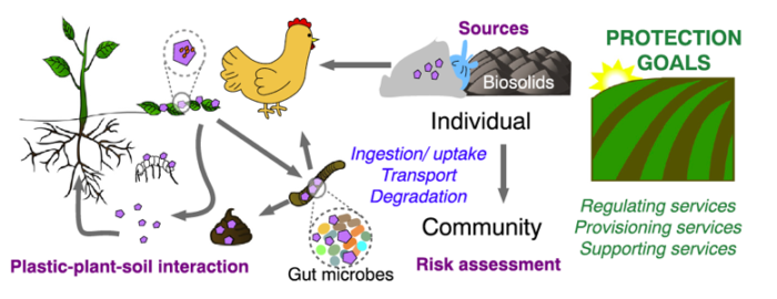
With a limited amount of space, you want to pack the most bang for your buck. Consider this figure[2] from Science of the Total Environment:

What is the most important message conveyed in this figure? What did you notice first? Negative space, color and fonts greatly influence where our attention is drawn. This figure packs a lot of bang for its cluck, but how did this influence your interpretation?
The TOC figure is an opportunity to convey a clear message. Have you ever had multiple people speak to you at once and understand nobody? Formatting allows you to amplify the voice you want to be heard and quiet any others. Judicious use of color and negative space can direct the reader’s attention to what is most meaningful.
Tips for your best TOC figure
- Make a new figure
Although it may be tempting to use a figure already in the paper, try to avoid it. You could modify an existing figure, but take the opportunity to have a balanced graphic that provides a holistic view of your work.
- Keep it simple
Avoid clutter and font sizes that will be too small to read. Too much content can be overwhelming. Convey a message that’s short and sweet.
- …but not too simple
You still want to draw the attention of your readers. Make sure the graphic conveys the focus and result of your work. It may be the only 5 seconds a viewer spends on your paper.
- Ask a friend
Show your TOC to a friend or colleague who may not be familiar with your work. Ask them what they think it’s about or simply to describe what they see. They don’t need to work in your field, and you’ll likely get more insightful feedback if they don’t!
See also: CommKit article on figure design
Blog post by Andrea Lehn
[1] Yuan Gao, Yingzhu Zhou and Rona Chandrawati. “Metal and Metal Oxide Nanoparticles to Enhance the Performance of Enzyme-Linked Immunosorbent Assay (ELISA)” ACS Appl. Nano Mater. (2020), 3,1,1-21. https://doi.org/10.1021/acsanm.9b02003
[2] Ee-Ling Ng, Esperanza Huerta Lwanga, Simon M. Eldridge, Priscilla Johnston, Hang-Wei Hu, Violette Geissen and Deli Chen. “An overview of microplastic and nanoplastic pollution in agroecosystems” Science of the Total Environment 627 (2018) 1377-1388. https://doi.org/10.1016/j.scitotenv.2018.01.341
