Structure diagram
Criteria for Success
- The presentation starts with the motivating problem for the research and why it’s being presented.
- Every slide shows something relevant to the motivating problem.
- Every slide shows no more information than necessary to convey the message.
- Slide titles stand on their own; other text supports the visuals.
- The audience takes away the presenter’s desired message.
Identify Your Message and Purpose
Identify your message and goals as a presenter and use them to organize your presentation. Your message is what you wish to convey to the audience, and is your primary goal. Other goals could include eliciting feedback, receiving a job offer, etc. Use your goals to structure your presentation, making it easier for the audience to follow your logic and identify important points that support your goals.
For example, if your goal is to communicate a new scientific result, focus on the results and broader implications rather than your methodology. Specific methods should take a back seat (e.g. “I measured key material properties,” rather than “I found the thermal decomposition temperature and profile”). Spend more time focusing on what the result means, and how it can be used.
Alternatively, if your goal is to elicit feedback from colleagues on an experimental apparatus, focus more on the experimental methods. Compare the advantages and disadvantages to alternatives. Explain your assumptions, base models and why your proposed experimental design will give more useful results than other designs would.
In less formal settings such as lab meetings, you can explicitly tell your audience what you’re looking for (e.g., “I’d appreciate feedback on my experimental methods”).
Analyze Your Audience
Understanding your audience is of paramount importance for a successful presentation. Highlight how your goals overlap with what audience cares about, so they receive your message. A well-designed presentation will steer the audience’s attention such that you can lead them to the exact point that you want them to take away.
Different audiences have different goals for attending a presentation, and therefore pay attention to different things. For example, at the same talk, an engineer may be interested in using your result to solve their problem, a scientist in the broader scientific advance, a venture capitalist in its impact as a novel product, and clinician about how your device could improve their patients’ care. The introduction of your presentation should speak to the range of backgrounds and experiences in your audience.
That being said, often an audience consists of people with similar backgrounds and interests. Therefore, identify whether jargon is appropriate for an audience, and to what extent. Consider whether other methods, such as images or analogies, are more appropriate to convey concepts that would otherwise rely on jargon.
Skills
Plan Out the Presentation
Presentations are constrained by the fact that they progress linearly in time, unlike a written piece of communication, where the reader may jump forwards and backwards to get at the information they seek. Outline the content of the entire presentation first, then begin to design the slides, rather than jumping straight into them.
Lay out the order in which the content needs to be presented to achieve your goals, such that your message flows from point to point, topic to topic. This order may be very different from the structure of the journal paper you’ve already written.
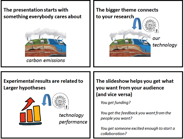
Start by motivating your work with a problem that everyone cares about. Then develop your message step by step, from the background to the final message, so the logic flows clearly.
In many cases (depending on the audience), it might be most appropriate to reveal your conclusions up-front, so that the audience can tie everything else in the presentation back to supporting those conclusions. For instance, technology-focused program managers or engineering sponsors are likely most interested in your results, which will determine whether they are interested enough to pay attention to your process and justification. By contrast, certain scientific communities appreciate being taken through your scientific process to develop their own conclusions before you present yours.
Because the audience cannot immediately see a presentation’s structure like they can with a paper, it is often a good idea to provide a high-level roadmap of the presentation early on. At key points throughout the presentation, remind them of where they are on the roadmap.
Connect Your Work Back to the Broader Motivation
At the beginning of your talk, develop the broader context for your work and lay out the motivating questions you aim to answer. The audience should understand how your answers have an impact on the broader context, and why a solution was not immediately possible without your work.
At the next level down, when showing data and results, make sure it’s clear what they contribute to answering the motivating questions.
Anticipate Questions
If your audience is following along with your presentation, they’ll likely have questions about why you made certain decisions or didn’t make others. Sometimes, the questions could arise from what you’ve said and presented. Other times, they’ll arise from a listener’s knowledge of the field and the problem that you’re working on.
While you design your presentation, think about what kinds of questions may come up, and identify how you will address them. For less formal talks, you can anticipate interruptions to discuss these questions, whereas for more formal talks you should make sure that none of the questions are so big that they’ll preoccupy your listeners. For big questions, decide if you’ll explicitly address them in your talk. For smaller ones, consider adding back-up slides that address the issue.
Remember – while you know all of the information that is coming up in your talk, the audience probably does not. If they develop a question that doesn’t get addressed clearly, they could get distracted from the rest of the points you make.
You can use questions to create strong transitions: “seed” the listener’s thought process with the questions you’re about to answer in an upcoming slide. If a listener develops a question, and then you answer it immediately after, your message will stick much better!
Each Slide Should Convey a Single Point
Keep your message streamlined—make a single point per slide. This gives you control over the pace and logic of the talk and keeps everyone in the audience on the same page. Do not be afraid of white space—it focuses your audience’s attention.
The slide title should identify where you are on your roadmap and what topic the question the slide is answering. In other words, the audience should know exactly where in the presentation and what the slide answers just from the slide title.
Strong Titles Tell a Message
Strong titles highlight where on the roadmap you are, and hint at what question the slide is answering. Weak titles tend to be vague nouns that could be used across many slides or presentations. A rule of thumb is your title should be a clear, single-line phrase illustrating the importance of the slide.
Note that different mechanical engineering fields have different preferences for titles that are phrases versus full sentences. In general, design, system, or product-focused presentations tend to have short titles that only highlight what the speaker is saying, allowing audiences to focus more on the body of the slide, which is usually a figure. In other fields, a strong title might instead be a full sentence that states a message.
| Context in presentation | Weak title | Strong title | Why? |
| Background slide | “Background” | “Background—First Order Linear Stability” | It tells the audience where you are and what concept you are illuminating. |
| Data/Result slide | “New Model” | “A Novel Nonlinear Model” | It indicates you have moved out of background and into your work, and answers the question “how do we model X better?” |
| Conclusions slide | “Conclusions” | Whatever the main conclusion is | You say “In conclusion” with your words, tone, and body language. There’s no need to repeat it. |
Emphasize Visuals
When a new slide is presented, most people will shift their attention from what you’re saying to the slide. People can often interpret figures and listen, but not read text and listen simultaneously. The more words on the slide, the less control you have over your audience’s attention. If you are reading words off the slide, you’ve lost the audience’s attention completely—they’ll just read the slide too.
Use brief statements and keywords to highlight and support the slide’s individual point. Slides are a visual medium, so use them for figures, equations, and as few words as possible to convey the meaning of the slide.
If you have a block of text on your slide, ask yourself what the takeaway message is, and what is the necessary supporting material (data, analysis). Then, identify how text can be reduced to still support your point clearly. Consider…
- Replacing text with figures, tables, or lists.
- Eliminating all but key words and phrases, and speaking the bulk of the text instead.
- Breaking up the slide into multiple slides with more visuals.
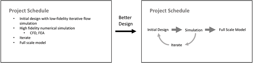
Replace blocks of text with easy-to-read pictures, tables or diagrams.
Left: The original slide provides specific information as text, but makes it easy for both speaker and audience to read directly off the slide, often leading to a distracted audience.
Right: The improved slide conveys the same information with a simple graphic and keywords, conveying the chronology more clearly, and allowing the reader to speak the same information without reading off the slide.
Simplify Figures
The purpose of a figure is to convey a message visually, whether it be supporting evidence or a main point. Your audience usually gives you the benefit of the doubt and assumes that whatever you show in the figure is important for them to understand. If you show too much detail, your audience will get distracted from the important point you want them to gather.
An effective presentation figure is often not one made for a paper. Unlike you scrutinizing your own data or reading an academic paper, your audience doesn’t have a long time to pore over the figure. To maximize its effectiveness, ask yourself what minimum things need to be shown for the figure to make its point. Remove anything that doesn’t illuminate the point to avoid distraction. Simplify data labels, and add emphasis to key parts using colors, arrows, or labels.
Additionally, presentations offer different opportunities than papers do for presenting data. You can use transitions on your slides to sequentially introduce new pieces of information to your slide, such as adding data to a plot, highlighting different parts of an experiment (or equation), or introducing text concepts as bullets.
Simplify data, simplify labels for emphasis.
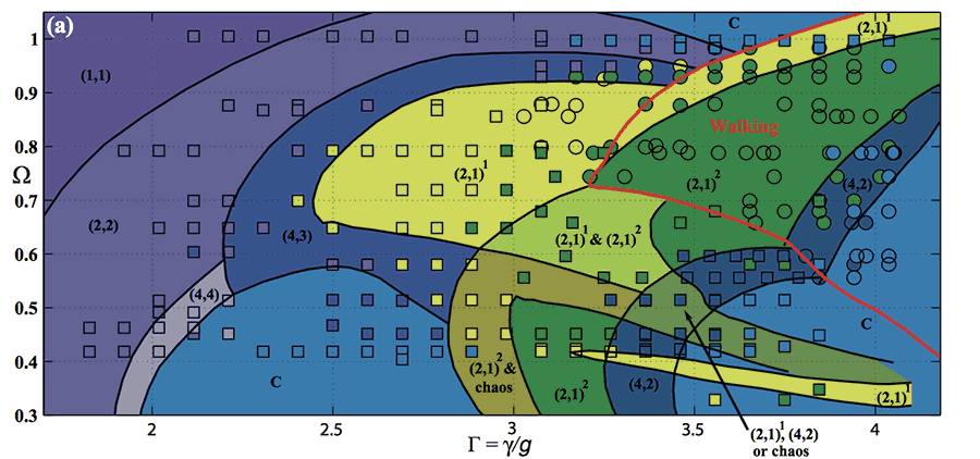
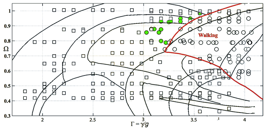
Top: Academic referees and peers would prefer to see the complete theoretical model and experimental data (top), so they can interpret it for themselves. In addition, in papers, space is limited, while time to digest is not.
Bottom: But in a presentation, simplifying the data makes it easy to focus on the feature of interests for the presentation, or even at that moment (different regions may be highlighted from slide to slide). Slides provide plenty of space, while time is at a premium. [Adapted from Wind-Willassen et al., Phys. Fluids 25, 082002 (2013); doi:10.1063/1.4817612]
Introduce Your Data
Make sure your audience will be able to understand your data before you show it. They should know what the axes will be, what points in the plot generally represents, and what pattern or signal they’re looking for. If you’re showing a figure common to a specific audience, you may not need to explain as much. But if you show the data before the audience knows how to read it, they’ll stop listening to you, and instead scrutinize the figure, hoping that a knitted brow will help them understand.
If you are worried your audience won’t understand your data, one approach is to show sketches of what the data would should like if your hypothesis were true or false. Then show your real data.
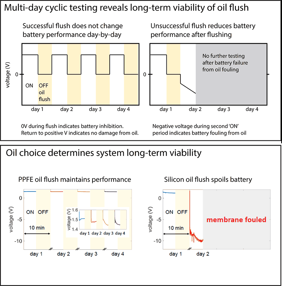
For an audience unfamiliar with cyclic battery testing as a way to measure corrosion, first show a slide explaining how the electrical signal would appear without corrosion (top) before showing the slide with the actual data (bottom). Use parallel design across the explanation and data slides. This way, the audience is introduced to the logic of the experiments and how to draw conclusions from the data, making them more likely to follow and agree with the point made on the second slide. [Adapted from AAE2]
Be Critical of Visual and Textual Jargon
If there are discipline-accepted symbols, for example in fluid or electrical schematics, using them is an effective tool to simplify your visual for people in your field. However, if these may be unknown to a significant portion of your audience, be sure to add a descriptive keyword, label or legend.
Use simple, consistent visual design
A clean set of slides will minimize visual noise, focus the audience’s attention and improve the continuity between what you’re showing and telling. The graphical design is also important for setting the tone and professionalism of the presentation.
- Be consistent with your slide design—font styles and sizes, figure sizes, margins, colors.
- Are colors related to each other? Do some carry intrinsic meaning (e.g. blue = cold, water, red = hot)?
- Are you using colors that are well-represented when projected?
- Are your color choices appropriate for colorblind members of the audience? Can you textures or line/point styles to differentiate data instead?
- Spread out elements on a slide to use space effectively—don’t be afraid of white space! By limiting the amount of information on a slide, you can control what your audience will focus on at each moment in time.
- Use your software’s alignment and centering features.
- When items are grouped as a list, make sure they actually belong under a helpful unifying theme.
- Make sure all text and figures are legible to the back of the room.
Resources and Annotated Examples
Annotated Example 1
This is a technical presentation given by MechE graduate students for a system design class. 13 MB
Annotated Example 2
This presentation was given by a MechE PhD student during interviews for postdoc positions. 1 MB