
Criteria for Success
- Your figure leaves the audience with a clear, one-sentence main message
- You provide evidence that directly supports the main message
- Any content not related to your main message is removed from the figure
Structure Diagram
An effective figure is the successful convergence of the message and data
Purpose
Figures are any visual presentation of your results and they come in a variety of forms. Graphs, diagrams, photos, drawings, schematics, and maps are all types of figures. Despite this variety, the purpose of all figures is the same – to provide evidence to support your message.
Your message is the reason you want to show people your data! A good figure will show your audience your data AND communicate the message you have learned by interpreting that data.
Analyze Your Audience
An accurate analysis of your audience enables you to convincingly deliver your message. Ask yourself who will be viewing this figure and whether they are specialists or a more general audience. Depending on the answer, you will want to tailor the complexity of your message and its supporting evidence.
For example, if your figure is for publication in a field-specific journal, your audience will likely have a great deal of background knowledge about your topic. In this case, you can deliver a very specific message (e.g., “RTK ligands attenuate kinase inhibition in oncogene-addicted cancer cell lines” Source: Wilson et al., Nature, 2012) and provide detailed evidence (e.g., flow cytometry data). Insufficient or excessively simplified evidence will result in skepticism about your message.
If your figure will be used in a presentation for a high school outreach program, your audience will have a very different set of background knowledge. Here, you should alter the message (e.g., “Cancer cells can exhibit resistance to therapies”) to make it more interpretable. This can be achieved by presenting evidence that’s less complex (e.g., number of immune cells). Giving a general audience too many details will be overwhelming; they won’t be able to distinguish the evidence that supports your main message from all the other details.
Take-away message—provide technical audiences with detailed evidence to avoid skepticism; provide general audiences with fewer details to avoid confusion.
Analyze Your Visual Platform
Will you be presenting your figure in an academic paper, a poster presentation, an oral presentation? The final format dictates how your audience will interact with the figure, and how much support or explanation you will be able to provide.
| Visual platform | Static or dynamic? | What information goes where? |
| Paper | Static |
|
| Poster | Static |
|
| Slides | Dynamic (can be animated) |
|
Skills
Choose figure designs that best communicate your message
Just as particular words may more or less effectively communicate an idea, your choices in designing your figure are critical for effectively conveying your message. In designing a successful figure, consider your audience, your message, how much detail you want to convey, and how best to highlight your message.
For complex messages, multiple panels can break down a message into clear statements. Multi-panel figures will likely employ a combination of media and plot types. Use the complementary strengths of each element to communicate your message.
What is your message? What is the best way to present your message?
Choosing how to guide your audience through your data is critical for convincing your audience of the validity of your message and keeping your audience engaged:
- Text and speech tell precise statements.
- Tables list information with little context or interpretation.
- Figures illustrate conclusions with evidence and are open to interpretation.
Your goal should be to present your data such that your audience reaches the same interpretation that you did. As an example, compare the table, bar graph, and line chart below. While all contain the same data, the figures suggest an interpretation and highlight trends that are not immediately evident in the table.

Your decision to use a specific type of media depends on the message that you want to communicate.
Referring to the data above, if you want the reader to know that “Gene B has the highest expression”, a bar graph representing data at the 2 hr time point would most clearly convey your message (A). However, if you want to convey a dynamic response over time, the line graph most effectively does this (B). If you want the reader to know what the specific values of each gene were at different times, the table is an effective way to communicate this information (C).
The text/speech that corresponds with the figure is important as well. For example, presenting the line graph and stating “Gene B has the highest expression,” presents one specific interpretation and makes it clear to your reader/listener that maximum expression matters more here than, say, average expression. It also allows the reader, while looking at the line graph, to see the whole picture and draw her own interpretations.
What is the best type of figure for your data?
The choice of plot for presenting data depends on what you are trying to show in your data. Are you trying to represent a correlation, a distribution, an event in time? Your choice of chart will be determined by your overall message.
| Trying to show… | Recommended presentation |
| Overall distribution of data | If possible, show the entire data set |
| Large data set | Histograms, box plots: summarize features of the distribution |
| Events in time
Evolution of a variable |
Line plot |
| Correlations | Scatter plot |
| Comparison of two+ conditions | Bar chart |
With a distribution, using a summary of your data (i.e. mean and standard deviation) can obscure interesting information about your data. For example, the four datasets below have the exact same mean and similar standard deviations. This is Anscombe’s quartet, a group of datasets which are used to demonstrate the importance of graphing individual data points before deriving conclusions from descriptive statistics, such as the mean and standard deviation.
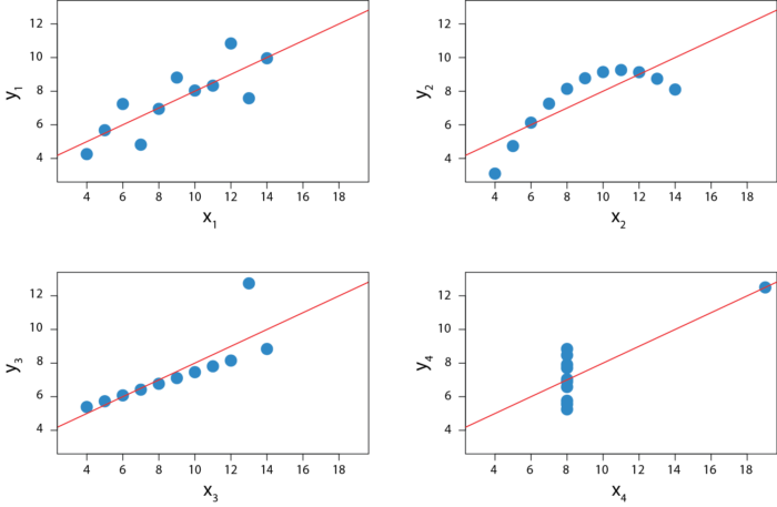
Source: Adapted from Anscombe’s Quartet illustration from Wikimedia Commons user Schutz under the CC BY-SA 3.0 license.
What level of detail are you trying to convey?
Sometimes you will find that you want to convey a general message or theme through your figures. At other times, you want your reader to look at data that you collected. The specificity of your message will determine the level of detail you want to include in your figure.
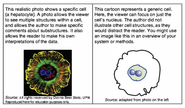
- Photos portray the subject exactly, providing concrete evidence.
- Illustrations relax precision to draw attention to a chosen theme or element.
- Graphs display processes, quantities, or comparisons.
Maximize your signal-to-noise ratio
Treat the message you want to communicate as your “signal.” Your goal is to transmit this signal as clearly as possible to your audience. Anything that interferes with communication of your message is “noise.” We’ve discussed ways to increase your signal by optimizing figure design. Here we will talk about strategies for minimizing noise.
Noise from evidence
Don’t drown your audience in data: include only the minimum data necessary to make your point. Also, including evidence that doesn’t directly support your message distracts from evidence that does.
Noise from presentation
The way you present your chosen evidence can also draw attention away from your message. Using the figure below, we’ll give a few common examples of how a figure can be improved to remove noise.
- The title of the figure is changed from a description of the data to a message about the data.
- Legends are moved directly next to the data they describe, so the reader doesn’t have to look back and forth and match colors.
- Color scheme is simplified and changed to draw attention to the relevant portion of data.
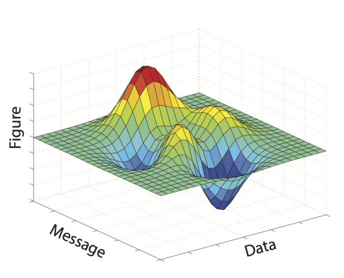
- Unnecessary 3D graphics are removed.

Source: Trees, Maps, and Theorems, by Jean-Luc Doumont, page 99
Many other types of noise exist. For example, unnecessary gridlines or axis labels can clutter a figure. Ask yourself what you want your audience to take away from the figure, and how you can make it easier for them to locate and focus on the relevant information.
(The metaphor of “signal-to-noise ratio” comes from Jean-luc Doumont’s book Trees, Maps, and Theorems.)
Resources for advanced figure design
Many great resources for styling visual communications and data already exist. One to definitely check out is this collection of articles by Bang Wong, Martin Krzywinski, and colleagues. Here, you’ll find detailed discussions and examples of:
- Visual design principles and their relationship with clarity
- The use of color
- How to style figure elements
- The strengths and weaknesses of specific plot types
- Best practices for visualizing multi-dimensional data
- The use of figures to explore data
This content was adapted from from an article originally created by the MIT Biological Engineering Communication Lab.
Resources and Annotated Examples
Annotated Example 1
Varying degrees of specificity within the same figure 663 KB
Annotated Example 2
Clear parallels between messages between mediums 887 KB