
Strategies scientists can use when creating graphics for a broader audience
By Craig McLean, Yerri Portillo, Tianna Rivera, Tui Calvette, and Christine Lopez
Craig McLean is a Communication Fellow in the MIT Civil and Environmental Engineering Communication Lab. All of the authors are members of the Unofficial Committee: a collective of artists and scientists who work on community advocacy and education.
As the old saying goes, “Numbers don’t lie.” For journalists, scientists, and designers, these numbers come from data. Data visualizations serve to legitimize claims and have become ubiquitous: flip through a recent issue of the New York Times or the Economist and you’ll find colorful and intricate graphics reminiscent of paper figures. If you are reading this post, you might be familiar with the challenges involved in data visualization.
How then, exactly, do designers and journalists make figures targeted to non-academic audiences-an audience with less patience and training for interpreting data?
Designers think very carefully about both aesthetics and language, working not to only transmit the information as clearly as possible, but also to relay the gravity of the message described by the data. When dealing with a general audience, it’s the designer’s responsibility to ensure that the visualizations used inform instead of incite panic, and encourage discussion rather than mislead. Through our work as part of the Unofficial Committee, a collective of artists and scientists striving to inform and empower others, we often find ourselves wrestling with ideas about how to present complex data in a clear and coherent way.
This blog post addresses those ideas in two parts. First, we’ll provide an example of how design can sway the interpretation of data. Next, we’ll provide a step-by-step walkthrough of how we can apply design principles to timely data.
Part 1: Design choices influence the perception of data.
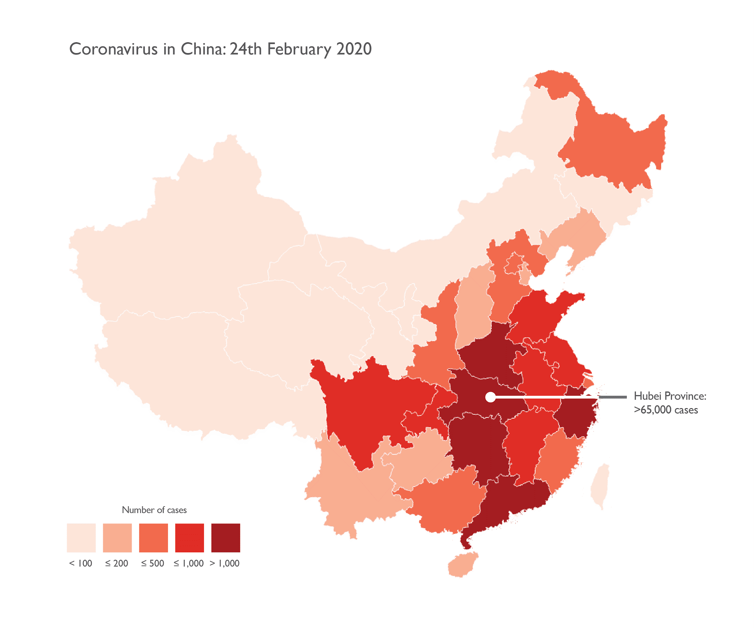
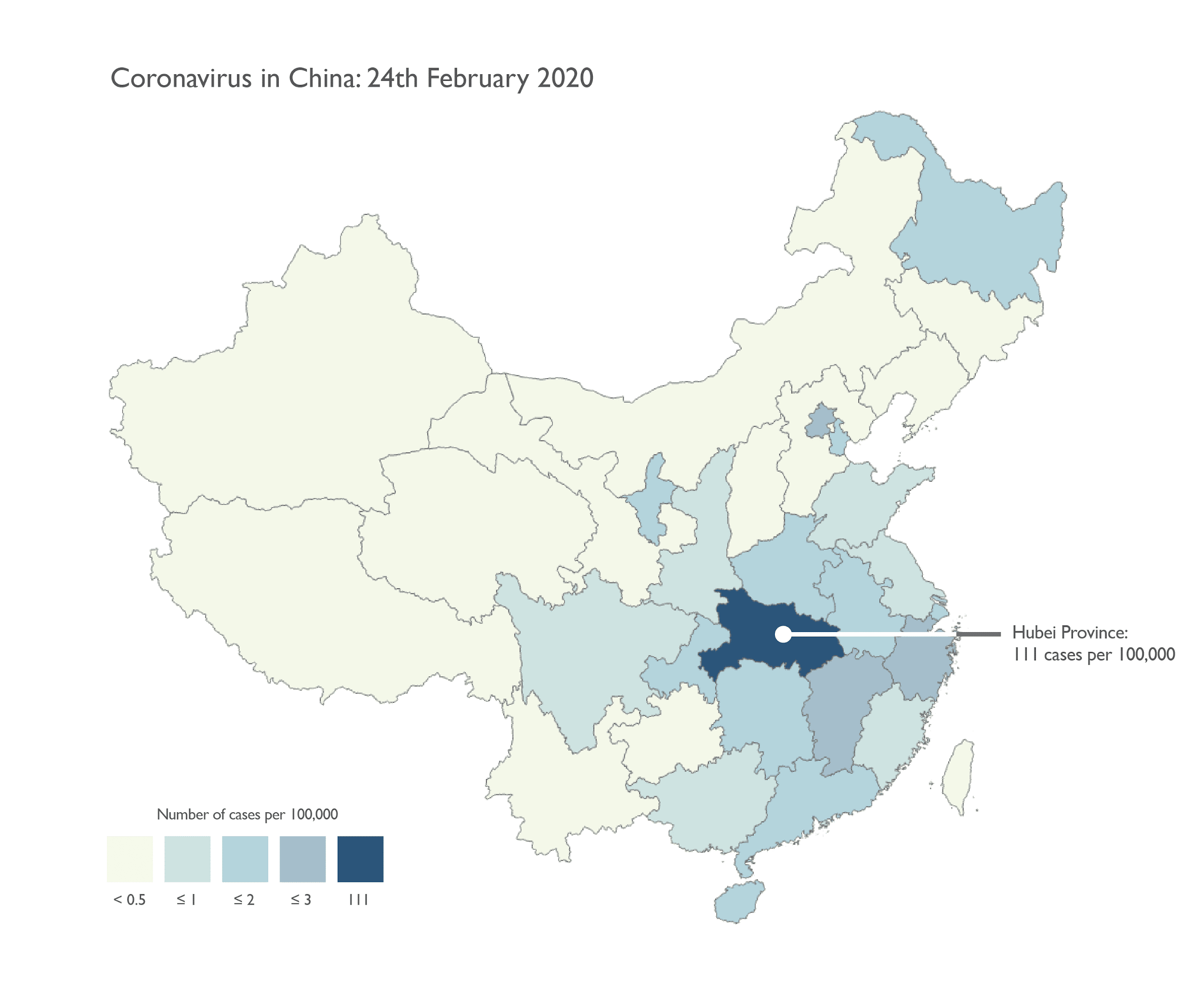
The COVID-19 crisis has provided a wealth of examples of responsible data visualizations within the media. A recent favorite of ours comes from the blogpost “Mapping coronavirus responsibly” by Kenneth Field (see below). These visualizations showcase COVID-19 counts across China on February 24, 2020. Two figures were created with the same dataset, but their aesthetic choices provide readers with different pictures of the underlying data. Can you guess which one of the two is less deceptive? (You can click to see them full-size.)
 |
 |
If you guessed that the blue version was more reliable, you’re right:
Color
Color impacts our perception of objects: red conveys urgency and alarm, while blue conveys a sense of calm and trust. In the already stressful context of COVID-19, the blue version allows viewers to evaluate the data more neutrally. For more on the emotional effects of color perception, check out this link.
Scale
Inspecting the COVID-19 counts in the red figure reveals that the case number in Hubei province (>65,000) is several times greater than the next most highly infected province (>2,000) – yet they have the same color. The numerical scale here stops at 1000, giving the impression that five provinces share similar counts to Hubei. On the other hand, the blue figure uses a more sensitive scale, allowing us to see how Hubei stands out.
Presentation
Showing count data on choropleth maps (maps showing data distributions over predefined areas), as is done on the red figure, can deceive observers. The provinces on the maps clearly have distinct areas, and most likely have distinct population sizes. It is unclear if the reason a region has more cases is due to increased infection or increased population. To make fair comparisons between regions, the designer must normalize the counts by population, as is done in the blue plot.
The plots above are just one example of how design can alter the perception of the underlying message in data. For more examples of misleading design, check out Juliana Castro’s page, “Design is lying to you.”
Part 2: Thoughtful design can help diverse audiences understand data.
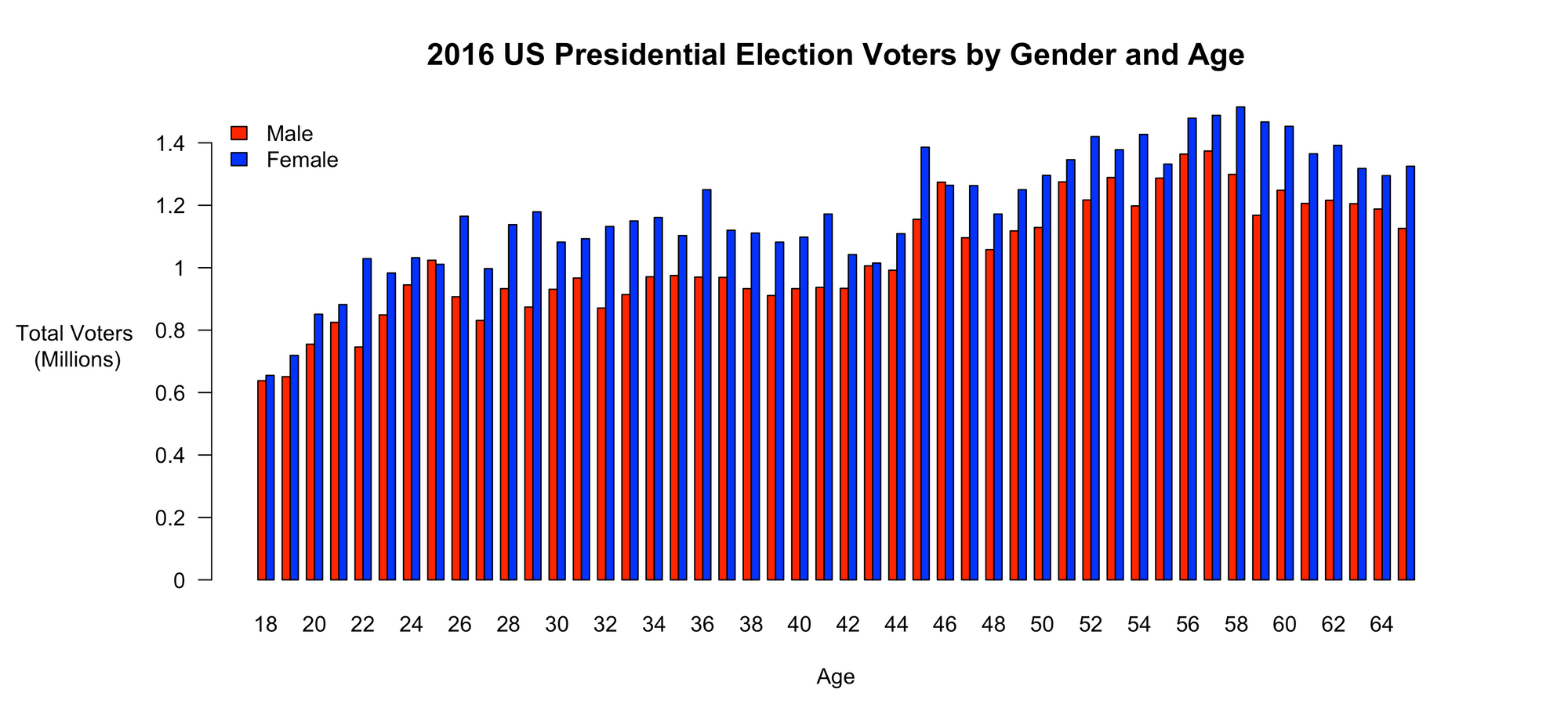
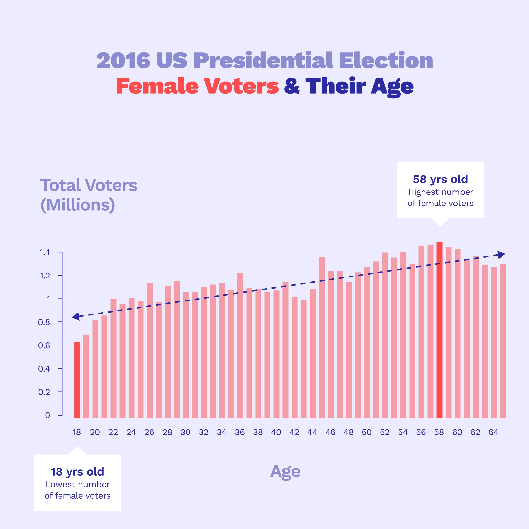
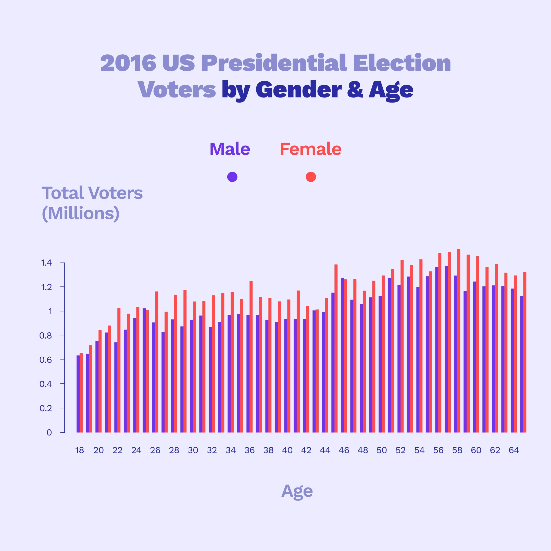
Next, we’d like to take you through an example of our design process. This visualization was created as part of an Instagram campaign to motivate young people to register to vote. We designed our graphics for a non-technical audience of all ages, with an attention span of 15 seconds or less. These visualizations were meant to showcase the difference in voting in the 2016 election by gender and age.
| Before | After |
 |
 |
1. Choose a plot type that can be understood by someone without technical training.
We gathered data from the 2016 US Census Bureau to make our initial figure. The data shows the counts of people who voted across age and gender. We chose to use bar graphs because they are a familiar and easy way to showcase data holistically.
2. Color can distinguish data elements and highlight the post.
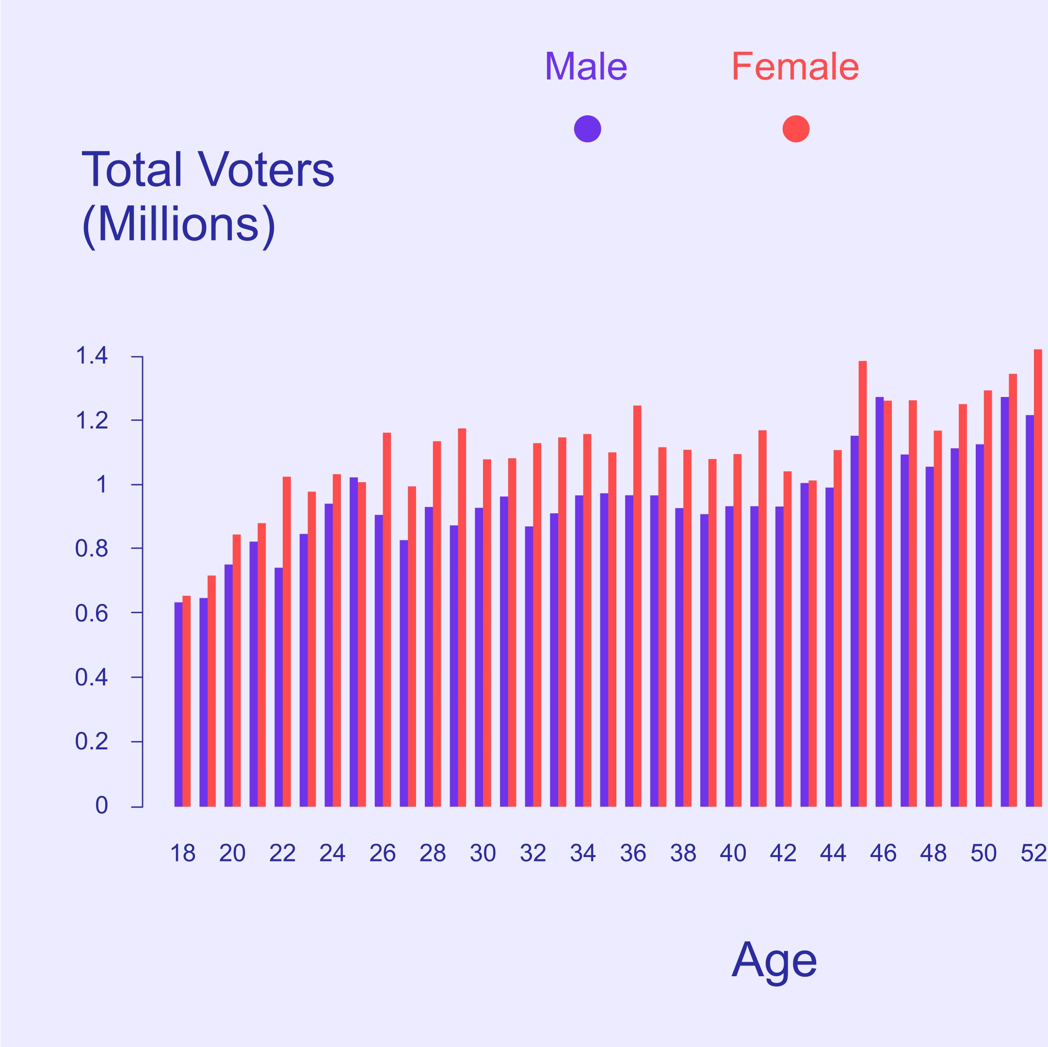
Color changes can inform viewers about the underlying structure within data. Here, we swapped the colors to use typical gender color-coding. We also removed unnecessary colors like the black outlines on the bars. Finally, we changed the background color from white to a color that would make the post stand out from Instagram’s white background.
3. Typeface can help you connect with your audience.
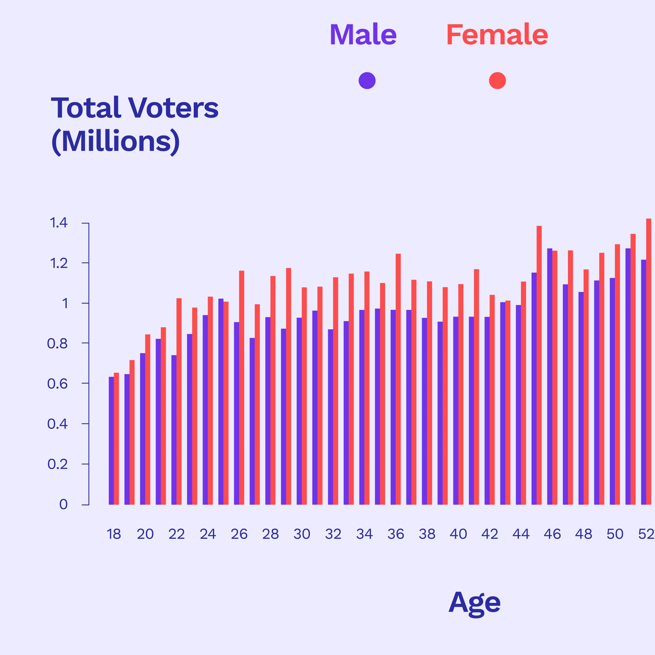
TL;DR: Please think again before using Arial.
Typefaces have a big impact on the psychology of the audience. You can find more info on the topic here. We chose Work Sans to provide a friendlier feeling over the less-personal default typeface of Arial.
4. Hierarchy can help guide readers through your intended narrative.
 |
 |
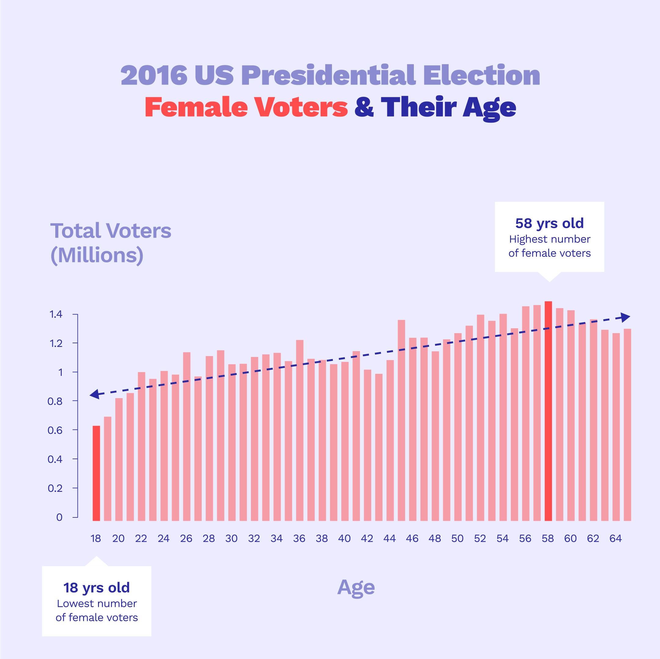 |
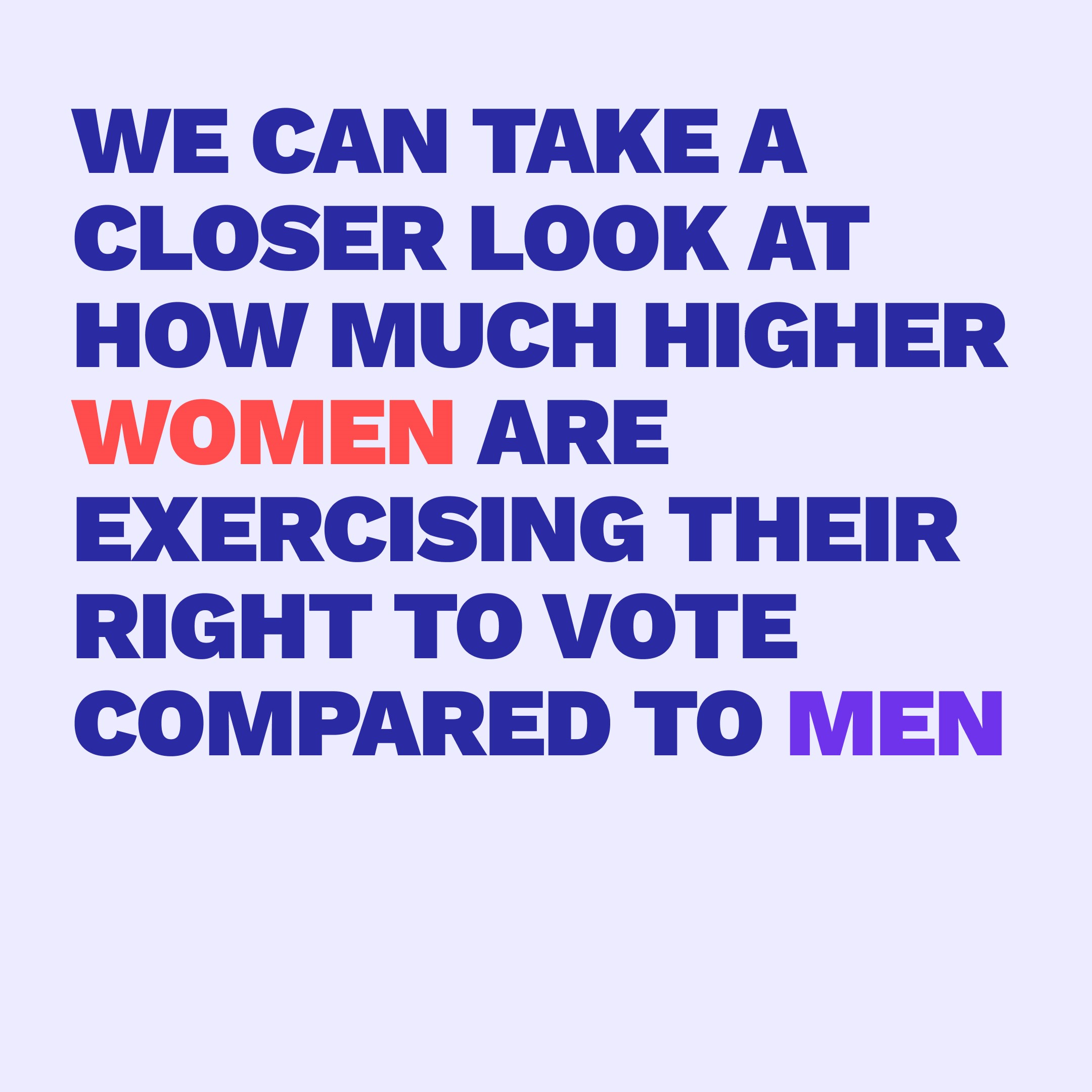
Hierarchy refers to the order in which elements are presented to the user. Given the challenge of presenting our information to our users in 15 seconds or fewer, we divided our content into separate sections:
- Introducing the topic behind the data
- Showcasing the data in its entirety
- Highlighting a specific point comparing different age groups of female data.
|
Sum-up
We hope this post has made you more aware of how small but intentional improvements help readers interpret data visualizations more easily and clearly. The concepts presented here barely scratch the surface of what is possible.
Consider reaching out to designers next time you need to make a figure. Just like scientists, designers strive to exchange information clearly and accurately. We at the Unofficial Committee and (if you’re an MIT affiliate) the MIT Communication Lab are happy to talk! Additionally, Boston is full of talented students, practicing artists, and organizations like the American Institute of Graphic Arts (AIGA).
Resources
- Unofficial Committee – Learn more about us and send us questions or suggestions.
- Unofficial Committee Instagram – See some of our other work, or slide into our DM’s.
- American Institute of Graphic Arts, Boston – Meet local designers through Boston’s AIGA.
- The Science of Colors in Design – Learn more about the effects of color on perception.
How Typography Affects Readers – Check this link out for non-Arial fonts. - Design is lying to you – More examples of misleading design
- Mapping coronavirus responsibly – Great blog post about visualizing geographic data
Read the rest of the Communication Lab’s COVID-19 blog series
- How to Be Clear When Nothing Else Is, pt. I: Communicating Science During a Pandemic, by Sarah Schwartz
- How to Be Clear When Nothing Else Is, pt. II: Reading Responsibly During a Pandemic, by Sarah Schwartz
- Let’s Not Make it Viral! Help Flatten the Curve of Misinformation, by Eugenia Inda
- When Science Doesn’t Have All the Answers: Demarcating science in the midst of the COVID-19 crisis, by Maria Eugenia Inda