Scientific figures do not equally suit all contexts. A figure designed for a paper will often be information-dense; multiple panels illustrate multiple ideas, multiple axes and color bars show the impact of numerous variables, annotations highlight specific caveats, and an extensive caption explains the whole thing. This can work well where a figure demonstrates the conclusions of a full page of tightly edited text, and where a reader has plenty of time to read through the caption and think things through.
However, figures like this rarely work well for presentations. When you show an audience a highly detailed figure, they immediately jump to trying to understand it, and due to that change in focus, there’s a good chance they just stopped listening to you talk. Instead of copying a figure straight from a paper into my presentation, I try to rethink how I can show the data to most effectively tell an engaging story.
This post features several examples of ways you can make figures that are better suited to use in a presentation. This includes redesigning your own figures and modifying figures made by others. All figures taken from the literature are reproduced under Fair Use.
Example 1: Redesigning your own paper figures
Pictured here is a figure I made for a recent publication (Barber et al., ES&T, 2023). This shows the modeled indoor air quality parameters under fifty-six different modeled scenarios. While this figure is quite information-dense, this format allows a reader to identify expected indoor concentrations for a specific ventilation rate and UV fluence rate that might be relevant to their own indoor space. It is, however, way too much to try to show on one slide during a presentation.
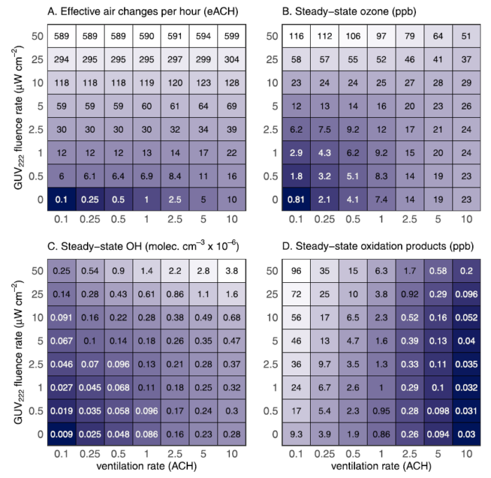
A useful way to restructure this is to decide exactly which information from the figure is important to your presentation’s story… and throw the rest away. Any excess information which you don’t talk about will only serve to distract your audience. In this example, the exact values of the numbers labeling each grid box are pretty irrelevant to the presentation audience. I also only want to talk about the ozone panel, and don’t feel that such a wide range of ventilation rates is necessary to show. Here, I’ve taken the same data and replotted it as a series of four lines.
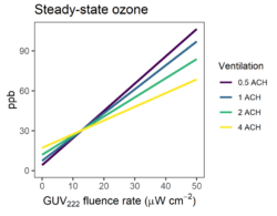
This shifts information that was previously conveyed using text to a graphical format while eliminating a lot of extraneous data. The fonts are also larger to make sure they can be read at the back of the room. By focusing on only one plot and rethinking how to format the key data, it’s a lot easier to explain the results to the audience.
Example 2: Modifying someone else’s figure
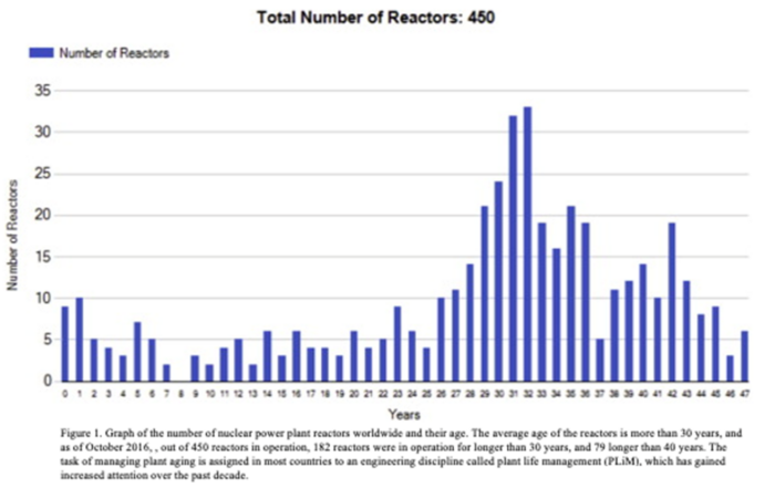
Figures from the literature can provide useful context in the introduction of a presentation or when comparing your own results to previous work. However, these figures may not always be up to snuff. Consider this figure from Krivanek and Fiedler, Nucl. Eng. Des., 2017. It’s a bit blurry and the font is very small and hard to read.
By covering parts of the figure with text boxes to rewrite the axes, this becomes more legible for those in the back of the room. I’ve also added an arrow to visually demonstrate that nearly half of the reactors are more than 30 years old, something that was previously only noted in the caption. Just make sure to cite the new figure appropriately (e.g. “modified from Krivanek and Fiedler, 2017”), so your audience knows that you adapted or modified an existing figure.
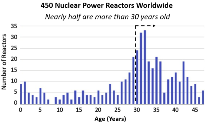
You can even take this to the next level by scraping figure data to reproduce the figure as you wish. By using a free software such as Ankit Rohatgi’s webplotdigitizer, it’s easy to extract data so that you can replot it as you wish. Here, I’ve remade the figure, grouping the data by decade to make it a little simpler, and recoloring it to fit my presentation’s color scheme.
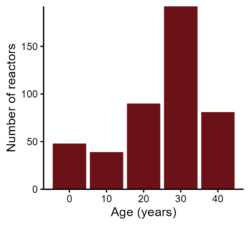
Just make sure to adjust your citation appropriately (e.g. “data from Krivanek & Fiedler, 2017, figure 1”) and consider citing the software tool.
Example 3: Selecting only the relevant part of a literature figure
Finally, let’s consider this figure from Veres et al., PNAS, 2020. It contains a ton of information about hydroperoxymethyl thioformate (HPMTF) concentrations measured above the oceans.
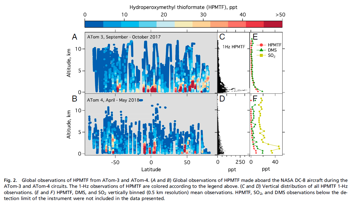
But perhaps I just want to use this figure in my hypothetical presentation to show that HPMTF and dimethyl sulfide (DMS) concentrations are highest near the surface. There’s a lot of information here that I don’t need. Luckily, panel E contains everything I want to talk about!
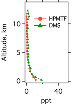
Here, I’ve simply cropped the original figure in powerpoint, lined up cropped axes labels, and covered up the panel label and the unused SO2 legend entry with white rectangles. With only a couple minutes of work, I’ve created a much simpler figure that will be far more legible to a presentation audience. As always, make sure to cite the figure appropriately (e.g. “modified from Veres et al., 2020”).
Hopefully these examples demonstrate ways in which you can improve your presentation figures to highlight your specific message without distracting the audience with overwhelming details. Redesigning figures may take a bit of extra work, and it can be challenging to take a step back and reevaluate your own prior figure designs, but I hope you’ll agree that the results are worth it.
If you want some hands-on help with redesigning figures for presentations and you’re a member of the MIT community, you can always make a Comm Lab appointment, and we can go through it together!
Additional resources
Check out the full collection of free CommKit Resources created by the MIT CEE Comm Lab team.