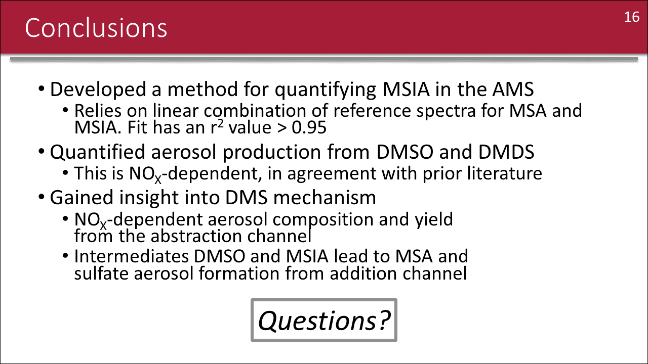
Have you seen a conclusion slide that looks like this? At conferences, such walls of text are often the cue for the audience to take out their phones and check their email as the presenter hurries through a summary of their findings.
In the slide shown below, I’ve provided an example of a wall-of-text conclusion by modifying a concluding slide from one of my talks.
It doesn’t have to be this way! Thanks to a tip from MIT postdoc Hannah Kenagy, I’ve started to incorporate miniature figures into conclusion slides as a way to link concluding statements to the detailed analysis that I’ve already discussed.
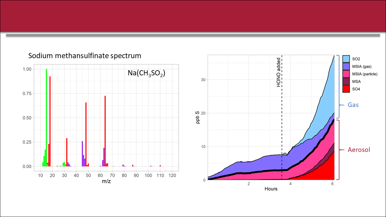
Earlier in this example presentation, I featured several key figures which informed the conclusions of the study. While the details of these figures are unimportant for the purposes of this blog post, I’ve copied them here for context.
By simply exporting these figures at a much smaller size, removing extra labels, and simplifying axes, these figures can quickly be transformed into graphical icons that remind the audience of the earlier detailed discussion. When these miniature figures are combined with simplified text and a few animations to help steer the audience, the concluding slide becomes more engaging and maintains a visual link with the underlying research methods and data.
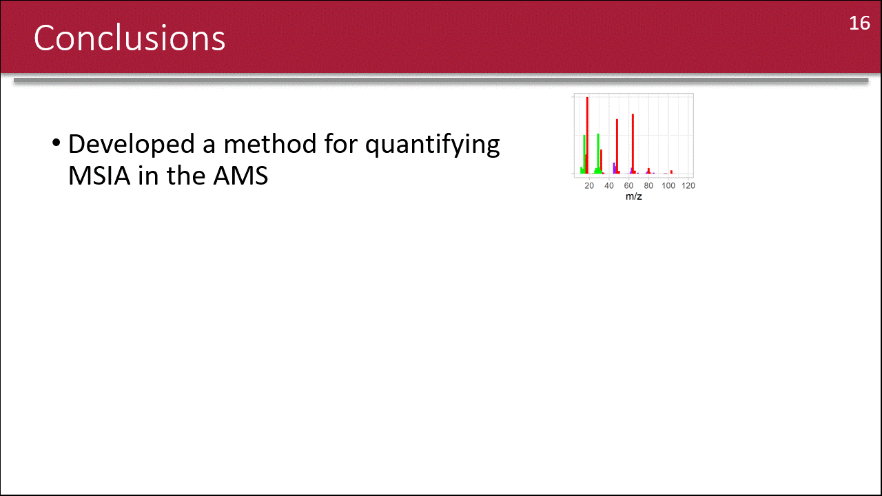
When I’ve used miniature figures in concluding slides, I’ve found that these visuals can facilitate discussion following my talk. When I see concluding slides like this as an audience member, I find myself more consistently engaged with the topic and more eager to ask questions. I hope you give this technique a try in your own work!
If you want some hands-on help with creating miniature figures for presentations and you’re a member of the MIT community, you can always make a Comm Lab appointment, and we can go through it together!
Additional resources
Check out the full collection of free CommKit Resources created by the MIT CEE Comm Lab team.