1. Introduction
Whether at a technical conference, departmental showcase, or public outreach event, the purpose of a poster is to communicate your research quickly, clearly, and effectively. Posters are unique in that they are a form of communication that sits somewhere between a paper and a presentation, but require far less engagement time. With limited space and visual attention spans, you must distill your work down to its core message and highlight what truly matters. This process not only makes your research more approachable to a wide range of audiences, but it also helps sharpen your own understanding of your work and the value that it offers. A successful poster should do more than present information. It should spark curiosity, encourage questions, and open the door to valuable feedback and discussion.
This CommKit will walk you through best practices for designing and presenting academic posters so that your work does not just sit on the wall but stands out, communicates clearly, and invites meaningful engagement.
2. Criteria for Success
- Communicate the main message at a glance
Ensure that the key takeaway of your research is immediately apparent, even to someone quickly scanning the poster. - Use impactful visuals and limit text
Prioritize well-designed, intuitive figures and diagrams that illustrate your findings. Use minimal text to support visuals and avoid crowding the poster. - Design for readability and visual hierarchy
Use clear headings and logical layout to guide the viewer’s eye. Important points should be easy to locate and understand. - Prepare and practice a 20–30 second elevator pitch
Be ready to engage passersby with a concise, enthusiastic summary of your work that can invite further conversation.
3. Analyze Your Audience
Are you presenting at a technical conference where most attendees are experts in your field? Are you showcasing your work at the Master’s Thesis Showcase, where viewers might include faculty, graduate students, and undergraduates from within your department? Or is your poster intended for a general audience, with little to no background knowledge of your topic?
Understanding your audience shapes how you communicate your work. It influences what information you include or highlight, how much technical detail you build in, and the structure and language of your main message. Tailoring your poster to your audience ensures that your message is accessible and engaging. For example, a highly technical poster filled with jargon may resonate with specialists but could alienate or confuse a more general or interdisciplinary audience. In contrast, when presenting to a broader group, providing clear background context and framing your findings at a high level within a big-picture narrative will make your poster more inviting and easier to understand.
By designing with your audience in mind you not only make your work more approachable, you also increase the likelihood that people will stop, read, understand, and remember your main message.
Here are some modifications that can be made depending on your audience:
| Poster Component | Experts in your topic | Researchers in your field | Researchers outside your field | General audience |
|---|---|---|---|---|
| Visuals | Data-rich plots, technical diagrams | Data-rich plots, technical diagrams with moderate details, additional annotation for interpretation | Use simpler plots and diagrams that are clearly annotated to provide context and highlight the main idea(s) | Use simple, visually engaging graphics that help tell a story, minimal plots, use icons, infographics, or illustrations |
| Text | Technical language and jargon is limited and only used where absolutely necessary, assume shared knowledge and focus on novel contributions | None to minimal jargon, define key terms, highlight relevance of your work to the broader field | Avoid any jargon, emphasize big-picture insights to tell a story | Use plain language and no jargon, use analogies to tell a story building up to your main takeaways |
| Dialogue | Be prepared to dive deep into your methodology and answer challenging technical questions | Explain your methodology and assumptions, be prepared for technical questions | Explain your methodology and assumptions at a high level and simplify complex concepts | Use metaphors and real-world parallels to explain your topic, highlight the impact and motivation |
4. Context
Because posters are a highly versatile form of communication, they can be used in a wide range of settings. However, the physical environment and presentation format in which your poster will be displayed can significantly influence how it should be designed.
As you are preparing your poster, consider the following questions:
- How will the audience move through the space? Will they pause to engage, or just pass by?
- How much physical space will you have for your display?
- From what distance will people be viewing your poster?
- What are the expected noise levels?
- Will you be physically present to walk people through your poster, or will it need to stand alone?
- How much time will people have to look at your poster?
Reflecting on these environmental factors will help you tailor your poster and corresponding talking points for maximum effectiveness. For instance, in a large, open conference hall, a bold, prominent title and a visually striking figure can draw attention from several feet away. The amount of physical space available also influences your poster’s size and layout. In tighter spaces, a smaller poster may be necessary, so it is important to prioritize content and avoid overcrowding. Be sure to position key information at eye level, as placing important content too low may make it difficult for viewers to see, especially if you are located in cramped or crowded settings.
Another key consideration is whether you will be present to explain your poster. If not, design it to function as a self-contained narrative. Use clear section headings, logical flow, and concise explanations. Including a QR code that links to your website, paper, or contact information can be a great way to provide viewers with a way to learn more or follow-up.
By designing with your presentation context in mind, you not only improve the accessibility and clarity of your poster, you will also increase its overall impact and engagement with your audience.
5. Structure Diagram
When designing your poster, prioritize figures and visuals over dense blocks of text. A poster is meant to visually communicate your work at a glance—images, charts, and diagrams are far more effective than paragraphs when it comes to grabbing attention from passerby and conveying key messages quickly.
While the exact layout and figure-to-text ratio may vary depending on your personal style, audience, and presentation context, a good general rule is to let visuals do the heavy lifting. This not only makes your poster more approachable but also encourages viewers to engage with your work rather than feel overwhelmed by reading.
Use the following as a starting point and make note of the text-to-figure division of space. Keep in mind that this is just one example and although there are general rules of thumb as discussed above, you should use a template that works best with your specific content and session requirements:
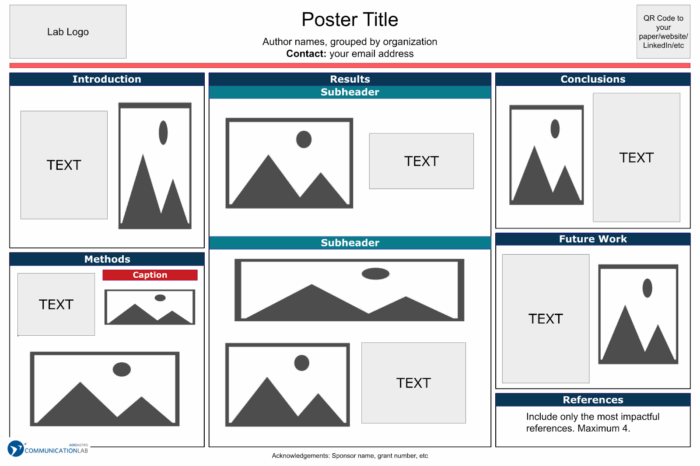
Figure 1. Example poster layout.
Diagram adapted from an AeroAstro Comm Lab poster template.
Here are some additional example templates from the AeroAstro Comm Lab that are tailored for presenting academic research:
Poster Example 1
Poster Example 2
Also check out this additional resource from the Biological Engineering Comm Lab on the “#evenbetterposter template”
6. Best Practices
6.1. Create a clear and compelling title
Your title is often the first, and sometimes the only, thing people will read so it needs to work hard. A strong title can be the difference between someone pausing to learn more or walking past your poster entirely. Think of it as your poster’s headline: it should clearly convey what your work is about while sparking interest.
Here are key principles to follow when creating your title:
- Grab attention from afar: Your title should be large, bold, and easy to read from afar. Consider the environment in which your poster will be displayed as someone walking into the space should be able to read your title. Use a Sans Serif font, such as Arial or Roboto, as these font types are highly legible. Keep the color high-contrast (dark text on a light background or vice versa) to ensure legibility.
- Be concise, but informative: Consider your audience and avoid overly long or technical titles. Instead, aim for a phrase that captures the core message or contribution of your work. A good rule of thumb is to choose specific but broadly understandable nouns and verbs, and link them together with as few extra words as possible. For example, think: “Optimizing Wing Design for Fuel Efficiency” rather than “A Multidisciplinary Computational Framework for the Aerodynamic Optimization of Fixed-Wing Aircraft via High-Fidelity CFD and Genetic Algorithms.”
- As additional examples taking the audience into account, here are 3 concise title versions for a poster that discusses developing methane-based rocket fuel on Mars via in-situ resource utilization (ISRU):
- General Public:
- As additional examples taking the audience into account, here are 3 concise title versions for a poster that discusses developing methane-based rocket fuel on Mars via in-situ resource utilization (ISRU):
“Making Rocket Fuel on Mars”
- Academic Interdisciplinary Group:
“Enabling Mars Return Missions with In-Situ Propellant Production”
- Experts in Your Field:
“ISRU-Based LOX-CH₄ Propellant Production for Mars Ascent”
6.2. Create impactful, attractive figures and visuals to help communicate your main message
A well-designed visual can quickly convey what paragraphs of text might take minutes to explain. Whether you’re illustrating a method, showing experimental results, or laying out a system architecture, your figures should serve one clear purpose: to support and strengthen your main message.
Figures come in many forms—plots, charts, block diagrams, system schematics, conceptual illustrations, images, or tables—but what they all have in common is their ability to distill complex information into a format that is easier to interpret visually. For example, a labeled schematic of your system can instantly give your audience a clear understanding of how different components interact. A concise data plot can highlight a trend or result that forms the backbone of your conclusions.
To make your visuals effective, follow these core principles:
- Be purposeful: Every figure should exist for a reason. Ask yourself: What is the message I want this figure to convey? What should the viewer notice first? Eliminate any visual clutter or excess information that does not serve this purpose.
- Label clearly and guide interpretation: Ensure all axes, elements, and key features are labeled. Use text callouts, arrows, or annotations to direct the viewer’s attention to the most important takeaways. If your audience has to guess what they are supposed to learn from a figure, its impact is lost.
- Simplify to clarify: Figures that are too dense or busy can confuse more than they support. Include only the data or elements necessary to support your main message. For example, don’t include every simulation result, select the one that best illustrates your point.
- Use color, symbols, and contrast wisely: Visual tools like color, shape, line weight, and icons can help differentiate elements, highlight trends, and draw attention to key data. However, these tools should enhance clarity and not overwhelm it. Be intentional and consistent in their use.
- Ensure accessibility: Make your figures readable and accessible to all audience members:
- Use high-contrast color combinations for readability in various lighting conditions.
- Combine color and shape for clarity, avoid exclusively using color to indicate something to ensure accessibility for those with color vision differences.
- Use legible font sizes for labels and figure text.
In short, impactful figures do more than decorate your poster. With thoughtful design, clarity, and accessibility in mind, your visuals can become the centerpiece of your poster, catching attention from across the room and sparking deeper conversation up close.
See this AeroAstro Figure Design Commkit for more information and details on how to create effective figures.
6.3. Designing your poster for readability and visual hierarchy
No matter how strong your research or how compelling your figures, your poster will only be effective if it is easy to read and visually navigable. Designing with readability and hierarchy in mind ensures that your audience can quickly grasp the flow of your information and most importantly, understand your main message.
Here are some key principles to guide your design:
- Prioritize Simplicity and Clarity: Posters are meant to visually summarize, not replicate, your paper or thesis. Keep paragraphs short, using bullet points when possible. If a viewer cannot skim your poster and understand the main takeaway within 30 seconds-1 minute, it is time to trim. Viewers should be able to understand the finer details of your poster such as the methodology or nuances between data points within about 2 minutes.
- Use Panels or Grouped Sections: Organize your content into clearly defined panels or boxes, each focused on a specific part of your story (e.g., Background, Methodology, Key Results, Conclusion). These panels can potentially be defined by borders, white space, or shading. Regardless of the method used to define your panels, the key is to ensure that they are visually distinct. Additionally, instead of labelling each panel with a generic heading, consider using a short, meaningful phrase or takeaway that communicates the message of that section.
For example: instead of “Results,” try “Methane Production Increased 40% with Temperature Optimization.”
Also be intentional with the order and placement of these panels. Consider visual scanning patterns, such as a “Z-pattern” or “F-pattern”, to arrange information in the order people are most likely to read it. The goal is to minimize cognitive load and make it effortless for your audience to find what they need. Make sure your key findings and contributions stand out visually. Do not let them get buried in a sea of text or squeezed into the bottom.
- Check Size Requirements Early: Before you begin designing, confirm the required poster dimensions for your event or venue. Poster sessions often have strict guidelines for size and orientation and designing with these constraints in mind from the start will help you optimize your layout and avoid last-minute reformatting.
- Highlight the Main Message: A large, central figure can serve as the visual anchor of your poster and reinforce your main conclusion. Viewers should be able to glance at it and quickly understand its significance. Consider building your layout around this focal point so that everything else supports or relates to it.
6.4. Practicing your pitch
One of the most common and important questions you will hear during a poster session is:
“Can you tell me about your work?”
How you respond can shape the interaction. A well-practiced, concise pitch helps you connect with your audience, communicate your contribution, and spark meaningful conversation. Your pitch should last about 20-30 seconds and use your poster as a visual roadmap to walk your audience through your story. This should be long enough to convey the essentials but short enough to keep your listener engaged. A good structure to follow and tailor to your poster is:
- What is the problem? (Title and background)
- Why do we care about this problem? (Motivation)
- How does your work address it? (Method)
- What is the significance of the results of your work? (Key result and takeaways)
Don’t read your poster, your explanations should complement it. You can gesture or point to parts of your poster as you are talking to direct their attention. Ultimately, a pitch is not about explaining every detail, it is about delivering the main message with clarity and confidence, leaving your audience curious to learn more. Think of it as your research’s “movie trailer”: highlight the big picture, key takeaway, and significance, and let your poster and following conversation fill in the details. Remember: you are not just transferring knowledge—you are starting a dialogue.
Here are a few key tips:
- Speak clearly and at a measured pace. Avoid “firehosing” your audience with too much information too quickly.
- Watch for cues: if someone looks confused or overwhelmed, pause and let yourself adapt in real time. This might seem difficult at first but is something you can achieve with practice.
- Practice leads to confidence! Rehearse your pitch as many times as possible, ideally in the same stance and environment where you will be presenting.
- Practicing with a peer or mentor can help you gain feedback on content, clarity, and pacing.
- Try explaining your work to people with varying levels of expertise. This practice will help you adjust your message depending on the background of whoever stops by your poster.
*For additional tips on the act of presenting, check out our CommKit on the Physicality of Presenting.
Ultimately, a strong pitch can do more than just communicate your research. It can show that you understand your work deeply and can distill it into a compelling story. It also sets the tone for the interaction: you are inviting the audience in and setting up for a collaborative exchange of ideas.
7. Annotated Examples
| Poster Component | Example Poster #1 | Example Poster #2 |
|---|---|---|
| Audience | Researchers and professionals within the aerospace field, people who are interested in NASA Innovative Advanced Concepts (NIAC) Program projects. | Researchers and students within the aerospace field. This poster was displayed at the MIT Masters Thesis Showcase. |
| Goal | To give an overview of a concept for constructing large antennas in space and summarize the key results from the project. | To give an overview of the research process and findings of this masters thesis. |
| Title | Large, bolded title with minimal jargon. While a viewer with no knowledge of this field or lacks a technical background might not fully understand the title, it appropriately fitted to the intended audience. | Large, clearly worded title with language that a wide range of audiences can understand. |
| Figures and Visuals | Most boxes are composed of at least ~50% figures.Almost all figures used have some arrows with additional descriptors to aid in the viewer’s understanding. | Most boxes are composed of at least ~50% figures and tables.Specific parts of the text are bolded and/or colored to highlight findings or metrics of interest. |
| Readability and Visual Hierarchy | Headers are bolded and clear. Instead of traditional, generic headings, short phrases which more accurately describe the content were used.Content is clearly boxed into sections of relevant content.All text is in bulleted form.The concept that the poster is explaining is clearly displayed in the center with larger figures to draw the view’s eyes. Arrows and descriptive labels highlight the important features of the concept that the presenter wants the viewers to notice. | Headers are boxed in colored sections which clearly stand out.Content is boxed into panels which follow a traditional layout and grouping commonly seen in research posters.The results of the research is located in the center of the poster and is mostly composed of figures which draw the viewer’s attention to those findings.The main takeaways are in a distinguished section which makes them easy to find. |
8. Additional Resources
BE Comm Lab CommKit: Elevator Pitch
Resources and Annotated Examples
Research Poster Annotated Example 1
Goal: To give an overview of a concept for constructing large antennas in space and summarize the key results from the project. 15 MB
Research Poster Annotated Example 2
Goal: To give an overview of the research process and findings of this masters thesis. 694 KB