Figures are a vital part of scientific communication, and making a good figure takes time and thought. Ideally you want anyone who interacts with your figure to be able to understand the main message as quickly and effectively as possible. This article is meant to be a guide with best practices for effective figures.
1. Criteria for success
- Your figure leaves the audience with a clear, one-sentence main message.
- You provide evidence that directly supports the main message.
- Your figure minimizes any noise distracting from the main message.
- The reader can easily distinguish visual components of the figure.
2. Purpose
Figures are an efficient form of visual communication – as the saying goes, a picture is worth a thousand words. Figures come in a variety of forms, e.g. graphs, diagrams, photos, drawings, schematics, and maps. In research, they are also a vital part of disseminating your work, particularly as a visual presentation of results. Despite their large variety, all figures generally communicate two things:
- A take-away message
- Evidence showing your message is true

The message is the reason you want to show people your data, and the evidence is the data itself. Hence the purpose of a figure is not only to show people your data, but to also communicate the message you have learned by interpreting that data.
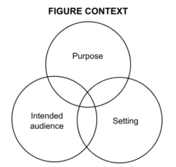
3. Analyze your context
To design a good figure, start with the context around it, particularly its purpose, its intended audience, and its setting. In many cases, these three aspects are intertwined:
Let’s say you are making a figure for a journal article in your field. Ask yourself the purpose of the figure, i.e. why you want to include it in the first place. Does the figure illustrate an important part of the research story? What should the audience walk away with from the figure? Answering these questions will guide the figure design and better connect it to the rest of the text.
At the same time, ask yourself who will be viewing the figure and whether they are specialized in your field or represent a more general audience. Depending on the answer, you will want to tailor the complexity of your message, the conventions and language you use to present the message, and the amount of evidence you present. For example, if you are making a figure for a high school outreach program, the audience may have little background knowledge. Hence you may want to alter the figure’s message to make it easily interpretable (e.g., “woven meshes in channels increase heat loss”) and present less evidence (e.g., cartoon-style plot of temperature difference, with and without mesh).
Another consideration is the setting: Will you be presenting your figure in an academic paper, a poster presentation, or an oral presentation? Great figures are adjusted based on their setting, which dictates how your audience will interact with them and how much support or explanation you will be able to provide. For example, in the case of a figure for a journal article, you likely want to deliver a very specific message (e.g., “at all bulk Reynolds numbers, the addition of woven meshes in the flow-channels increases the mean Nusselt number”) and provide detailed evidence (e.g., plot of Nusselt number vs Reynolds number, with and without mesh). Insufficient or excessively simplified evidence will result in skepticism about your message.
Here are some more tips for adjusting figures based on their setting:
| Figure setting | Tips |
| Conference or journal paper |
|
| Poster |
|
| Presentation slides |
|
4. Best practices
Once you have analyzed your context, you can begin drafting your figure. Below we discuss best practices for designing great figures.
4.1. Choose figure designs that best communicate your message
Just as different words may be better or worse at communicating an idea, different figure designs may be better or worse at communicating your message. To draft a successful figure, consider which media, figure types, and plot types best highlight your message. When deciding between different media to deliver your message, consider the following:
- Text and speech deliver precise statements.
- Tables list information with little context or interpretation.
- Figures illustrate conclusions with evidence and are open to interpretation.
Hence different types of media can deliver different messages, even when containing the same data. For example, compare the text, table, and figure below – which does a better job at getting the message across?
Increasing the time-averaged current density ratio decreased total specific energy consumption, because the decrease in pumping energy consumption exceeded the increase in desalination energy consumption.
Table 1. Specific energy consumption at varying time-averaged current density ratios
| Time-Averaged Current Density Ratio | Desalination Specific Energy | Pumping Specific Energy | Total Specific Energy |
| ri | Ed [kWh/m3] | Ep [kWh/m3] | Es [kWh/m3] |
| 0.39 | 1.2 | 8.4 | 9.6 |
| 0.45 | 1.5 | 7.1 | 8.6 |
| 0.57 | 2.2 | 5.3 | 7.5 |
| 0.74 | 2.8 | 4.1 | 6.9 |
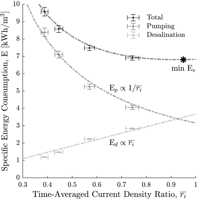
While the text, table, and figure all contain the exact same data, the figure makes it easier to understand trends in the data which support the intended main message.
Once you decide a figure is a good way to communicate your message, the next step is to decide which type of figure is best. When deciding between different figures to deliver your message, consider the following:
- Photos portray the subject exactly, providing concrete evidence.
- Illustrations relax precision to draw attention to labeled elements. They also let you highlight important parts of the message and choose to leave out unimportant parts.
- Graphs display processes, quantities, or comparisons.
Hence different figure types present different forms of information. Consider the following comparison between photos and illustrations in a figure:
| This is a photograph of optics equipment used in an experimental setup. Here, it is easy to follow the path of the laser beam and understand the scale.
|
This is a schematic of the same experimental setup. Here, it is easier to understand the spatial arrangement and interpret the function of each component of the system.
|
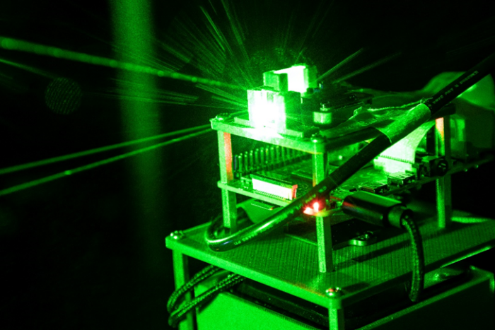
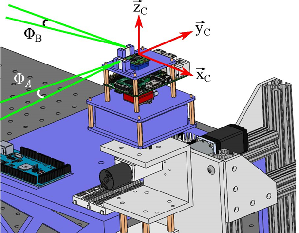
(From Evan Kramer’s blog on Technical Photography)
When deciding between different plots to deliver your message, consider the following: What are you trying to show with your data: a correlation, a distribution, an event in time? This is important as different plot types emphasize different types of data. Here are some recommended plot types for specific types of data:
| Trying to show… | Recommended presentation |
| Large data set | Histograms or box plots to summarize features of the distribution |
| Events in time, Evolution of a variable | Line plot to show evolution of the variable |
| Correlations | Scatter plot to quickly compare data |
For figures with plots, beware of making any conclusions before plotting all the data. For example, consider Anscombe’s quartet, a group of datasets which have the same linear fit, mean, and standard deviation but vary considerably when graphed:
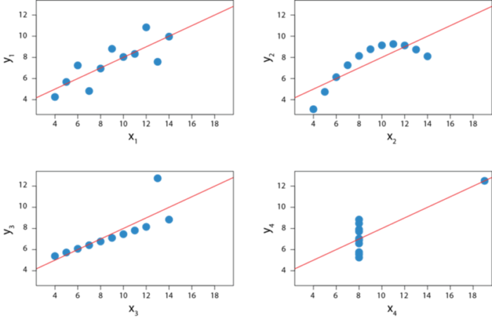
(Adapted from Wikipedia)
These datasets show that when you have a distribution on hand, simply using a summary of your data (i.e. mean and standard deviation) can obscure interesting information about your data. Another interesting paradox is Simpson’s paradox, which shows that plotting separate data together can yield counterintuitive trends.
For figures with complex messages, a final consideration is to break down the message into chunks and use multiple panels to tell a story. Multi-panel figures can employ a combination of media and plot types, using the complementary strengths of each element to communicate your message as a story. Consider the following example:
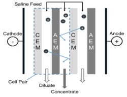 |
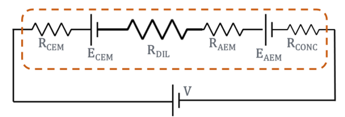 |
| In electrodialysis, an electric field is applied across repeating cell-pair units to separate a saline feed into diluted and concentrated streams (left). The cell-pairs form an electrical circuit, with the transport of ions represented by the current density i (right). | |
4.2. Maximize your signal-to-noise ratio
When designing a figure, you want your reader to understand the message as quickly as possible. You can think of this as maximizing the “signal-to-noise” ratio, i.e. transmitting the message “signal” as clearly as possible to your audience. Anything that interferes with communication of your message is “noise.” So far we’ve discussed ways to increase your signal by optimizing figure design. Here we will talk about strategies for minimizing noise.
The first main source of noise is the evidence itself. The best strategy here is don’t drown your audience in data. To do this, try to include only necessary data to make your point and remove any additional noise from the figure. Note that error bars do not constitute noise, and should be included to indicate the uncertainty when reporting measured values.
The second main source of noise is the presentation of the data, i.e. the way you have chosen to present your evidence. The best strategy here is to consider different figure and plot types to highlight the key point as efficiently as possible. A good mantra for efficient figures is the so-called KISS principle: “keep it simple, silly!”. For example, compare these two figures:
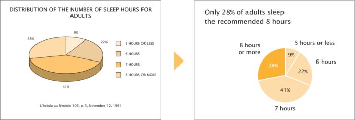
(From Trees, maps, and theorems by Jean-Luc Doumont)
The right figure clearly does a better job at emphasizing the main message that only a small fraction of adults sleep 8 hours or more. Here are some things it does better:
- The figure title directly states the main message of the data, instead of a general description.
- Legends are placed directly next to the data they describe, so the reader doesn’t have to look back and forth to match colors.
- Color scheme is simple and draws attention to the relevant portion of data.
- Unnecessary 3D graphics are removed.
There are many other sources of noise. For example, unnecessary gridlines or axis labels can clutter a figure. Ask yourself what you want your audience to take away from the figure, and how you can make it easier for them to locate and focus on the relevant information.
4.3. Make your figure accessible to all audience members
Another important skill is to make your figure accessible to all members of your audience. Ideally you want anyone who interacts with the figure to be able to understand the main message. Here are some strategies for this:
- Never just use color to differentiate data in plots. Differentiate data with both symbols and colors. This allows people with color vision differences to easily distinguish your data.
- Use high contrast colors in plots. A mobile app like CVSimulator can help check whether different colors in your plot are visible to people with color vision differences. Also check out Color Brewer for exemplary colors schemes with high contrast.
- Use simple fonts, large font sizes, and consistent font colors. This allows readers to quickly grasp the data without spending unnecessary time on the details. See this digital accessibility guide for additional tips for text accessibility.
- Include alt-text along with normal captions. While the purpose of captions is to provide necessary info to fully grasp the figure, the purpose of alt-text is to describe the content of the figure itself. Alt-text helps Blind and visually-impaired people access visual content through screen readers. Here are some guides for writing alt-text for your figures:
- W3C guide to writing alt-text for technical figures
- Harvard guide to writing alt-text for images
- New York Times article on the importance of using alt-text
5. Annotated examples
See these annotated examples of figures from published papers, highlighting their strengths and weaknesses:
- Annotated Example 1: Kilobot swarm robot
- Annotated Example 2: In-orbit maneuvers performed by an iodine electric propulsion system
6. Additional resources for figure design
General figure design:
- Ten Simple Rules for Better Figures, from PLOS
- What makes bad figures bad?, a useful summary of figure design rules
- Elements of Visual Style, from Nature Methods
- Collection of articles on data visualization, from Nature Methods
- Advice on plot elements – Axes, ticks and grids, plotting symbols
Composition:
- Layout, from Nature Methods
- White space, from Nature Methods
Color:
- Color coding, form Nature Methods
- Mapping quantitative data to color, from Nature Methods
- Color blindness, from Nature Methods
Software tools for making figures:
- Inkscape, Draw.io, Gimp, Linearity Curve, Powerpoint (free)
- Illustrator, Origin (paid)
- Making publication-quality figures in MATLAB
- Example figures in Python, MATLAB, R, Illustrator
Acknowledgements:
This content was adapted by the AeroAstro Comm Lab from an article originally written by Sahil Shah for the MechE Comm Lab. Thanks to Nick Rober and Brian Mernoff for the comments and edits.
Resources and Annotated Examples
Kilobot Swarm Robot
318 KB