1. Introduction
Designing slides for a presentation can be a daunting task. There are many decisions to make, both large and small. You may have a rough idea of what to present and know how long the presentation should be, but when you sit down to make the slides, you hit writer’s block. How many slides should I have? What should I put in my slides? How much text should I have? How do I make my slides engaging? How do I not solely rely on my slides during the presentation?
Many of these questions can be answered with good slide design. While we specifically target PowerPoint or Google Slides presentations for research conferences, seminars, and classes, we aim to provide general guidelines for visual communication. Note that we do not discuss the content and organization of presentations, but rather how to design slides once you have identified the main messages you wish to convey.
2. Criteria for Success
After reading this CommKit, you will be able to:
- Develop slides to supplement and amplify the key messages of your presentation.
- Use effective visual communication to convey necessary information.
- Capture the attention of different audiences with engaging slides.
3. Purpose
This CommKit will help you develop best practices for creating presentation slides and for visual communication in general. A great slide deck should concisely convey the necessary information to the audience and supplement the overall multimodal presentation. A “multimodal” presentation is one in which the information is presented in different formats, for example visually through text or images and auditorily through speech. Remember: the slides should supplement the presentation rather than be the presentation themselves.
4. Analyze Your Audience and Context
The first step in designing slides is to analyze the audience and context of your presentation. For instance, if your presentation is for a research conference, your slides should have sufficient technical detail for someone to understand your contributions, e.g., detailed figures, plots, and equations. Instead, if you are giving a TED talk to a general audience, you want to focus more on the big picture by minimizing jargon and capturing the audience’s attention with large photos, videos, and discussion questions. Other important considerations are the size of the audience and the location of the presentation. If you are giving a talk to 100 people in a large lecture hall, you should minimize text and use large font sizes so that the audience in the back can understand your main points.
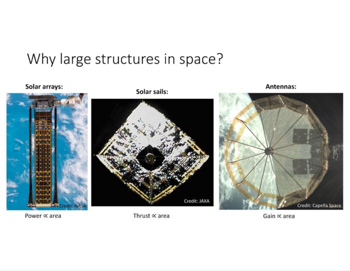
Consider the two slides below, one to an audience of 30 people at a research conference, and another to an audience of 60 people at a public science festival. The first slide, meant for a research conference, compares two approaches to large space structures with images, has descriptive text, and deliberate citations to previous work. The second slide, meant for a public science festival, has less jargon and highlights the key applications of large space structures with large photos and minimal text. While both slides explain the research motivation, their different organization and content are tailored to the targeted audiences.

Motivation slide for a research conference
Motivation slide for a public science festival
5. Best Practices
Once you have analyzed the audience and context of your presentation and have identified the main messages you want to convey, you can start designing slides to supplement your presentation. We recommend the following best practices:
5.1. Identify the main message of each slide
Each slide should have a singular main message, to maintain good flow and not overwhelm your audience. Here are some examples of effective main messages for a slide:
- This research problem is important because XX
- The experimental setup consists of XX and YY
Once you have decided on the main message, think of the content you need to convey that message – figures, text, graphs, etc. This supporting information can go in the main body of the slide, and the main message can be succinctly summarized in the slide title. The slide title is generally the first thing the audience sees, so it is a good place to put your main message. Consider the example below, in which the slide title conveys the main message and the figure below directly supports it with a quantitative comparison.

Clear slide title with a main message and supporting information underneath.
5.2. Control the audience’s eyes, i.e. visual hierarchy
Visual hierarchy refers to the order in which the audience views the information. As the presenter, you can guide where the audience looks. A good rule of thumb for English-speaking audiences is that they will read your slide left-to-right and top-to-bottom. However, the size, shape, color, and movement of the information can affect visual hierarchy. Consider this example:
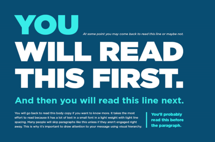
Visual hierarchy highlighted through varying font sizes and colors. Source: Markustudio Ltd 2023. All rights reserved.
Here we receive information in a specific order as our eyes follow the text from the largest font size to the smallest font size. It may seem like trickery, but you can use this visual hierarchy to your advantage, for example, by varying the size, shape, color, and movement of information in your slides. In Powerpoint, one classic method to guide the audience’s attention is to use animations that cause a figure or text to appear, disappear, or move across the slide. Other methods for highlighting information include varying the font color and enclosing text in a box. Beware that these strategies only work well sparingly – overuse of visual hierarchy may decrease effectiveness and mentally tire your audience.
5.3. Understand visual perception
Visual perception refers to how the audience perceives and comprehends the visual information on your slide. There are some general principles that govern how we humans organize visual information, known as Gestalt principles:
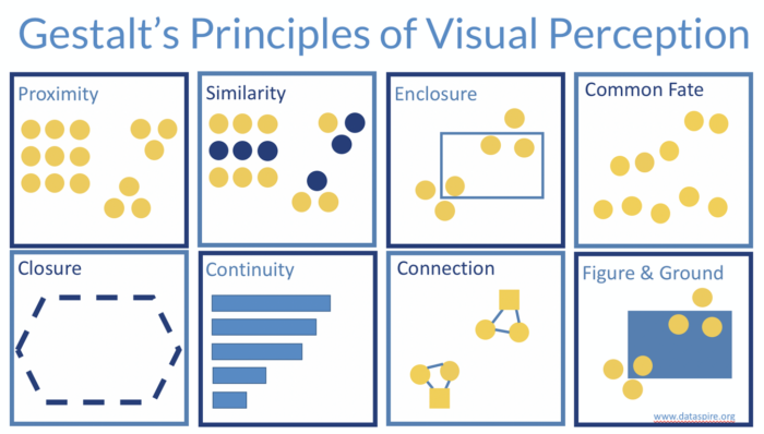
Gestalt principles of visual perception. Source: dataspire.org All rights reserved.
- Proximity: Objects physically close to each other appear as part of the same group (even if they are not in reality).
- Similarity: Objects of similar shape, size, and color appear as part of the same group.
- Enclosure: Objects in an enclosure appear as part of the same group.
- Common Fate: Objects moving together appear as part of the same group.
- Closure: Individual objects may appear as a single, combined shape.
- Continuity: Objects in line with each other appear as a continuation of one another.
- Connection: Physically connected objects appear as part of the same group.
- Figure & Ground: Objects in the foreground stand out more than objects in the background.
For instance, you can place similar text or figures physically close to each other, and enclose related text or data with a box to highlight a point. Consider this comparison of two slides:
OK Design
Textual description of research questions
Better Design
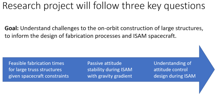
Research questions enclosed in an arrow to show their progression (“enclosure”)
Both slides convey the same information, but the second slide uses the arrow to highlight the progression of tasks (i.e. the continuity principle). Note that these principles are true regardless of whether you mean to organize the information that way. Hence be careful to not give your audience the wrong visual perception. See the annotated slides at the end of the CommKit for further examples of these principles in action.
5.4. Remove distractions, i.e. visual intention
Visual intention refers to how the audience understands the information on the slide through visuals. The best rule of thumb here is to minimize distractions to ensure the audience will understand each slide’s main message. Consider this example:
OK Design
Complicated slide with distractions. Source: Sydney Dolan, AA Commlab.
Why does this slide come off as overwhelming? There are many reasons: there is lots of text, many colors, and it is confusing where to look first. Further, the box enclosure competes with left-to-right reading, muddying the visual hierarchy. Now consider this revised slide:
Better Design
Simplified slide with a main message and minimal distractions. Source: Sydney Dolan, AA Commlab.
This slide is easier to understand because it has a more succinct title, the box enclosure is compatible with left-to-right reading, and any additional textual and visual information that distracts from the main message is removed.
For research presentations, another important source of distractions is data that is irrelevant to the slide’s main message. For example, when using figures from research papers, be careful with copy-pasting them directly into slides as they often contain extra, unnecessary information. Always simplify and adapt the figures to your presentation to ensure they align with each slide’s main message. Consider this example:
OK Design

Slide with a figure taken directly from a research paper.
The figure in this slide is difficult to understand because it contains lots of information and small text, which may be acceptable in the format of a research paper. However, when used for a presentation, it should be tailored for ease of understanding, as shown below.
Better Design

Slide with a better-adapted figure with larger text and images for context.
Caption: Slide with a better-adapted figure with larger text and images for context.
Alt-text: Slide containing the same figure as above but with fewer datasets and images to provide context and serve as a legend.
Another tip for minimizing distractions in slides is to avoid jargon. What constitutes jargon depends on your audience, so consider the background information they are familiar with. Additionally, acronyms are useful for compressing text, but don’t expect the audience to know what they mean. Make sure to define each acronym before using it, so the audience does not have to use mental effort to decipher it.
5.5. Strive for visual clarity with appropriate colors, font size, and choice
Visual clarity refers to how clearly information is presented on the slide. Some important considerations that can affect clarity are the size of text and figures, the contrast between colors, and the accessibility of the visual information. For text, some good rules of thumb are to use the largest possible font size given the other information on the slide (never go below 16 pt) and use a legible font like Sans Serif, Arial, or Times New Roman. Similarly, make the figures as large as possible and consider the view from the back of the audience. Using contrasting colors is also important, especially for plots with many lines and data points. To increase the effectiveness of your presentation, strive to make your slides accessible to all audience members. See other tips and resources for visual clarity in this Commkit on figure design.
5.6. Use slides to supplement your presentation
Great presentations are multimodal, i.e. the information is presented in different formats including visually through text or images and auditorily through speech. Keep this in mind when designing your slides: the slides should guide the flow of your presentation instead of being a transcript of everything you hope to say. This is important because when you present new information, people take time to process it and often only process one mode of communication at a given time. So if you say something and your slides show something else, your main message will get muddled. Hence strive to use slides to supplement your presentation, not vice versa. Some of the most engaging presentations use minimalistic slides or even no slides at all. This takes practice to get good at, but don’t be afraid to have little information on slides. Instead, focus on how to best convey the main messages of your presentation.
6. Additional Resources
- “How to Speak” by Prof. Patrick Winston
- “How to Avoid Death by Powerpoint” by David Phillips
- AeroAstro CommLab workshop on best practices for slide design
- Nature blog on best practices for data visualization
- Other MIT departmental specific CommKits on slideshow design
7. Acknowledgments
Thanks to Evan Kramer, and Mary Dahl for the comments and edits.
Resources and Annotated Examples
Annotated Example 1
Presentation at a Research Conference 5 MB
Annotated Example 2
Presentation to PhD Committee 3 MB