One of the first things I learned after joining the Comm Lab was a framework known as Claim, Evidence, Reasoning (CER)—a pedagogical tool with interesting applications in technical communication. I was in the process of shadowing a coaching session as part of my Comm Lab orientation when this beautiful piece of communication wisdom was dropped in my lap.
Step by step, the fellow was describing to the client an effective way to structure an individual slide: use the title of your slide as a key takeaway or claim (C), structure the body of the slide as the supporting evidence (E) for this claim, and tell the audience the reasoning (R) for why the evidence supports your claim. This immediately jumped out to me as I’d never really thought about a design framework at the individual slide level (other than some loose rules of thumb like not including too much text).
The value proposition of research presentations
As I reflected more on this communication bombshell, I was reminded of a question I often ask when putting together a research presentation: how do I get more value out of the process of creating and giving this talk? My answer to this question usually comes in two forms, both of which CER seemed to directly support. The first is, by putting the presentation together, can I identify some gaps in my thinking or uncover a new research direction? And the second is, can my audience point out something that I haven’t thought about before? After all, different perspectives and unbiased views often hold the key to unlocking sticking points in the research process.
As described, CER was clearly a way of forcing you to think through the logic of each aspect of your presentation, and in doing so, looked to provide the audience with a more digestible message. I decided to try it out for myself, setting the bar high on a slide that I was already pretty proud of. However, as I started to think through the steps, the flaws in my slide became glaringly obvious.
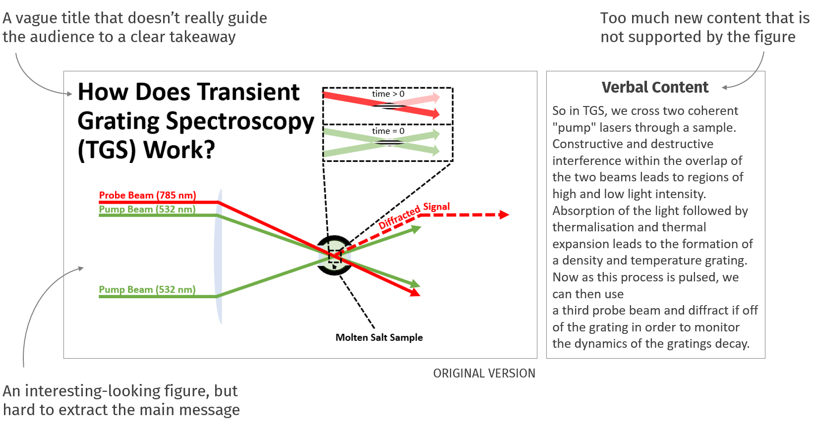
Humbled and surprised, I went back to the drawing board, re-imagining what the slide could look like when guided by a CER framework.
Step 1: Claim
What do I really want my audience to grasp from this specific slide, and can I distill it into a short claim to use as the slide’s title?
In my own presentations as well as experience listening to others, slide titles often seem to be a bit of an afterthought, typically acting as some broad description of the slides content, with no real purpose or aid for the audience. Contrast this with the fact that when I see a slide my eyes are almost always drawn initially to the title, providing the presenter with maybe the only guaranteed content that I will read.
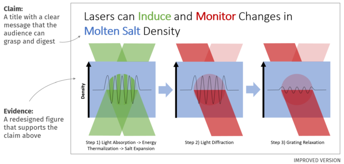
Forcing myself to think about what the key piece of information is, I settled on the following: “Lasers can Induce and Monitor Changes in Molten Salt Density.”
On to step 2!
Step 2: Evidence
Now what is the minimum amount of evidence I can use to support the slides takeaway? And can I turn it into some visual content that makes sense on a slide?
The notion of signal-to-noise is a well understood concept in science and engineering, which is why it always comes as a surprise when you see a slide that is seemingly allergic to the idea of white space. Taking the time to remove content that is not serving as evidence for your slide’s claim, not only creates a more digestible amount of material for your audience, but also forces you to think about what the key pieces of information are that support your takeaway.
I narrowed in on my claim from step 1 and trimmed the non-essential information from my previous figure. Because the lasers in my experiments are in fact green and red, I used a color blindness simulator to make sure the figure would be accessible to people with the most common forms of colorblindness. This is what I settled on:
Let’s wrap this up!
Step 3: Reasoning
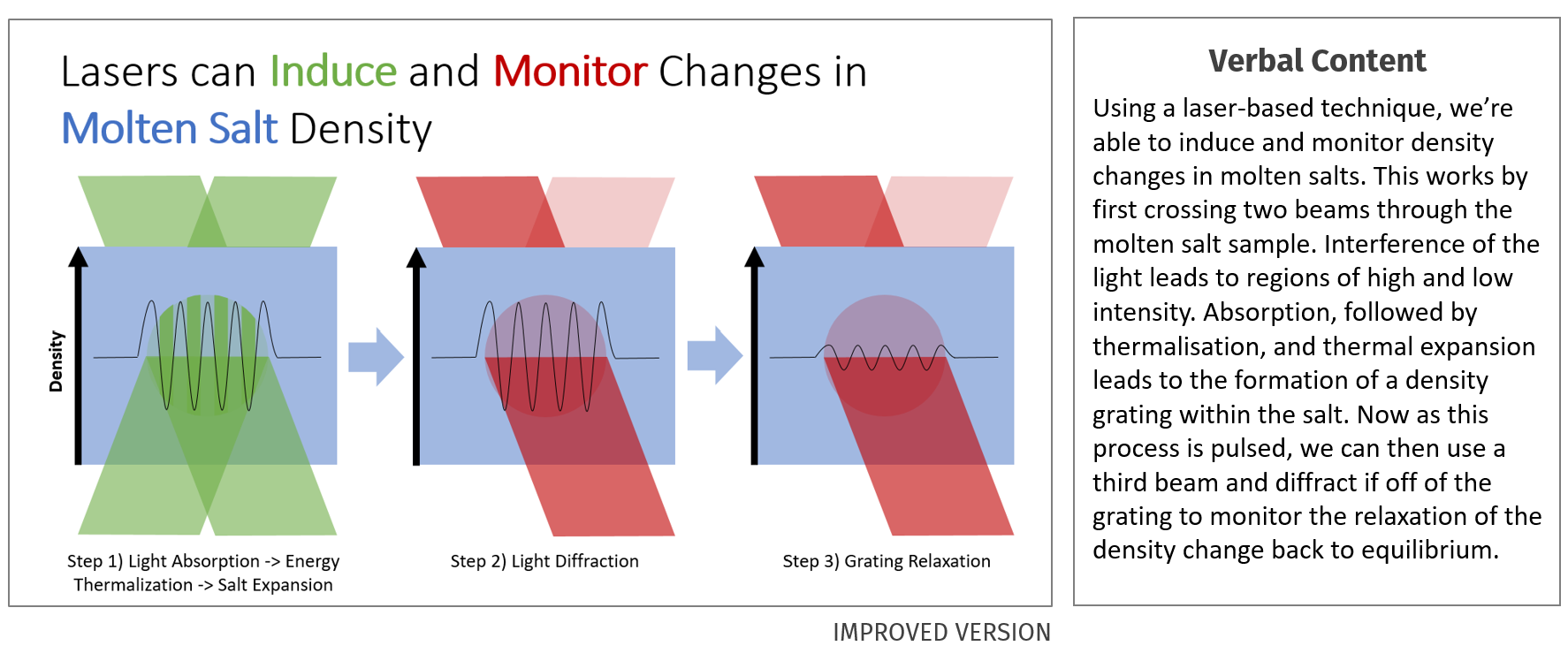
Finally, how can I walk the audience through the slides content in a way that makes them appreciate and not distract from the connection between my evidence and my claim?
As presenters, I find we often give the audience too much credit for their ability to process a lot of information quickly. Making your verbal and visual content completely consistent with one another is a great way to not overwhelm your audience. Try using these different modes of communication as a means of redundancy instead of different streams for them to process.
At this point I felt like, visually, my slide had a very linear flow of information. Still, I needed to make sure that my verbal content supported—and didn’t distract from—this path:
Moving Forward
Still not convinced of the power of the CER technique? I can understand. A lot of the value from the method comes from putting it to work on your own slides. I’d recommend trying it out in a low stakes environment where you are likely to get communication feedback in addition to technical comments (ex. your next group meeting or 22.911 seminar). If nothing else, it should help make your and your audience’s takeaways more aligned, but hopefully it can also catalyze a valuable Q&A and give you some insight into the blind spots of your research.
Despite it being only a few months since my introduction to CER, the framework has already become one of the most integral pieces of my communication toolkit. Working through the steps for individual slides had definitely provided value to my research, and I hope it can do the same for you!
Sean Robertson is a PhD graduate student in the Mesoscale Nuclear Materials group working under Prof. Mike Short. He is also an NSE Communication Fellow.
Published August 27, 2021
Related articles and resources:
If you have an upcoming presentation, be sure to schedule a time to speak with a Fellow about how to make your slides more effective.