Most recent revision of this article was led by Communication Fellow Chad Loh.
Criteria for Success
- Your figure leaves the audience with a clear, one-sentence main message
- You provide evidence that directly supports the main message
- Any content distracting from your main message is removed from the figure
- Visual components are easily distinguished
Structure Diagram

Purpose
Figures are any visual presentations of results and come in a variety of forms. Graphs, diagrams, photos, drawings, schematics, and maps are all types of figures. Despite this variety, the purpose of all figures is to communicate two things:
- A take-away message
- Evidence showing your message is true
Your message is the reason you want to show people your data! The purpose of a figure is not only to show people your data: it should also communicate the message you have learned by interpreting that data.
Analyze Your Audience
An accurate analysis of your audience enables you to convincingly deliver your message. Ask yourself who will be viewing this figure and whether they are specialized in your field or represent a more general audience. Depending on the answer, you will want to tailor the complexity of your message, the conventions and language that you use, and the amount of evidence you present.
For example, if your figure is for publication in a field-specific journal, your audience will likely have significant background knowledge about your topic. In this case, you can deliver a very specific message (e.g., “the reaction rate of calcium aluminate is dramatically decreased in the presence of the source of calcium sulfate, preventing flash setting”, [Bullard, CCR, 2011]) and provide detailed evidence (e.g., heat evolution rate curve during the hydration of calcium aluminate). Insufficient or excessively simplified evidence will result in skepticism about your message.
If your figure will be used in a presentation for a high school outreach program, your audience will have a very different set of background knowledge. Using common mineral names (gypsum) is better than explaining with chemical nomenclature (calcium sulfate dihydrate) and technical jargons (flash setting) can be replaced with an easier explanation. Here, you should alter the message (e.g., gypsum is added to concrete to keep it in its fluid form) to make it more interpretable and can present much less evidence (e.g., relationship between gypsum content and setting time). Giving a general audience too much evidence will be overwhelming; they won’t be able to distinguish the evidence that supports your main message from all the other details.
Understand your platform
Will you be presenting your figure in an academic paper, a poster presentation, an oral presentation? The final format dictates how your audience will interact with the figure, and how much support or explanation you will be able to provide.
| Platform | Type | Tips |
|---|---|---|
| Paper | Analog |
|
| Poster | Analog |
|
| Slides | Digital |
|
| Online articles | Digital |
|
Skills
Choose figure designs that best communicate your message
Just as different words may be better or worse at communicating an idea, different figure designs may be better or worse at communicating your message. In designing a successful figure, consider which media, figure types, and plot types (see below for examples of each) best highlight your message.
For complex messages, multiple panels can break down a message into clear statements. Multi-panel figures will likely employ a combination of media and plot types. Use the complementary strengths of each element to communicate your message. Consider the following example.
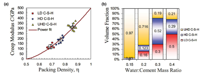
Figure 1 (a) Relationship between packing density and creep modulus (b) volume fraction of different C-S-H phases (Vandamme and Ulm, PNAS, 2009)
Scatter plots illustrate the relationship between two properties as shown in Figure 1a, while compositional volume fraction is easily compared using bar graphs as shown in Figure 1b. Use the same colors, symbols, or patterns for common items. This will help readers to easily navigate and compare the information among panels.
Media can deliver identical messages, but do so differently.
- Text and speech deliver precise statements.
- Tables list information with little context or interpretation.
- Figures illustrate conclusions with evidence and are open to interpretation.
As an example, compare the table and the figure below. The common statement is “lower water-to-cement (w/c) ratio results in faster and higher strength development.” Even though tables provide the information with better precision, it is difficult to notice the trend. However, by plotting the strength at each acquisition as Figure 2, we can easily notice that lower w/c ratio samples have higher strength at each time.
Table 1 Strength development of concrete samples with different water-to-cement (w/c) ratios
| w/c ratio | Compressive strength [MPa] | ||||
| 1day | 3days | 7days | 14days | 28days | |
| 0.25 | 3.38 ± 1.56 | 20.48 ± 2.92 | 26.57 ± 1.07 | 33.95 ± 0.29 | 46.88 ± 1.01 |
| 0.30 | 5.88 ± 0.63 | 32.55 ± 2.84 | 40.94 ± 1.63 | 49.10 ± 2.18 | 55.01 ± 3.09 |
| 0.40 | 11.58 ± 2.02 | 44.58 ± 3.36 | 51.85 ± 1.84 | 56.76 ± 1.17 | 61.42 ± 3.83 |
| 0.50 | 21.55 ± 2.07 | 53.37 ± 1.05 | 58.85 ± 1.87 | 66.44 ± 2.02 | 67.68 ± 3.30 |
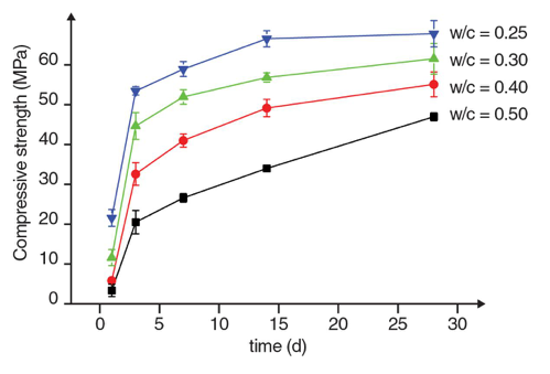
Figure 2 Strength development of concrete samples with different water-to-cement (w/c) ratios
Figure types present different forms of information.
- Photos, images, or maps portray the subject exactly, providing concrete evidence.
- Illustrations relax precision to draw attention to a chosen theme or element.
- Graphs display processes, quantities, or comparisons.
As an example, microscopy images (Figure 3) provide the exact representation of how different hydrates grow, while a schematic illustration (Figure 4) shows the general location, size, and trend of the change. Schematics are also good when emphasizing the main point, since unnecessary features can be omitted in schematics (Figure 4).
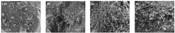
Figure 3 Scanning Electron Microscopy images of cement hydration (Scrivener et al., CCR, 2015)
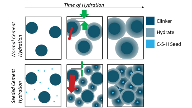
Figure 4 Schematic illustration of cement hydration (John et al., CCR, 2018)
Plot types and styles emphasize different types of data.
- What are you trying to show with your data: correlation, distribution, relationships, maps, hierarchy, or something else? Use the best graph type that fits your purpose.
- Selecting a “wrong” type of graph can confuse and/or mislead the reader.
- Graph styles (x-axis, y-axis, legends, grids, error bars, etc.) should also be modified from the default graph that your visualization tool might draw. Would it be better with a log-scale? Should you truncate or split your y-axis? Do you have error bars to show?
- These websites are helpful when you are deciding which graph type and styles to use: Chart Chooser Diagram, The Data Visualisation Catalogue, Fundamentals of Data Visualization.
Here is an example of “bad” and “good” figures. Here, we used a bar chart (Figure 5a) and a line graph (Figure 5b) to present the strength development of concrete samples. Can you find four reasons why Figure 5b is better than Figure 5a?
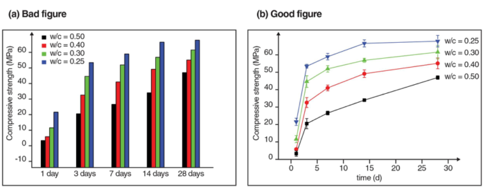
Figure 5 Data visualization using different graph types (a) bar chart (b) line graph
First, bar charts are effective when comparing different samples, but it is unintuitive when we want to see the strength development over time. The line chart, on the other hand, connects each data point to show the increasing trend over time.
Second, the x-axis of the bar chart does not consider the time interval between each data point. The line chart, however, uses time as the x- axis, so the time scale is represented more accurately.
Third, the y-axis of the bar chart starts from a non-zero value. This could be misleading because it seems like the w/c = 0.5 sample has a good strength at 1 day (Figure 5a), when the value is actually close to zero (Figure 5b). This kind of mistake can happen when you are using the default figure that your data visualization tool makes. Remember to adjust the x and y-axes.
Lastly, the error bars were omitted in the bar chart. Again, always show the error bar, if available.
Maximize your signal-to-noise ratio
Treat the message you want to communicate as your “signal”. Your goal is to transmit this signal as clearly as possible to your audience. Anything that interferes with communication of your message is “noise.” We’ve discussed ways to increase your signal by optimizing figure design. Here we will talk about strategies for minimizing noise.
Noise from evidence
Don’t drown your audience in data: include only the minimum data necessary to make your point. Including evidence that doesn’t directly support your message distracts from evidence that does. Note that error bars do not constitute noise, and should be included to indicate the uncertainty when reporting measured values.
Noise from presentation
The way you present your chosen evidence can also draw attention away from your message. Using the figure below, we’ll give a few common examples of how a figure can be improved to remove noise.
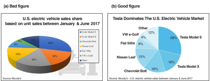
Figure 6 How to reduce noise from presentation. (a) The bad example includes features that are unrelated to the data and the message is not clear. (b) The good example is simple and effective.
(Data source: www.statista.com/chart/10684/tesla-dominates-the-us-electric-vehicle-market/)
- The title of the figure is changed from a description of the data to a message about the data.
- Legends are moved directly next to the data they describe, so the reader doesn’t have to look back and forth and match colors.
- Color scheme and font styles are simplified to draw attention to the relevant portion of data. A simple color scheme (e.g. monochromatic) is colorblind friendly and better when printed in grayscale.
- Unnecessary 3D graphics and background images are removed.
- The contrast between the graph and the texts are increased for better visibility.
Many other types of noise exist. For example, unnecessary gridlines or axis labels can clutter a figure. Ask yourself what you want your audience to take away from the figure, and how you can make it easier for them to locate and focus on the relevant information.
(The metaphor of “signal-to-noise ratio” comes from Jean-luc Doumont’s book Trees, Maps, and Theorems.)
Resources for advanced figure design
There are many great resources for styling visual communications and data. A small selection is listed below. Additional articles on figure design can be found in this collection of articles from Nature Methods.
General figure design:
- Ten Simple Rules for Better Figures, from PLOS
- What makes bad figures bad?, a useful summary of figure design rules
- Elements of Visual Style, from Nature Methods
- Advice on plot elements: Axes, ticks and grids, plotting symbols
Composition:
- Layout, from Nature Methods
- White space, from Nature Methods
Color:
- Color coding, form Nature Methods
- Mapping quantitative data to color, from Nature Methods
Coding:
- Blog with tutorials on the technical aspect of making figures, including examples in MATLAB, R, Illustrator
- Sample code for better-looking MATLAB plots, adapt to your own purpose
Additional reading
Check out the full collection of free CommKit Resources created by the MIT CEE Comm Lab team.
Resources and Annotated Examples
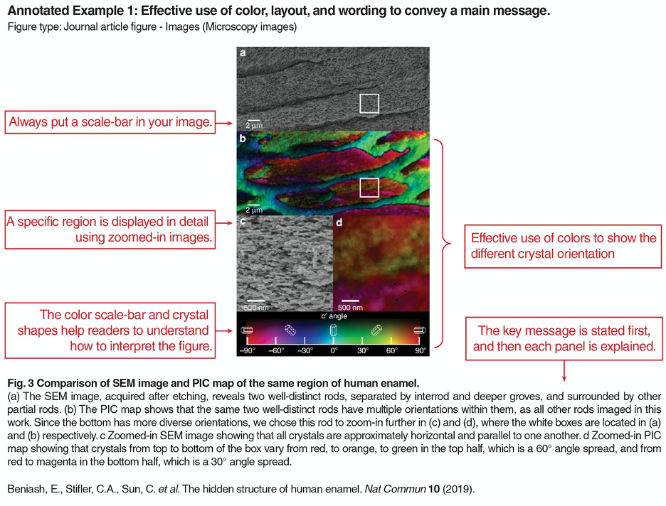
Annotated Example 1
An example figure showing effective use of color, layout, and wording to convey a message. 580 KB
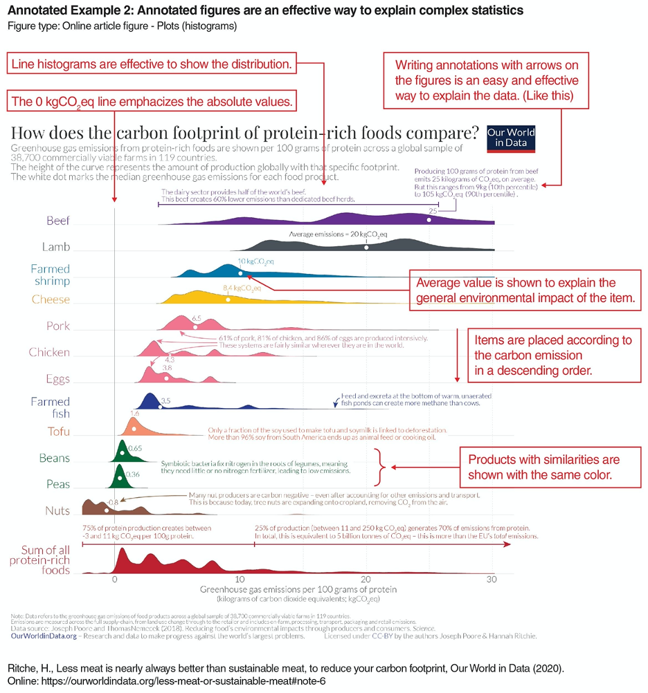
Annotated Example 2
This example shows an effective way to explain complex statistics. 709 KB