
Criteria for Success
- Your figure leaves the audience with a clear, one-sentence main message
- You provide evidence that directly supports the main message
- Your figure only contains content that is related to the main message
- All parts of your figure are easy for the audience to read and understand
Structure Diagram

Purpose
Figures are any visual presentations of results and come in a variety of forms. Graphs, diagrams, photos, drawings, schematics, and maps are all types of figures. Despite this variety, the purpose of all figures is to communicate two things:
- A take-away message
- Evidence showing your message is true
With the exception of some introductory figures—for example, schematics, circuit diagrams, or flow charts—a figure that lacks either of these two elements is incomplete: A take-away message without evidence may be mistrusted, while data without a take-away message may be misinterpreted. The purpose of a figure is to communicate what you’ve learned by interpreting the data.
Analyze Your Audience
Understanding your audience allows you to deliver your message convincingly. Think about who will be viewing this figure. Are they specialized in your field or a more general audience? Depending on the audience, you should tailor the complexity of your message and the amount of evidence you present.
For example, if your figure is for publication in a field-specific journal, your audience will likely have general background knowledge about your topic. In this case, you can deliver a very specific message (e.g., “ZnO nanowires improve collection efficiency for photocarriers generated far from the planar heterojunction interface” [Jean et al., Advanced Materials 2013]) and provide detailed evidence (e.g., external quantum efficiency spectra). Insufficient or over-simplified evidence will result in skepticism about your message. Consider helping your readers by following basic conventions set by important papers in your field.
On the other hand, if your figure is for a presentation for a high school outreach program, your audience will have a very different level of background knowledge. You should alter the message to make it more easily interpretable (e.g., “Nanostructures can make solar cells more efficient”) and present much less evidence (e.g., power conversion efficiency). A general audience will often be overwhelmed by too much evidence. They may not be able to distinguish the evidence that supports your main message from other details.

Skills
Choose figure designs that best communicate your message
Just as different words and sentence structures may be more or less effective for communicating an idea, different figure designs may be more or less effective for communicating a message. In designing a successful figure, consider which media, figure types, and plot types best highlight your message.
For complex messages, multiple panels can divide a message into clear statements. Multi-panel figures often employ a combination of media, figure, and plot types. Use the complementary strengths of each element to communicate your message.
Media types can deliver identical messages in different ways.
- Text and speech tell precise statements.
- Tables present information with little context or interpretation.
- Figures illustrate conclusions with evidence and are open to interpretation.
As an example, compare the table and the graph below. While both contain the exact same data, the figure suggests an interpretation and helps the audience identify trends.


Source: Jean et al., “ZnO nanowire arrays for enhanced photocurrent in PbS quantum dot solar cells,” Advanced Materials 25, 2790–2796 (2013).
Compare both of these representations to the statement, “Colloidal quantum dot solar cells with ZnO nanowires are more efficient than planar cells,” which presents one specific interpretation that is valid at typical light intensities around 1 sun. Stating this interpretation would make it clear to your reader that efficiency under full sunlight matters more here than, say, efficiency under extremely low light levels.
Figure types present different forms of information.
- Photos portray the subject exactly, providing concrete evidence.
- Illustrations relax precision, drawing attention to a chosen theme or element.
- Graphs display processes, quantities, or comparisons.
This figure combines a schematic (top) and a scanning electron microscope (SEM) image (bottom) of a solar cell, including a cross section and a top-down view.With the schematics, you might want the viewer to focus on the overall structure incorporating nanowires. Showing the actual disordered nanowires would distract. You could use a schematic like this in an overview of the device architecture.
With the more realistic SEM images, you can discuss the actual dimensions and imperfect alignment of the nanowires, as well as the practical issues with infiltrating quantum dots into a close-packed nanowire array.

Source: Jean et al., “ZnO nanowire arrays for enhanced photocurrent in PbS quantum dot solar cells,” Advanced Materials 25, 2790–2796 (2013).
Plot types emphasize different types of data.
What are you trying to show with your data? A correlation? A distribution? An event in time?
When you have a distribution on hand, using a summary of your data (i.e., mean and standard deviation) can obscure interesting information about your data. For example, the three different distributions below (normal, uniform, and bimodal) have the exact same mean (5) and similar standard deviations (2).

| Trying to show… | Recommended presentation |
|---|---|
| Overall distribution of data | If possible, show the entire data set |
| Large data set | Histograms, box plots: summarize features of the distribution |
| Events in time Evolution of a variable |
Line plot |
| Correlations | Scatter plot |
Tweak your figure depending on the setting
Will you be presenting your figure in an academic paper, a poster presentation, an oral presentation, or another setting? The final format dictates how your audience will interact with the figure and how much supporting information you can provide.
| Is the figure static or dynamic? | What information goes where? | |
|---|---|---|
| Paper | Static |
|
| Poster | Static |
|
| Presentation slides | Dynamic: can be animated |
|
Maximize your signal-to-noise ratio
Treat the message you want to communicate as your signal. Your goal is to transmit this signal as clearly as possible to your audience. Anything that interferes with communication of your message is noise. We’ve discussed ways to maximize signal by optimizing figure design. Here we will talk about strategies for minimizing noise.
Noise from evidence
Don’t drown your audience in data. Include only the minimum data necessary to make your point. Including evidence that doesn’t directly support your message distracts from evidence that does. (Make sure you do not violate scientific ethics in selecting your data. Consult a colleague or advisor if you’re not sure.)
Noise from presentation
The way you present your chosen evidence can also draw attention away from your message. Here are a few common examples of how a figure can be improved to remove noise, based on the figure below:
- Change the title from a description of the data to a message about the data.
- Move the legends next to the data they describe so the reader doesn’t have to look back and forth and match colors.
- Simplify the color scheme, focusing on drawing attention to the relevant portion of the data.
- Remove unnecessary 3D graphics.
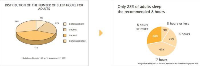
Source: Trees, Maps, and Theorems, by Jean-Luc Doumont, page 99
Many other types of noise exist. For example, unnecessary gridlines or axis labels can clutter a figure. Ask yourself what you want your audience to take away from the figure, and how you can make it easier for them to locate and focus on the relevant information.
(The metaphor of “signal-to-noise ratio” comes from Jean-luc Doumont’s book Trees, Maps, and Theorems.)
Resources for advanced figure design
There are many useful resources available on styling visual communication and data. Two books we recommend highly are The Visual Display of Quantitative Information (Edward Tufte) and Trees, Maps, and Theorems (Jean-Luc Doumont). We also recommend this collection of articles by Bang Wong, Martin Krzywinski, and their colleagues. Here you’ll find detailed discussions and examples on:
- Visual design principles and their relationship with clarity
- The use of color
- Styling figure elements
- The strengths and weaknesses of specific plot types
- Visualizing multi-dimensional data
- Using figures to explore data
Content adapted by the MIT Electrical Engineering and Computer Science Communication Lab from an article originally created by the MIT Biological Engineering Communication Lab.
Resources and Annotated Examples
Annotated Example for EE
Varying degrees of specificity within the same figure 3 MB
Annotated Example for CS
Clear parallels between messages between mediums 258 KB