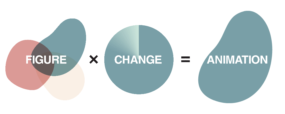
Criteria for success
- The main message of your figure is clear.
- The animation reveals a new dimension of data that supports your main message.
- The animation makes the main message of your figure easier to identify and understand.
Structure diagram
Identify Your Purpose
Over the past few decades, we have witnessed an exponential increase in our ability to collect wide swaths of data. In turn, the ways we visualize data have changed. Tables, spreadsheets, charts, and graphs have been the traditional (and still relevant) ways of visualizing data. However, with near universal usage of smart phones and easy access to the internet, new visualization techniques are being adopted, such as animations, movies, and interactive visualizations.
In academia, research articles are increasingly being viewed online, presentations are replacing posters, and during the COVID-19 pandemic, meetings are done virtually. The digital world has enabled new methods of presenting ideas and information in your presentations, electronic posters, virtual conferences, online articles, and zoom meetings.
Animations enable us to do the following:
- Emphasize changes over time or space
- Present complex data with many variables
- Correlate multiple layers of information
- Add new layers of information in intuitive ways
Experimental results or simulation results are presented as animations/videos in presentations or provided as supplementary videos in journal articles. Here are some exemplar supplementary videos from civil and environmental engineering journals.
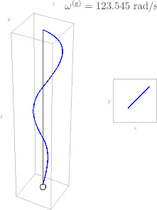
An eigenmode of a structural system
Carta et al. Philos Trans A Math Phys Eng Sci. (2019)
Landslides caused by the melting of ground ice in permafrost, Lewkowicz and Way, Nature Communications (2019)
Analyze your Audience
Similar to non-animated figures, understanding your audience is important. You will want to tailor the complexity of the message, the conventions and language, and the amount of details in your animation. [see Figure Design for more information]
Unlike non-animated figures, animations are all presented in a digital platform, such as e-posters, presentation slides, online articles, and video upload platforms (e.g. YouTube). Each digital platform tends to have a slightly different audience, and varying restrictions. Therefore, the animation should be tailored depending on the target platform.
| Platform | Tips |
|---|---|
| E-posters |
|
| Presentation Slides |
|
| Online Articles |
|
| Video Upload Platforms |
|
Skills
Narrow down which variables you need to highlight to underscore your main message.
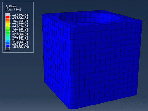
Animations are suitable for showing high-dimensional data. After an experiment or a simulation, we often end up gathering data with many variables, for example: x-, y-, and z-coordinates, time, color, experimental parameters, temperature, stress, strain, measured values. Visualizing these features all at once could be challenging, or even impossible. Even though our eyes have amazing abilities, we can only perceive a limited amount of data at any given point. [see Dimensionality of Visible Data for more information] Depending on the main message you are trying to convey, some variables will be more important while some of them can be de-prioritized.
 |
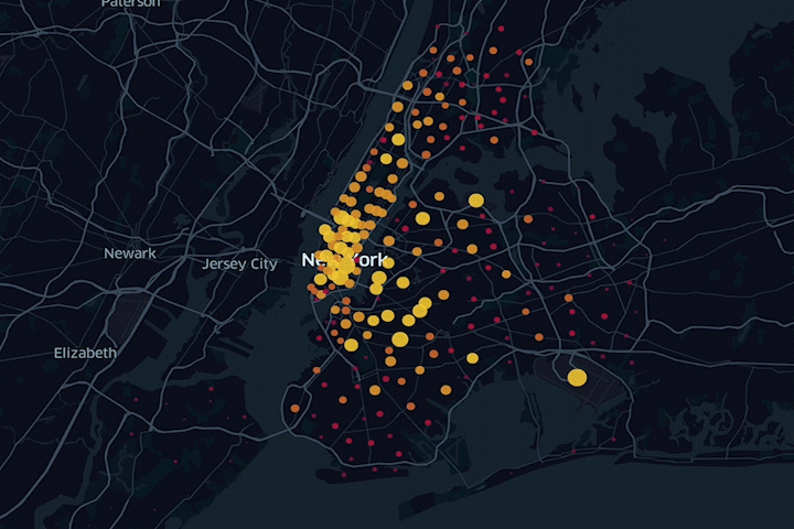 |
| Compression test simulation (Animation by Chad Loh) | Taxi rides in NYC (Animation by Chad Loh) |
| 5-Dimensional animation
X = X coordinate of the sample |
4-Dimensional animation
X = Longitude of the trip origin |
Using the right tool
Using the right tool can save you a lot of time when making a figure or an animation. Here is a list of the tools available for MIT students. Many of them are available from MIT IST website (https://ist.mit.edu/software-hardware).
Bolded items are Adobe Creative Cloud Apps. Free trials are available for using Tableau and Rhino.
| Purpose | Tools |
|---|---|
| Plotting and data visualization | Excel, MATLAB, Python, R, ImageJ, Tableau* |
| 2D Design tools | Photoshop, Illustrator , Inkscape, AutoCAD |
| 3D Modeling tools | SketchUp, SolidWorks, Rhino* |
| Chemistry | Chemdraw, PyMOL |
| Animation/Video Tools | Photoshop, Premiere Pro, Animate, DaVinci, EZGIF (online) |
Annotated examples
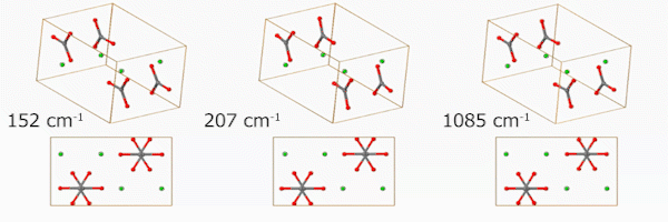
Example 1. Molecular vibration
Molecular vibration modes of simple molecules are easy to understand (like the CO2 stretching modes), but complex vibrational modes are easier to understand with animation. These three animations show us three of the aragonite vibrational modes (152, 206, 1085 cm-1). It can be better by explaining what each atom is and what the axes are. Animations are from https://www.crystal.unito.it/vibs/aragonite/
Additional resources
Check out the full collection of free CommKit Resources created by the MIT CEE Comm Lab team.