Although your poster is static, you will need to modulate your oral presentation to match the level of interest and expertise of your audience, who will also be flowing in and out of the session. While you stand next to the poster, it will serve as a visual aid to help you communicate and spark fruitful conversation. While you are absent or talking to someone else, it should succinctly communicate your work through effective figures, titles and captions. A successful poster will serve these functions through the use of visual design to effectively highlight the single main message that you have chosen to communicate and to illustrate the logical flow of your pitch.
1. Before you start
Resist the urge to immediately browse through poster templates or choose your favorite figures to include. To create an effective poster, you must clarify for yourself what you want to say, to whom, and why—when the session is over, how will you know that you were successful?
1.1. What is your ONE main message?
Identify the one thing that everyone must remember after seeing your poster (which is different from your poster title). You have limited space on your poster so this exercise will help you decide which content to include or leave out. Avoid vague statements such as “on the future of nuclear energy” and aim instead for full sentences such as “nuclear energy is essential in fighting climate change.” Make sure that your message is appropriate for your target audience.
1.2. Who is your audience?
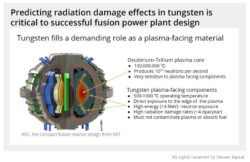
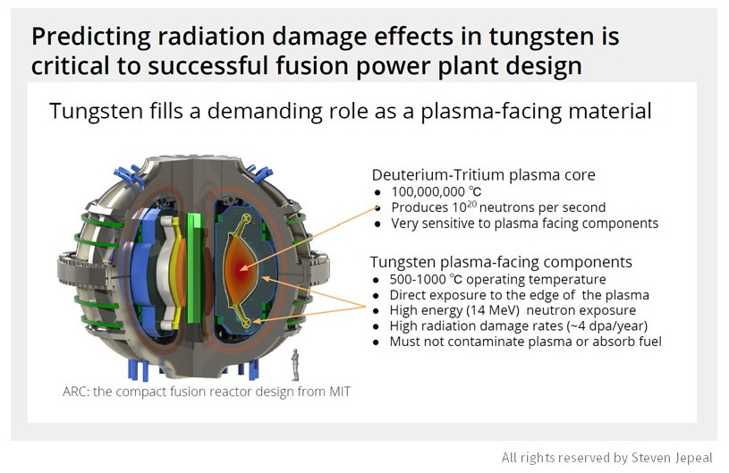
Will your poster be presented at the NSE Graduate Research Expo where you’ll have a mix of faculty, current NSE students, and incoming first-years, or is this poster for an APS-DDP (American Physical Society, Division of Plasma Physics) conference where everyone will have a solid grasp on plasma physics? Knowing this will help inform your objectives, your main message, and level of background versus technical detail. For instance, the posters below describe the same project, but one was targeting a broad, non-expert audience whereas the other was for a highly technical crowd.

1.3. What is your specific aim?
Decide what you want for/from your audience. This aim should be centered around your audience, specifically what you would like them to do or feel. Your poster (in content and design) should steer the conversation in your desired direction. For example, emphasize your methodology and critical concerns in order to hear critical feedback, or you may emphasize the importance of your work, its diverse applications, and future directions if you wish to attract collaborators.
2. Building your poster
2.1. Prioritize figures over text
Your poster is first and foremost a visual aid to your narrative. The general structure of a poster can vary, but you should aim for the following composition: 80% figures, 10% title, and 10% text.
2.2. Make your title visible, brief, and broad
To come up with a strong title, brainstorm the key nouns and verbs relevant to your work (aiming to keep them general) and link them together with as few words as possible.

 2.3. Organize your content in individual panels
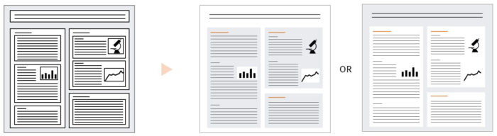
Consider each panel in your poster to be like a slide in a presentation. Use a section title that tells the reader the main takeaway. Provide figures, text, and data that present evidence for the validity of the title. Emphasize the figures, providing just enough text required to explain the figure. The text should be bullets and white space rather than paragraphs.
2.4. Use visual design to support your narrative
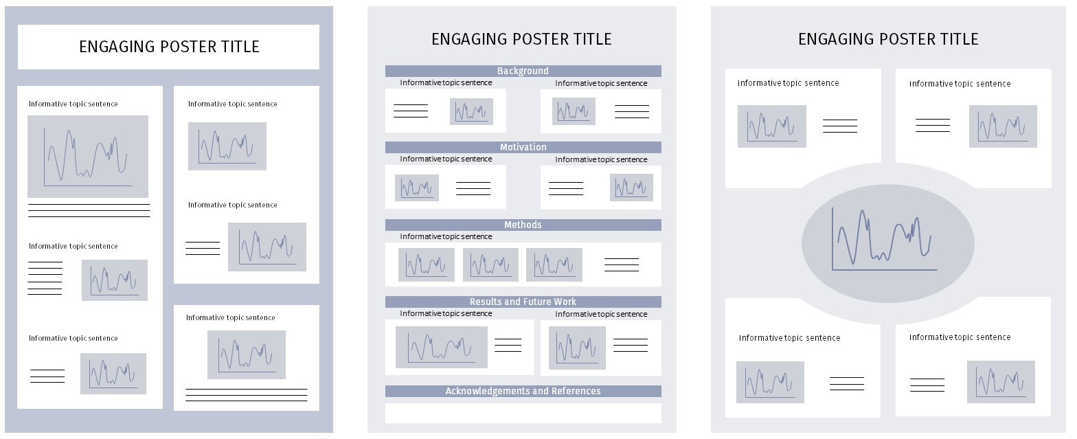
A large central figure is an effective way to showcase your main message, be it a representation of your experimental technique or a key result. Posters are usually organized into panels. Consider the placement of these panels to simplify the navigation through your poster. Certain design decisions can help to simplify and facilitate navigation. For example, the below design principles can work in synergy to guide your audience through the logical flow of your poster:
- Take advantage of size, font, and face to highlight the information hierarchy of your poster. At the same time, too many variations of text styles can be overwhelming. Keep your design and formatting consistent throughout.
 Group related content into panels so that the reader’s eyes intuitively follow the flow of your poster (see right). Guides such as arrows and numbering systems can help but may also add visual noise, so use them thoughtfully.
- Avoid dark, bold outlines to demarcate each panel, as these may compete with your actual text and contribute to visual noise. Instead, organize your content using space and color.
3. Presenting your poster
Your poster is a visual aid to your narrative, which means you are still the main conduit of information. As such, be ready to engage your audience in a meaningful conversation, and adapt to your environment.
3.1. Prepare your pitch
“Tell me about your work” is a commonly asked question at poster sessions, and you must prepare to answer it effectively without losing your audience. Aim to convey what the problem is, what you’re doing to solve it, and why people should care… all within 20-30 seconds. For example:
“A large obstacle for nuclear materials researchers is the cost and time required for in-core reactor irradiations. I’ve developed a technique to use charged ions from small particle accelerators to simulate neutron damage in nuclear materials. The rapid turn-around time and low cost of this technique allow for many small scoping experiments to be performed before committing a large amount of resources to a dedicated, in-core experiment.”
Head over to the Elevator Pitch CommKit article for more tips and examples.
3.2. Plan to optimize your pitch in real time
It is important to customize your pitch based on your audience’s level of expertise. If they work in your research area, the background and motivation you discuss can be minimized and you can dig into the details. However, if you are presenting at a general conference, keep the content at a high level and emphasize the motivation and conclusions. If you’re unsure where to start, ask your audience what they already know about your topic of research, and lead them from there. Remember you can ask questions too!
4. Quick tips
Tools and basic templates to get started
- Most people use Microsoft PowerPoint, which you should be able to access through your academic institution.
- Come up with a design that works best for you or, if you’re new to the task, check out these templates from the BE Communication Lab: Microsoft PowerPoint templates and Adobe Illustrator templates.
Poster logistics
- Review your conference guidelines carefully. One common poster size is 36 inches by 48 inches (easily accommodated by MIT CopyTech).
- Titles should be about 1 inch tall.
- Do not use valuable poster space to include an abstract, unless the session specifically asks you to do so.
- Do not wait until the last minute to print your poster! The turnaround time for many printing services is 24 hours.
Editing tips
- When you’re almost done, print a small draft version of your poster (ex: letter size paper) to get an overall sense of the finished product. It will be easier to catch formatting inconsistencies or size issues.
- If you can, practice presenting your poster before you send it to the big printer. You may find that some figures or transitions can be optimized to better match your message, and it won’t be too late to make edits.
Presentation and networking
- If you’re reusing a poster that was meant for a different venue, adapt your oral message to match your new audience and objectives. Your poster is not prescriptive; you can jump around and even skip parts that aren’t as interesting to your attendees.
- Use this opportunity to grow your professional network; consider bringing business cards and printouts of relevant papers. Make time to follow up after the poster session.
- Browse the conference agenda for people you are interested in seeing, and feel free to invite people to your poster session.
- Plan on dressing professionally though we recommend staying within your comfort zone.
Additional resources
- Bang Wong’s one-page guides for Nature Methods on layout and negative space
- Jean-luc Doumont’s booklet on effective research posters
5. Examples
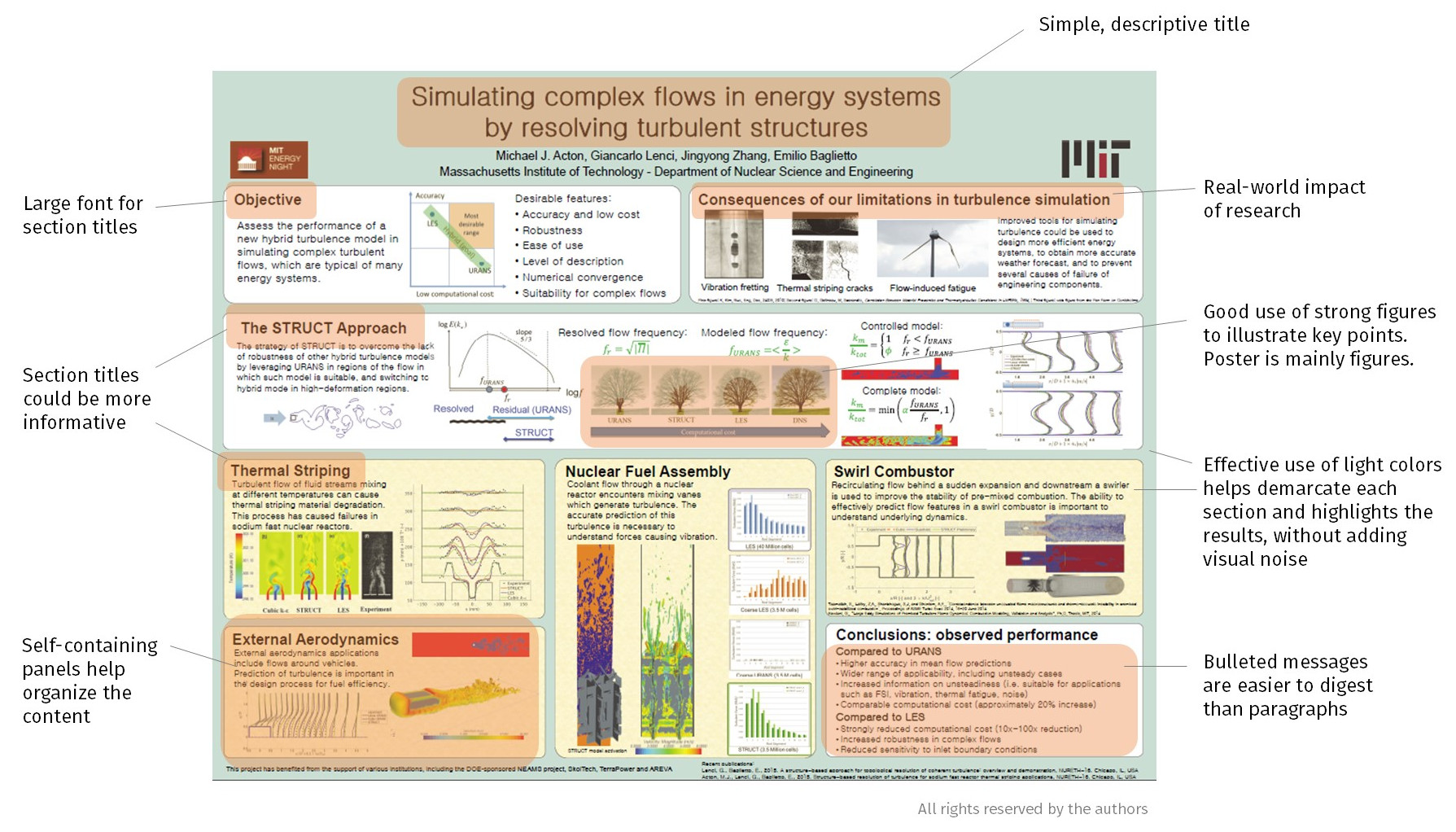
There are a lot of excellent posters out there, many of which can still be improved further. Here is an example with our annotations:
For inspiration, below are additional NSE posters that illustrate many of the practices that we recommend.
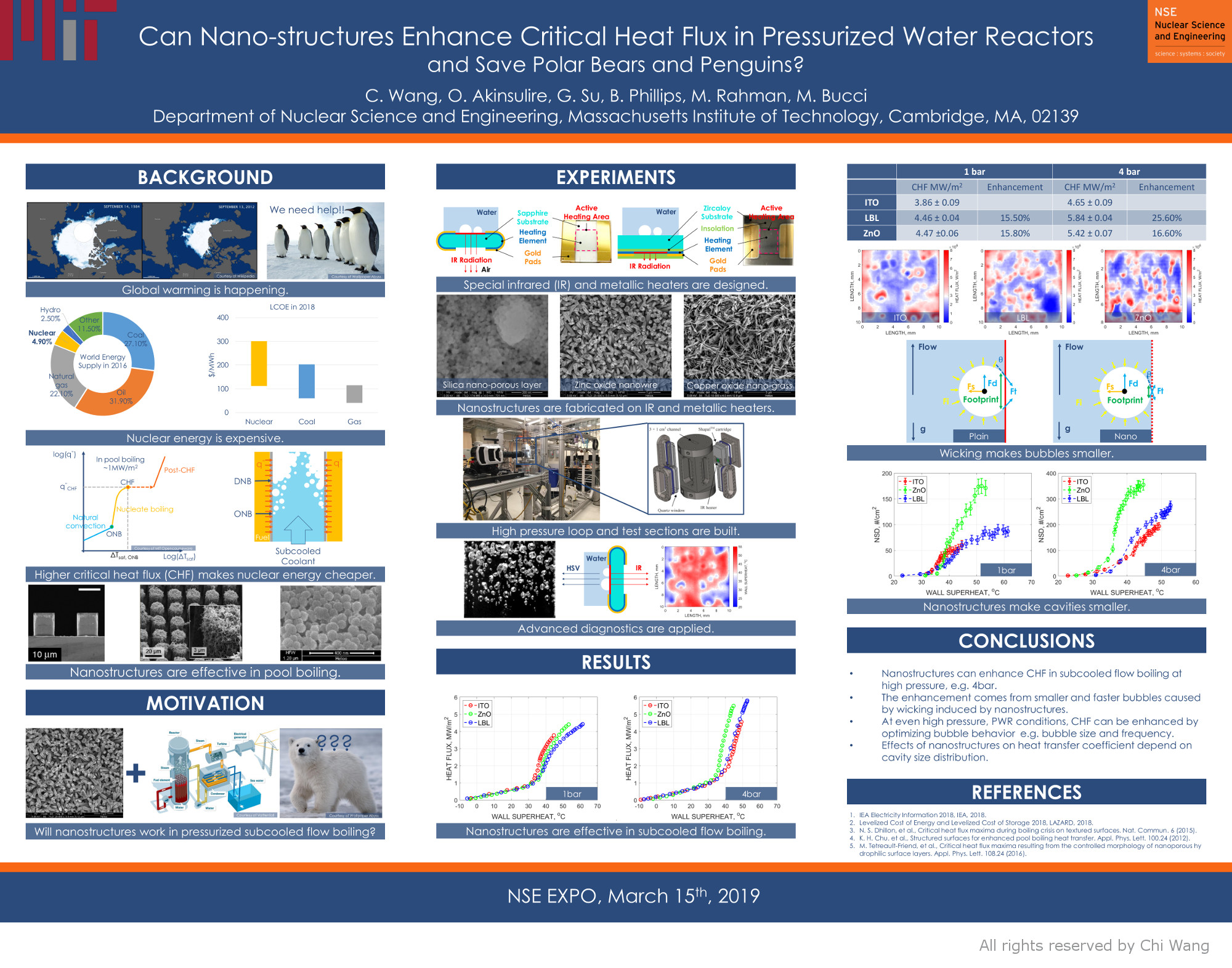 Chi Wang (2019) NSE Graduate Research Expo |
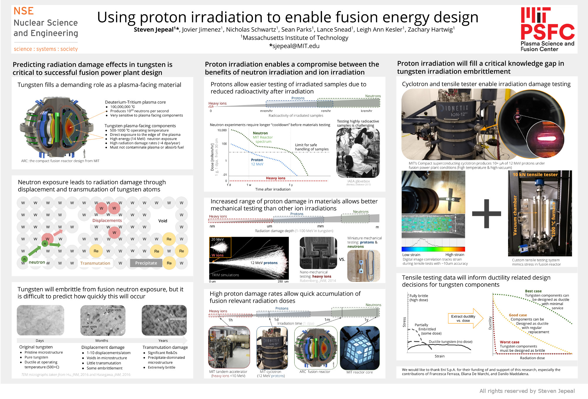 Steven Jepeal (2019) NSE Graduate Research Expo |
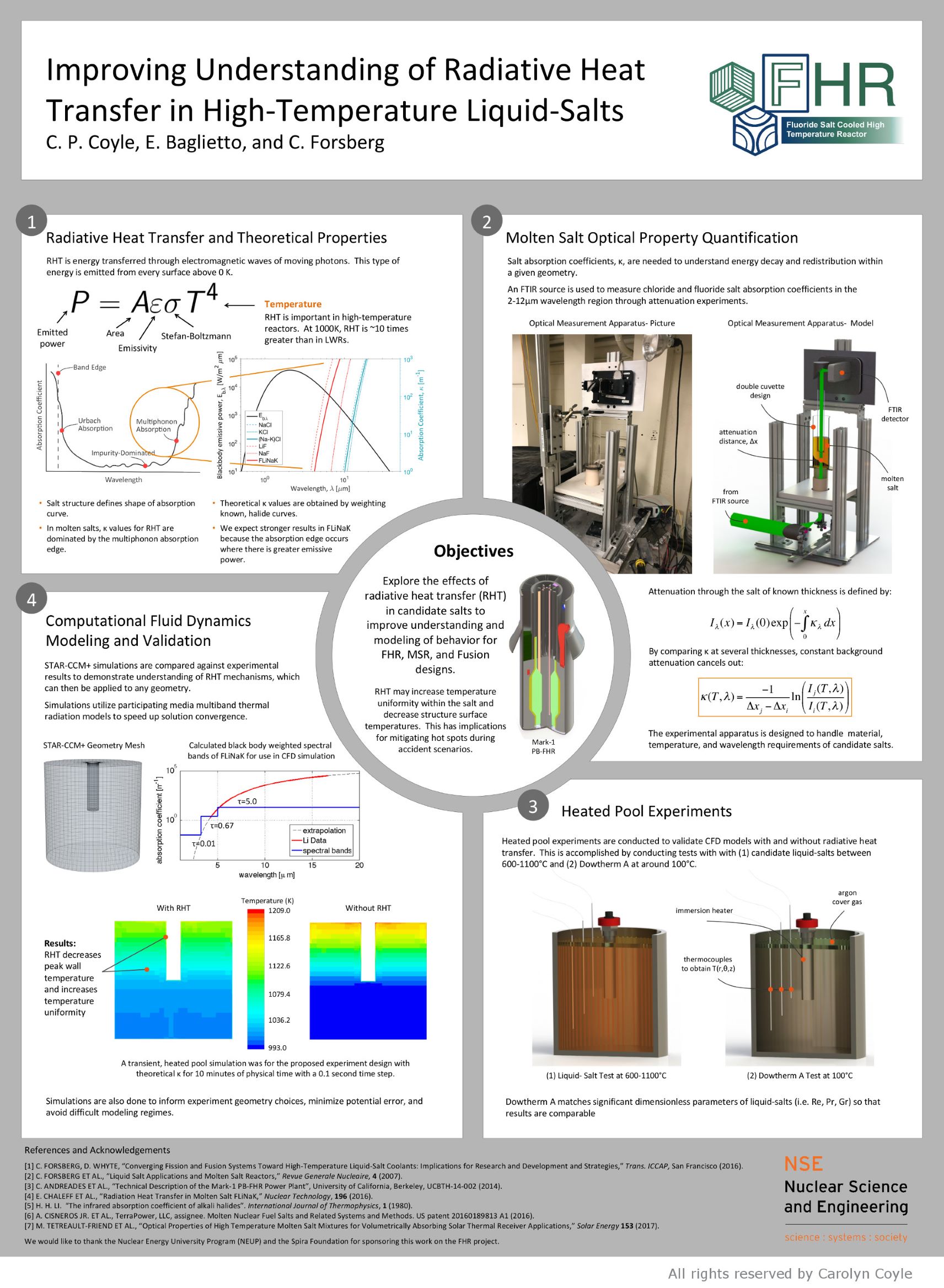 Carolyn Coyle (2018) NSE Graduate Research Expo |
 Sean Ballinger (2018) American Physical Society Division of Plasma Physics Annual Meeting |
 Jayson Vavrek (2018) NSE Graduate Research Expo |
 Max Carlson (2019) Gordon Research Conferences: Science of Adhesion, Adhesion in Extreme Environments |
 Thomas Varnish (2022) NSE Research Expo |
To get started or receive feedback on your poster, make an appointment with us. We’d love to help!