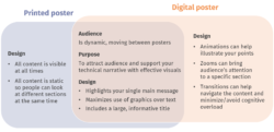
Simply put, a digital poster is a poster that’s displayed on a screen instead of being printed. As such, be sure to master the traditional poster before incorporating multimedia, zooms, and transitions. Digital posters (or e-posters) also open the door to countless design options, some of which are more effective than others. To help us navigate this new medium, we’ll introduce three types of digital posters: the “traditional,” the “Harry Potter style,” and the “Inception style” posters. Finally, we will flag common mistakes.
1. What is a digital poster?
Just like a printed poster, a digital poster is a visual aid to help you share your technical work at a poster session. The main difference is that a digital poster allows you to include dynamic content. For instance, you can embed multimedia files (GIF files, videos with audio, etc.) as well as control what information is shown throughout your presentation (using zooms and transitions).
2. Three types of digital posters
Digital posters offer an array of new design options, which is exciting but can also be overwhelming. Therefore, we’ve organized digital posters into three groups which we playfully call the “Traditional,” the “Harry Potter style,” and the “Inception style” posters. The main difference between them is how much dynamic content is included.

2.1. The “Traditional” digital poster
This is the most basic option, as you simply project your traditional, static poster onto the screen. (If you’re recycling a poster you’ve designed to be printed, be sure to adjust the dimensions to meet the new specifications.) While the easiest route, this option fails to capitalize on the main benefits of the digital format.
2.2. The “Harry Potter style” poster
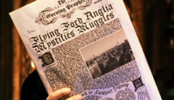
In Harry Potter, newspapers contain static text and moving images (Image source).
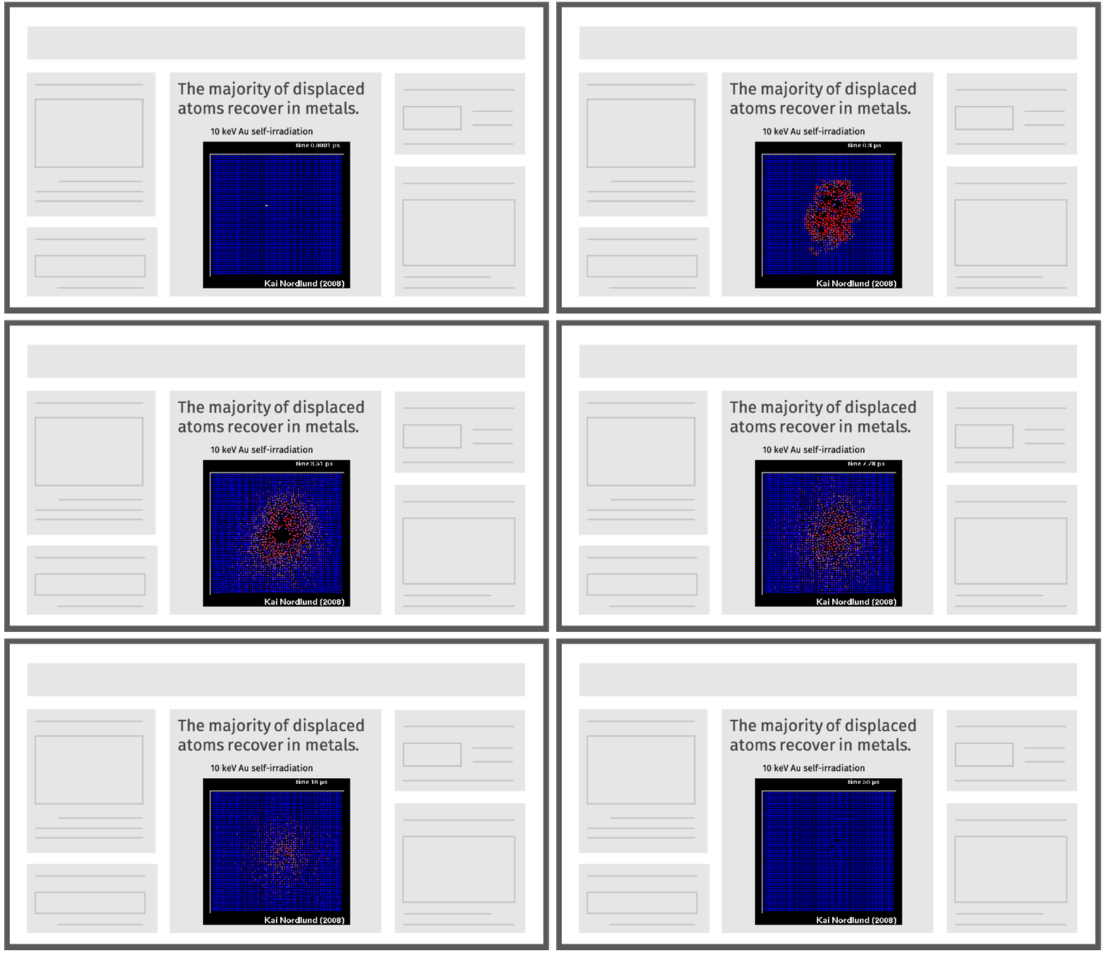
In the fantasy world of Harry Potter, images have the ability to move (among other things) while text remains static. For our purposes, a “Harry Potter Style” poster is a traditional poster with embedded multimedia, whether it’s in the form of animations, GIFs, or videos.
This option allows you to better illustrate your points. You could show evolving phenomena, computer simulations, or a 360° view of the experimental setup you built. You can also use animations and zooms to highlight/enlarge content that you want your audience to focus on.
2.3. The “Inception style” poster
The movie Inception takes place across multiple levels of (sub)consciousness, with ways to move between each one. With a similar (but simpler) model in mind, the “Inception style” poster contains multiple panels of information, each one offering new, specific insights into your technical narrative, and includes embedded links to transition in between panels. Of the three types of digital posters, this option is the most involved and requires more thoughtful design.
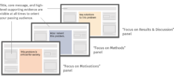
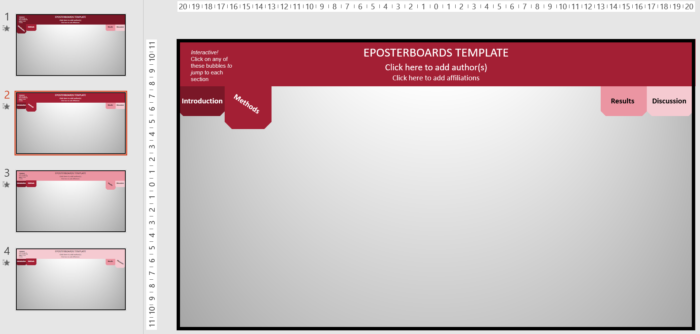
There are many readily available “Inception style” poster templates online. Each panel is effectively a slide (see example below from ePosterBoards) and contains embedded links to jump around. In this article, we use the word “panel” rather than “slide,” only to avoid confusion between digital posters and slideshows—these are different types of presentation and should be designed accordingly.
2.4. Pros and cons of each type of poster
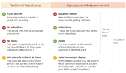
Overall, posters with dynamic content (“Harry Potter” and “Inception“) offer clear benefits over posters that only have static content (“Traditional”).
Now you have the background needed to start building your poster!
3. Building your digital poster
3.1. Recommended workflow

On a high level, you will be applying standard poster best practices such as relying more heavily on graphics than text, effectively organizing your content, and using informative titles and headers. In particular, plan your poster by answering “who,” “why,” and “what” questions. Clarify who your audience is (the more technical they are, the less background and more technical detail you want to give). Also, identify your objectives (Are you looking for feedback? Trying to wow potential employers?) and what specific message you want each audience member to take away from your presentation. Only then should you get creative with your dynamic content.
3.2. Brainstorm and organize your digital content
Unless you’re pressed for time and must choose the “Traditional” format, your next step is to brainstorm your dynamic content. Here are some things to consider.
- You can use animations such as a clip from a molecular dynamics simulation, an animation of how protons are accelerated in your cyclotron, or a video of your TEM sample lift-out procedure. The latter is a great example of how you can show your audience your methods section, rather than just telling them about it. However, make sure that you have a clear reason for showing the animation. It must clearly fit in the storyline of your discussion.
- You can include zooms to enlarge a graph to make the trends more obvious, or a schematic of your setup to make the components more visible. Another effective use of zooms is to enlarge the section currently under discussion to attract audience attention to it.
- Multiple panels can make additional details available if needed. For audience members interested in the more technical details of your work, you can pull up these backup panels to support the discussion.
Once you have determined your digital content, you can decide which type of digital poster will work best for your narrative and your interaction with your audience.
3.3. Common mistakes in digital posters
The new design options for digital posters offer great benefits, but they can also be taken too far. Therefore:
Don’t include too much content. This is true for all posters, especially the “Inception style” ones. Although you suddenly have more room for lots of additional details, be sure to use that space strategically to keep your audience engaged in your discussion.
Don’t use dynamic content that may distract from the discussion. Too many zooms and animations can become visual noise and compete with your pitch for your audience’s attention. Only include content that contributes meaningfully to the discussion, and also plan when it will (or will not) play.
Don’t use too many panels. If you do, your audience could get lost in the details and miss your main message. It would also make it hard for new audience members to join the discussion.
Don’t treat your panels as presentation slides. If you don’t keep the main title, motivations, methods, and key findings of your poster stationary, newcomers and distracted members of your audience may get disoriented and lose sight of the big picture. Your presentation should be tailored to a dynamic audience, with people coming and going.

4. Presenting your poster

Image source: ePosterBoards
In many digital poster sessions, the presenter controls the pace of the pitch and visual delivery. Practice will be key to make sure that your discussion matches what is going on in your poster.
Practice not to memorize but to improve clarity and flow. Once at the session, you will need to be flexible to engage with your audience in conversation. For instance, depending on what they are interested in, you may spend more or less time on different parts of your presentation.
5. Quick tips
- Start early! Your submission deadline could be a week before the day of the event so plan wisely.
- Carefully follow all instructions. The company supplying the digital poster boards will likely recommend specific software, dimensions, font sizes, and formatting. They may even provide templates. Be sure to review the guides that they provide. Often, they will recommend using landscape mode, font sizes of at least 28 pt, and bringing a backup copy of your digital poster to the event, just in case.
- Remember to network. Consider bringing printouts of your relevant papers and business cards to make yourself memorable. If you’re planning to go to grad school or will be on the job market soon, this may be a chance to learn about possible matches. Also, make the time to follow up via email to continue discussions.
To get started or receive feedback on your digital poster, make an appointment with us. We’d love to help!

