Rather than summarize the massive literature surrounding figure design, here we give you a high-level framework for getting started with your next technical visual. In particular, we’ve organized figures into three categories: figures that are based on collected data, figures that illustrate abstract concepts, and figures that are adapted from existing images. We’ve also included resources and examples for you to explore.
1. Before you start
 Don’t start plotting yet. Planning the strategy for your visual yields better visuals and saves you time.
1.1. Make your figure actionable
What do you want your audience to think or do based on the information you are giving them? Some figures have a very specific purpose such as revealing a key finding; other figures serve as maps or references. In all cases, maximize the impact of your figure by approaching its design from the perspective of the user. (Note that “Show my work” is neither audience-focused nor actionable, and can lead to ineffective messaging.)
1.2. Clarify your message
Next, focus on (1) your takeaway message and (2) the evidence needed to support that message. If you skip this step, you might spend a long time developing a more complex visual when a simple one may be easier and more effective.

2. Designing your figure
Your next design decisions will depend on the type of information you’re working with.
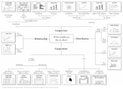
2.1. If you’re showing data
 You’re now in data visualization territory! There are so many ways to show your data, and deciding which one is best for your figure hinges on what you’re trying to communicate. For ideas, take a look at the following resources or examples in our gallery of figures.
 |
 |
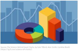 |
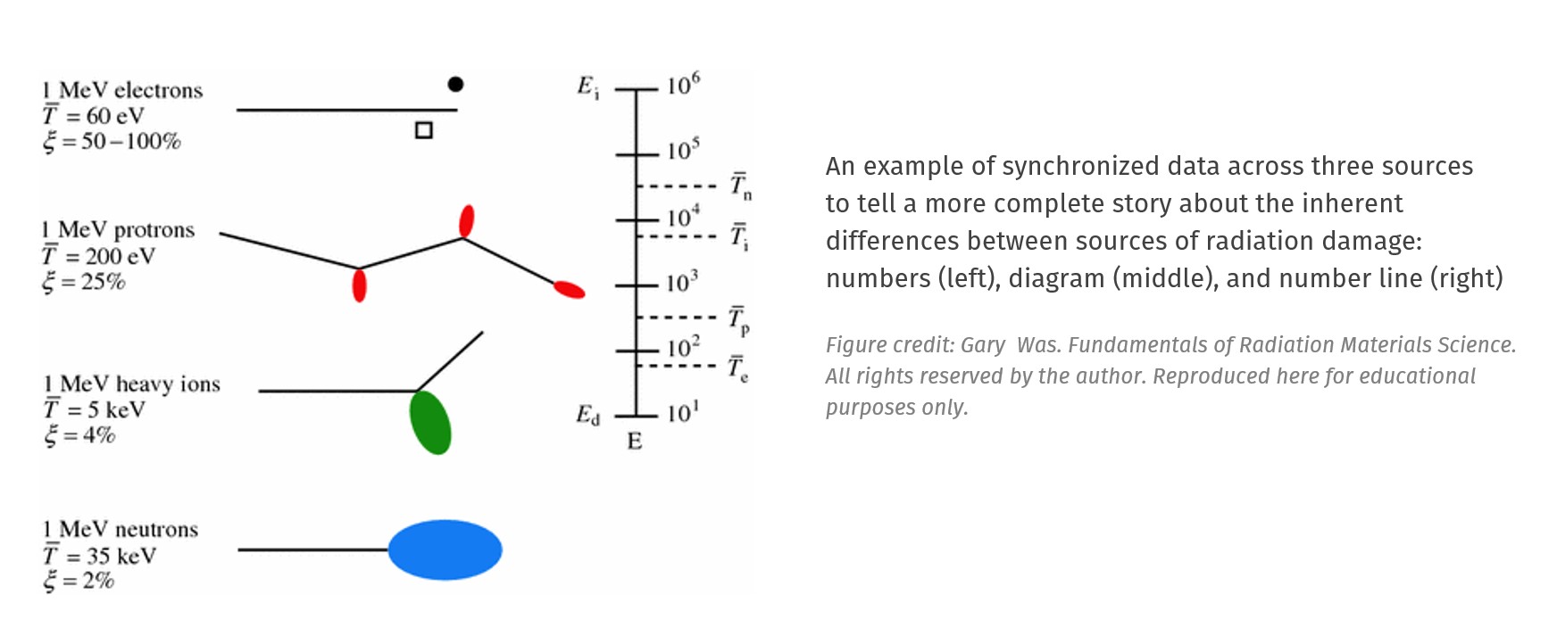
| “Choose the Right Chart Type for Your Data” is a reference guide to selecting your data visualization method. | “The Data Visualization Catalogue” offers a rich library of plot types and examples for you to choose from. | “The Science Behind Good Charts” lets you experience how hard it is to answer a specific question when the wrong chart type is chosen. (If there’s a paywall, just Google “science behind good charts.”) |
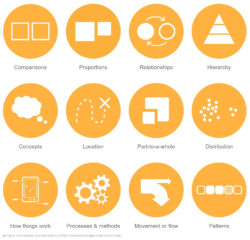
2.2. If you’re showing a concept
Many figures are designed to illustrate abstract concepts or ideas rather than data sets. Below are three ways to represent technical information that are not based on numbers. You can explore other ideas among our list of resources.
 |
 |
 |
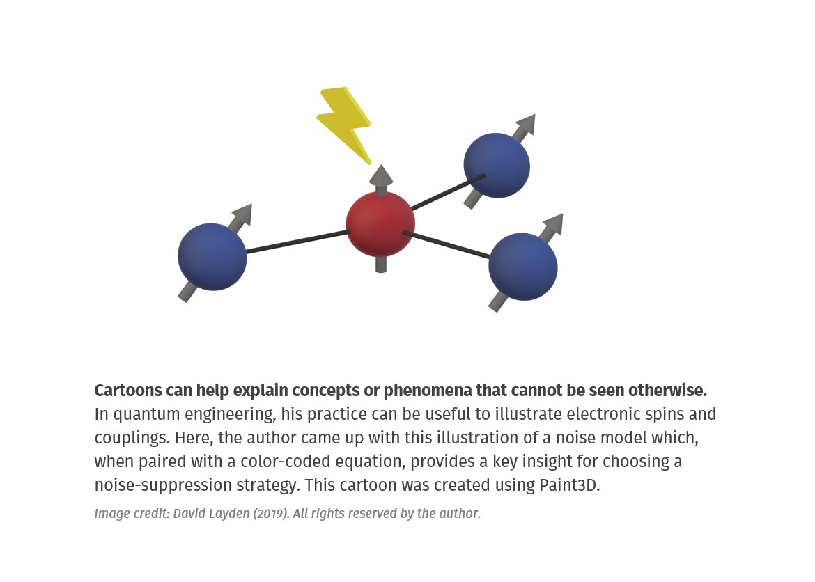
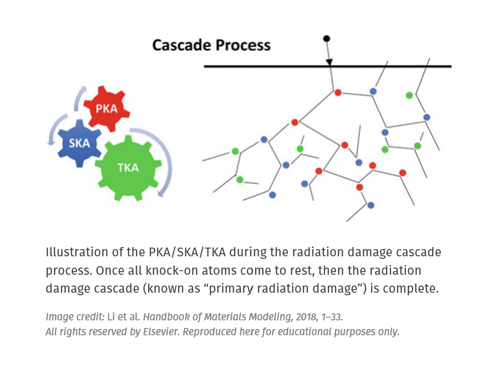
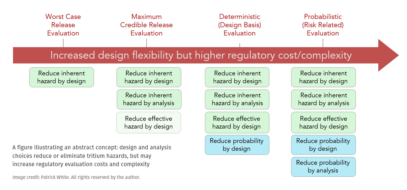
| Cartoons Create your own cartoon illustrations of abstract concepts to help orient your audience (example). |
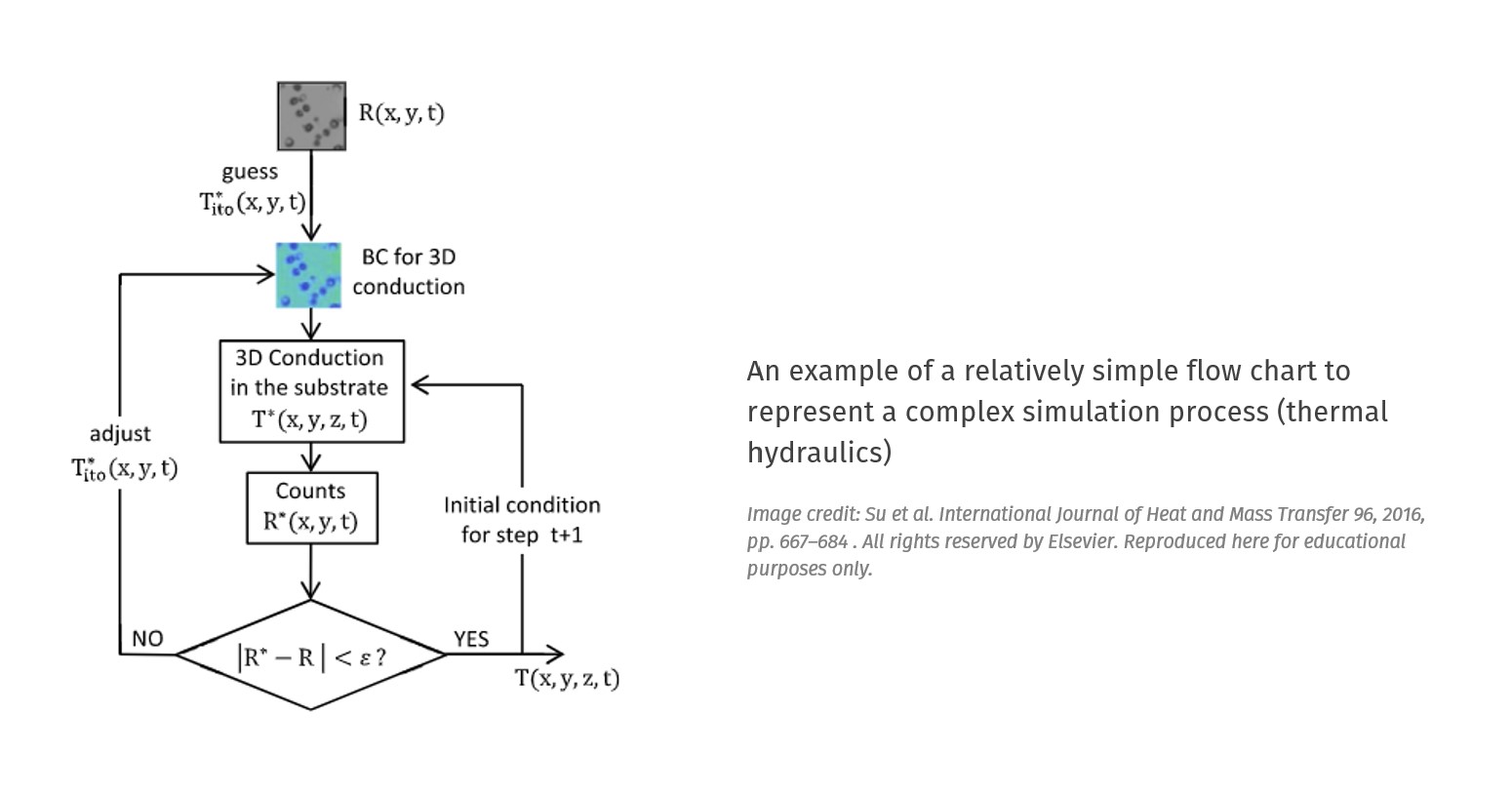
Flowcharts Use flowcharts to illustrate a network of decisions or processes, and the logical links between each element (example). |
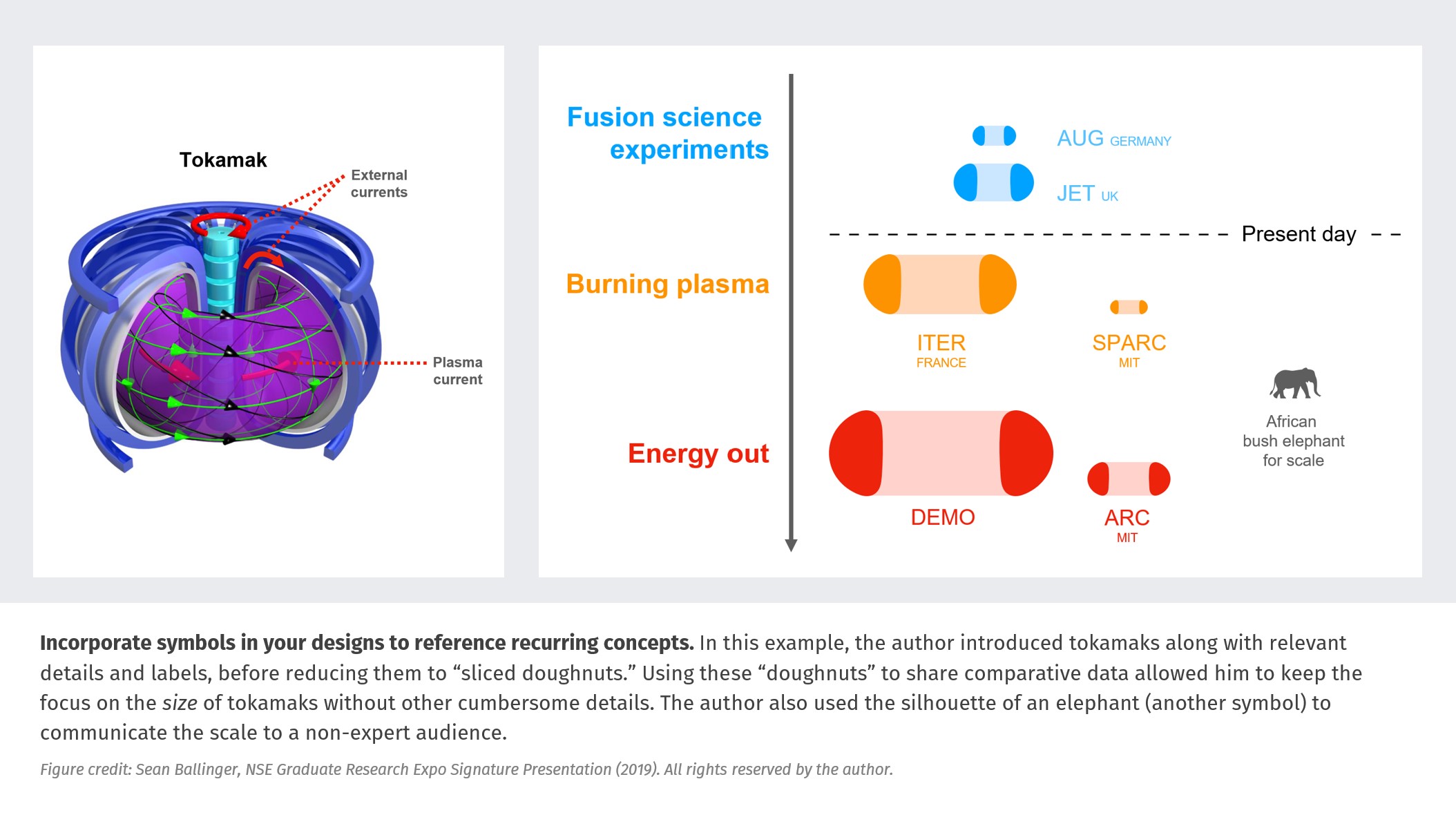
Symbols Consider using symbols to distill objects down to a few specific parameters (example). |
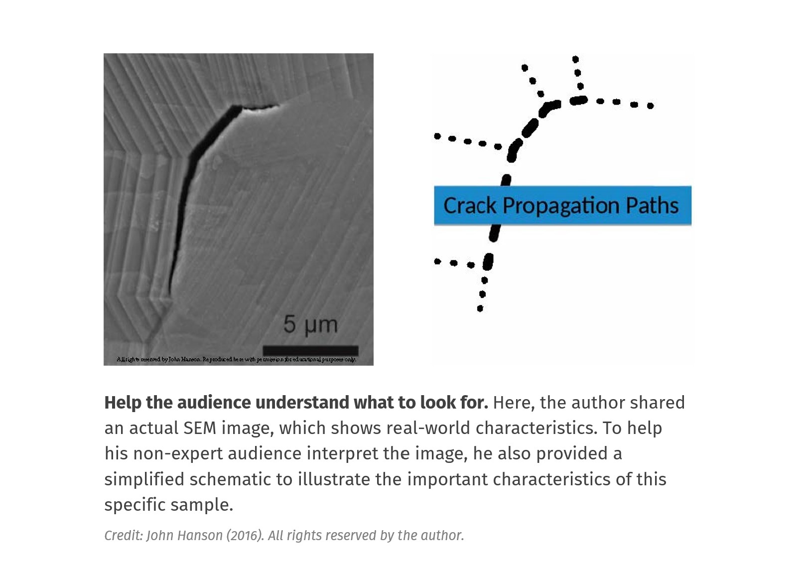
2.3. If you’re showing an image
This type of figure is based on images taken in the lab. In that respect, the information already exists in visual form, but even the best of images can have elements that compete for the viewer’s attention. To avoid these, try:
- carefully controlling the background of your image,
- creating a diagram or model in place of an image,
- labeling every important component.
 |
 |
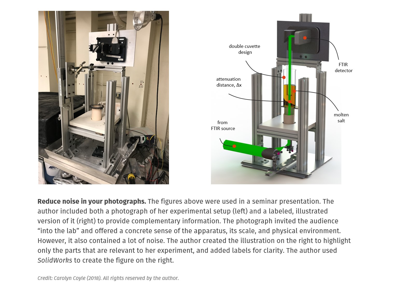
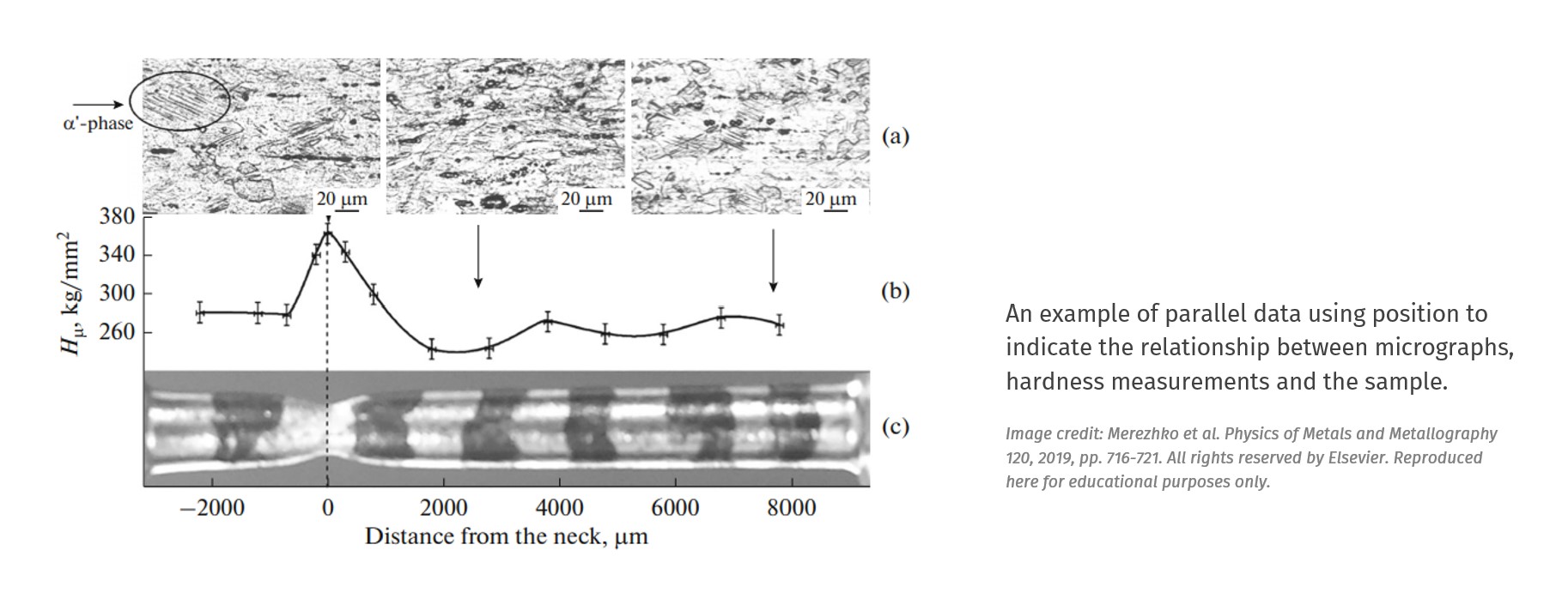
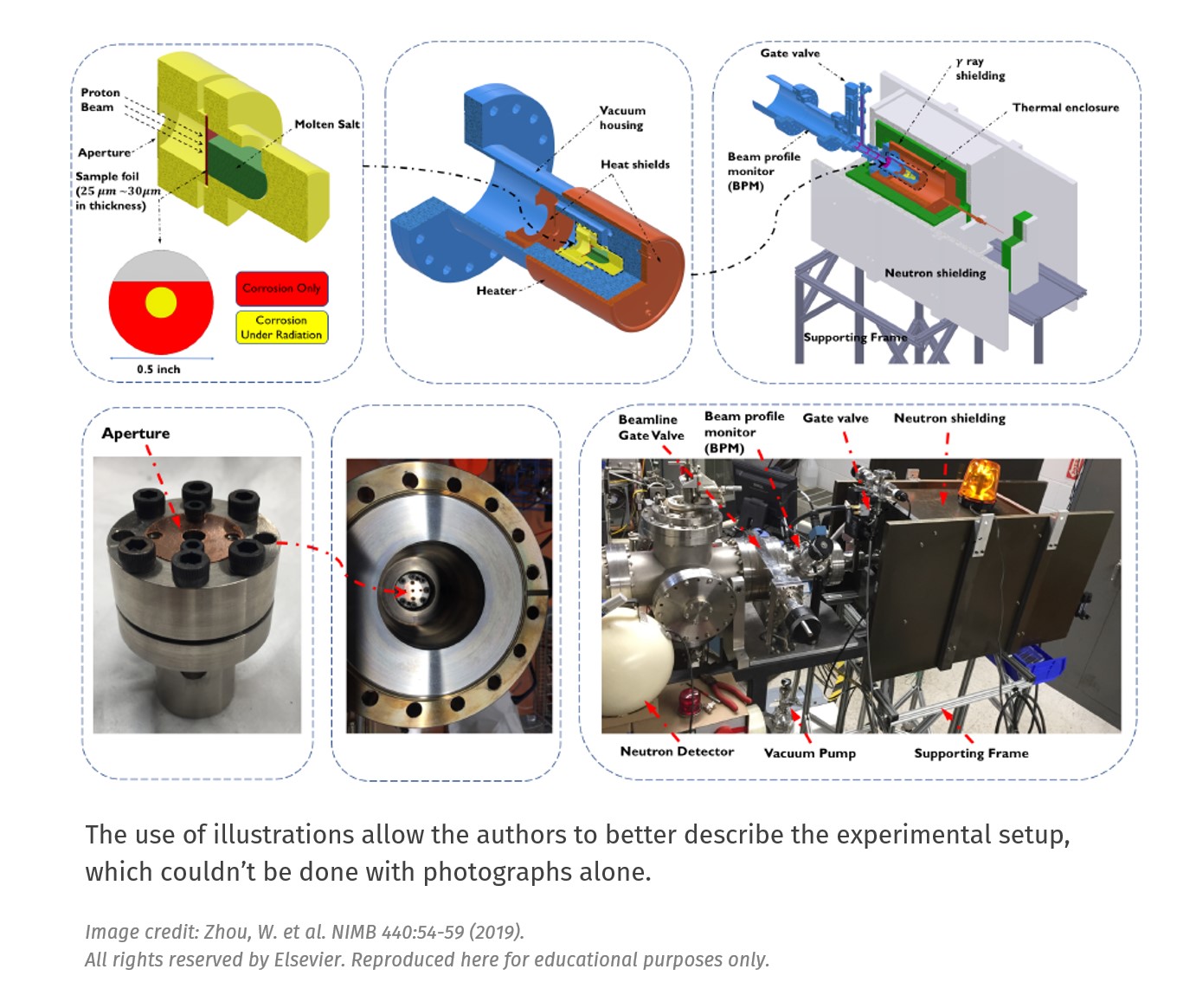
| Diagrams and illustrations Photographs contain a lot of details that can also interfere with the technical description of your setup. To combat this, consider creating a diagram to accompany your photograph (example). |
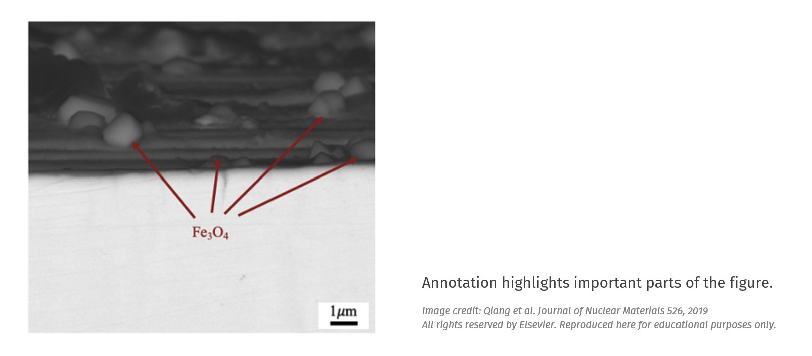
Schematics Include a schematic to highlight specific features of interest. This will help your audience rapidly distinguish signal from noise (example). |
3. Putting it together
Now that all the major elements of your figure are in place, you can start tweaking your design.
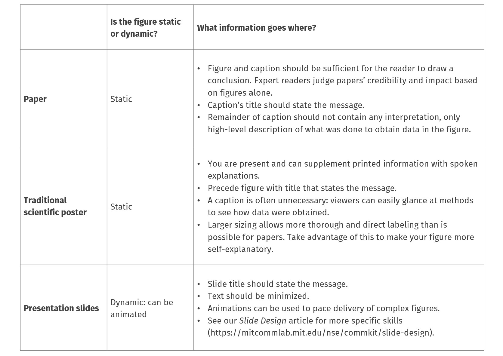
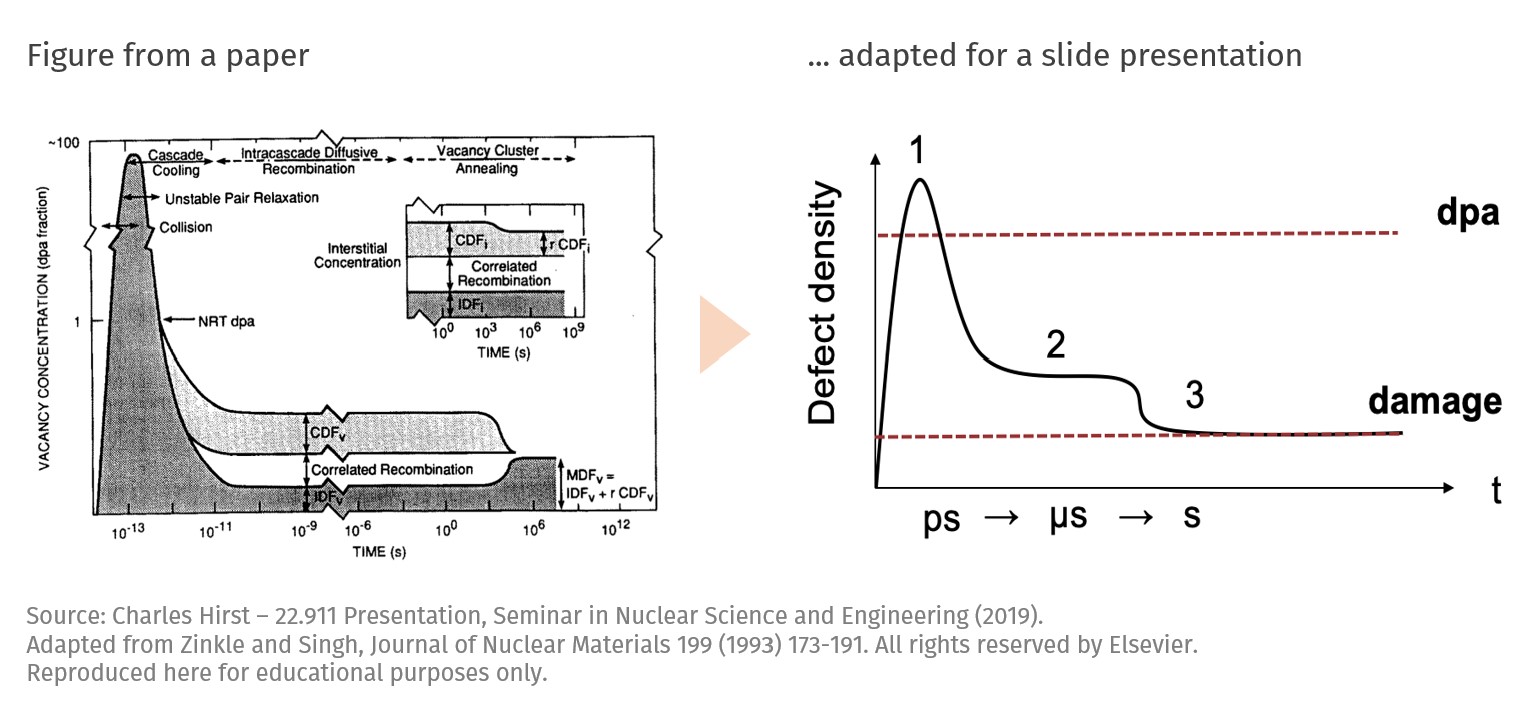
3.1. Adjust your figure to your presentation
Papers, talks, and slide presentations each force audiences to interact with your figure in different ways. When adapting a figure from one medium to another, be sure to control how much information you include.
 |
 |
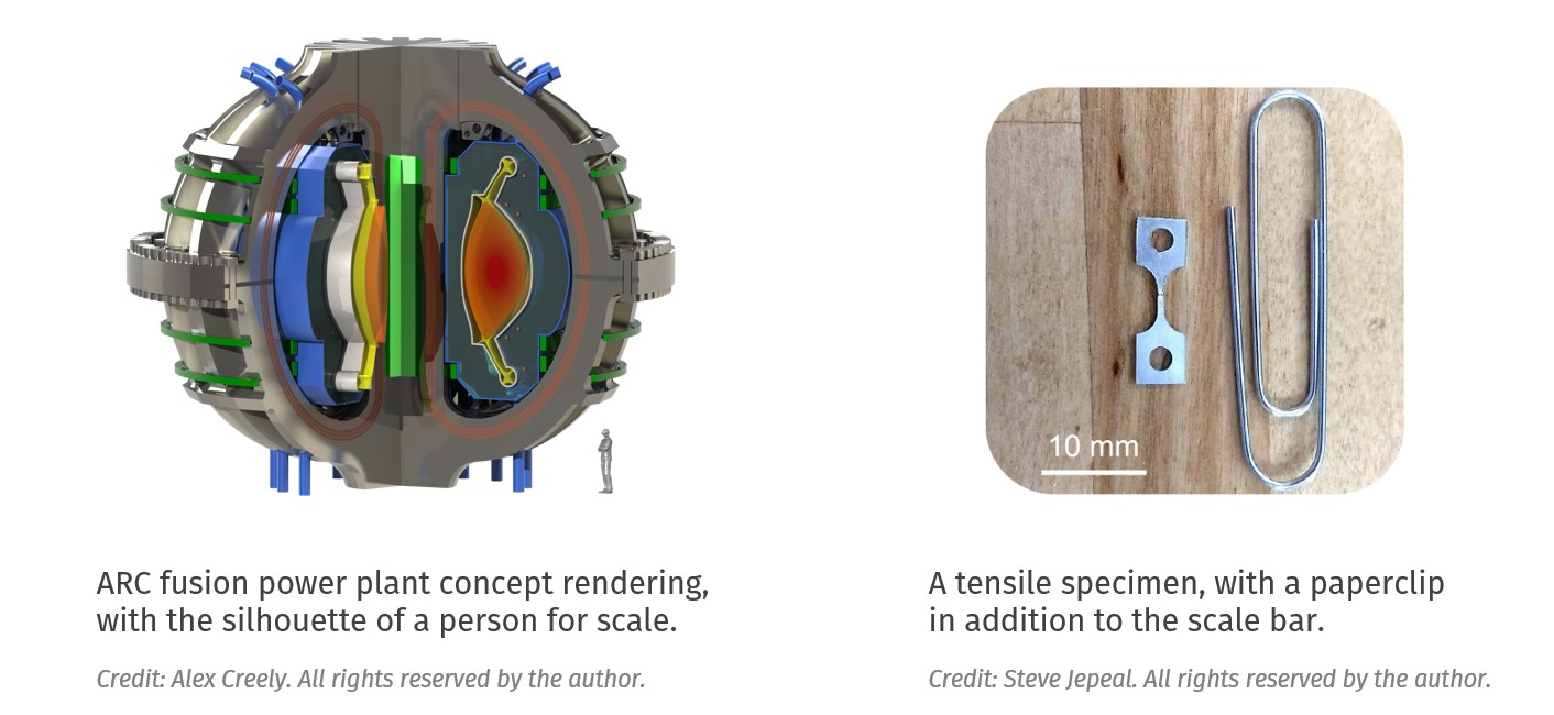
3.2. Add reference points
The use of scale bars on images is standard practice but even that information may need to be re-interpreted (ex: “0.08 mm” as “the thickness of a human hair”). When communicating to audiences that are unfamiliar with your work, and especially when size is an important part of the story, try using reference points that are considered common knowledge. In these cases, a relative sense of scale is more important than the actual dimensions.
3.3 Maximize your signal-to-noise ratio
For all figure types, aim to remove all potential distractions (reduce noise) and enhance your message (your signal). For instance, try:
 being selective in the amount of data or evidence you need to make your point
- minimizing the amount of text, lines, and effects that are not critical to your main message
- selectively using colors, bolding, and other accents only on the most important part(s),
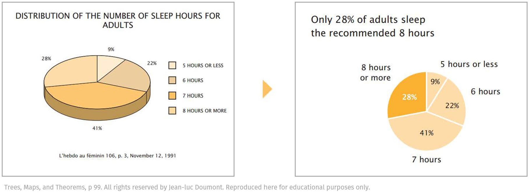
- labeling visuals as clearly and directly as possible (example from Doumont, above)
- titling the figure with the take-away message, rather than a description.
(The metaphor of “signal-to-noise ratio” comes from Jean-luc Doumont’s book Trees, Maps, and Theorems.)
Return to Contents
4. Resources
General design principles
- Ten Simple Rules for Better Figures, including “Do not trust the defaults,” “Avoid ‘chartjunk’,” and “Message trumps beauty”
- A Nature Methods collection of 1-page articles by Bang Wong, Martin Krywinski, and their colleagues on anything from the use of color to visualizing multi-dimensional data to data exploration.
- Design Strategies for Scientific Figures, a PDF document that covers topics such as messaging, composition, the use of color.
- A Brief Guide to Designing Effective Figures for the Scientific Paper, with a brief introduction into the use of figures and how to design effective figures in science
- Effective Graphical Displays by Jean-luc Doumont, an abbreviated version of his book chapter in Trees, Maps, and Theorems
Data visualization specifically
- The Chartmaker Directory, a collection of guides for creating charts in various software
- The Data Visualization Catalogue to explore different types of charts
- Now You See It: Simple Visualization Techniques for Quantitative Analysis by Stephen Few, an easy-to-read book that is half conceptual, half practical, and contains a generous amount of beautiful examples
- A Designer’s Perspective on Data Visualization: Strategies scientists can use when creating graphics for a broader audience
- Picking a Colour Scale for Scientific Graphics, an informative post about sequential, diverging, categorical palettes.
Photography
- Visual Strategies by Felice Frankel, which includes “before” and “after” versions of scientific images and goes through the reasoning behind each design decision
- Picturing Science And Engineering by Felice Frankel is a massive collection of impactful images that combine technical content with beauty. Felice regularly helps scientists get their work on journal covers.
Software and tools
- How to Create Publication-Quality Figures, is a step-by-step guide involving free software such as Inkscape
- GIMP2 and Inkscape are free alternatives to Photoshop and Illustrator, respectively
- SolidWorks is a solid modeling software program accessible through MIT’s IST
- Coblis is a color blindness simulator that allows you to upload your image and see what a colorblind person would see.
- Adobe Color lets you explore and create color combinations for your visuals, and includes an accessibility tool to make sure that your color choices are appropriate for color blind members of your community.
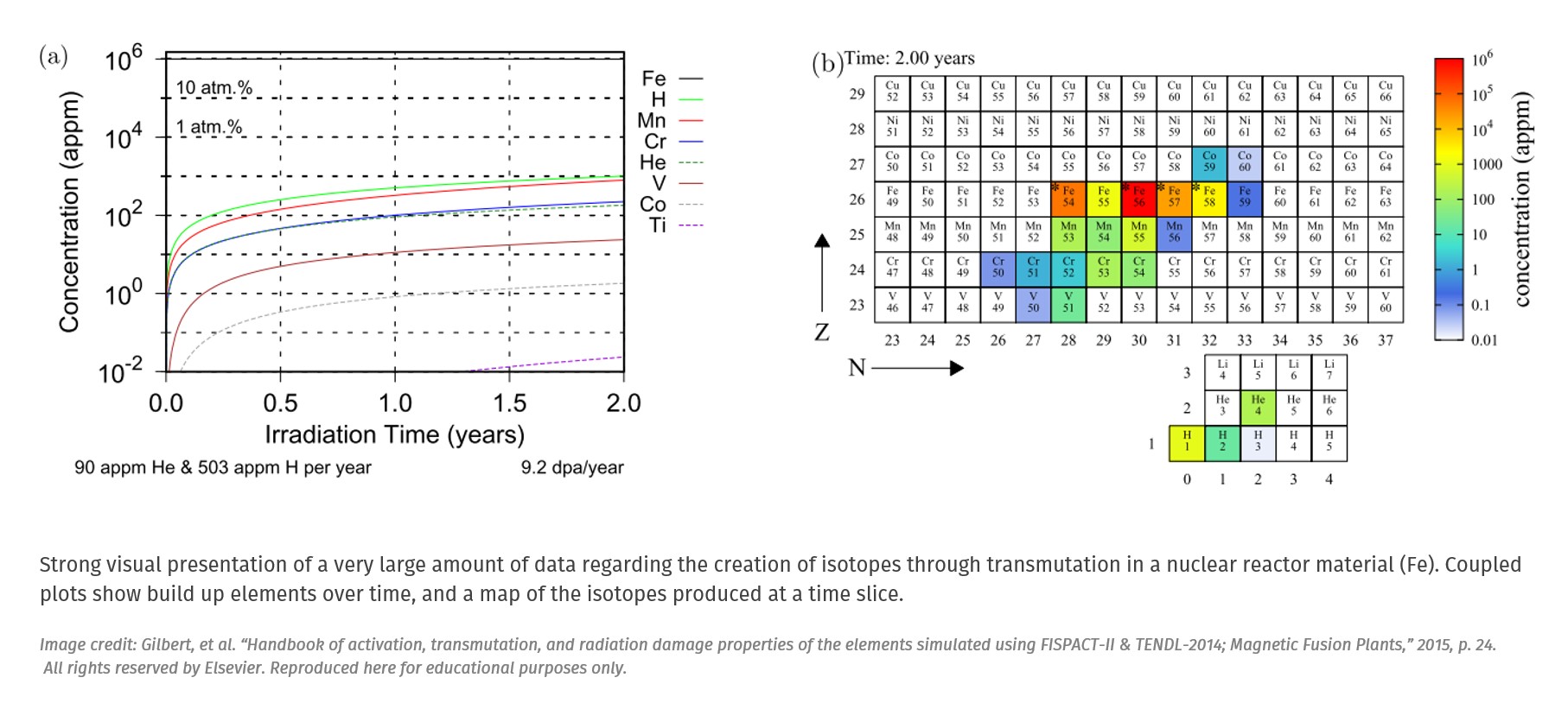
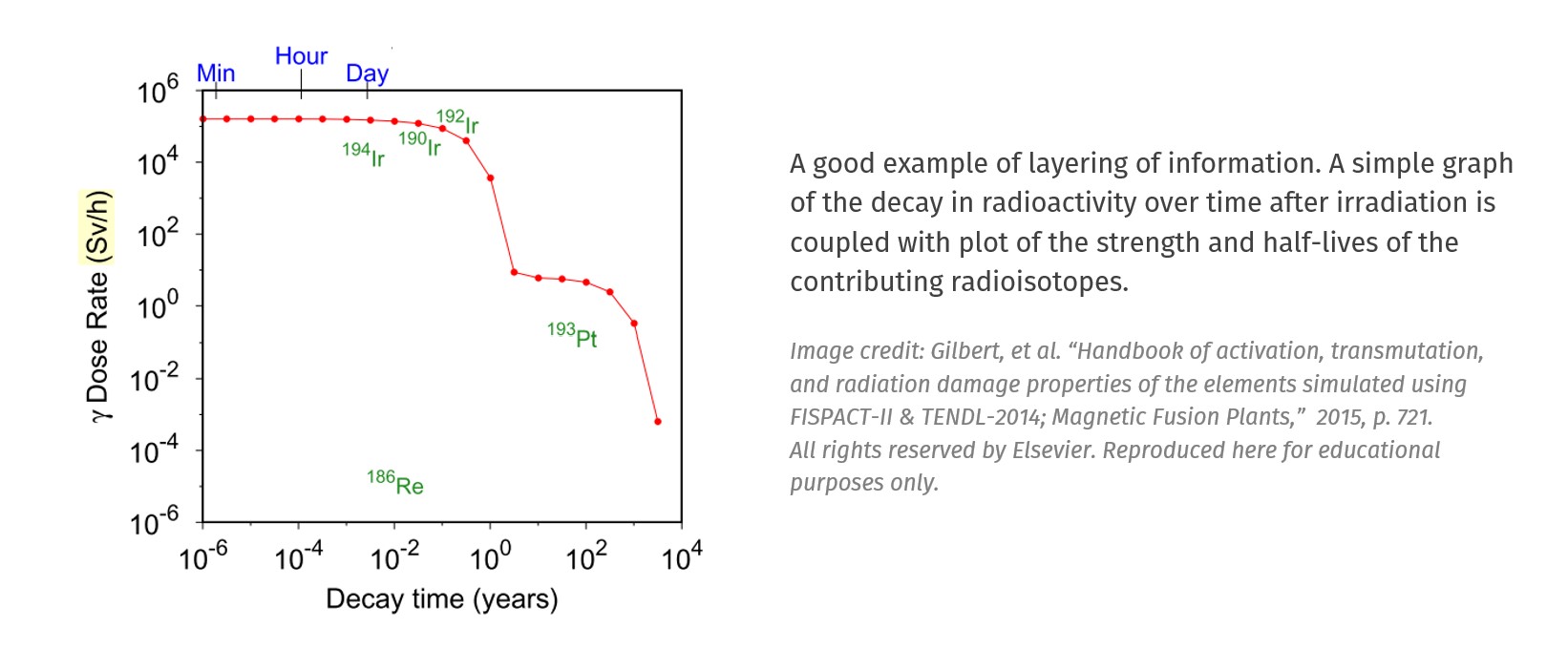
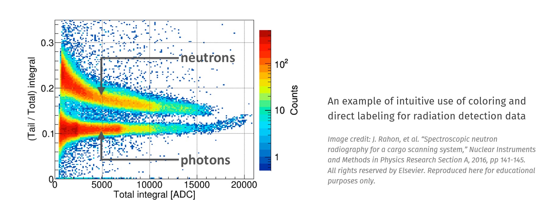
5. Gallery of figures
We’ve collected a number of technical figures you can use as inspiration. If you would like to contribute your own figures to the gallery, please email Erika Reinfeld (ereinfeld@mit.edu).
Data visualization
 |
 |
 |
 |
 |
 |
|
 |
Abstract concepts
 |
 |
 |
 |
|
 |
|
 |
Photograph-based figures
 |
 |
 |
|
 |
 |
|
 |
 |
|
To get started or receive feedback on your figure, make an appointment with us. We’d love to help!